

Posted
Hello, the overview page confuses me.
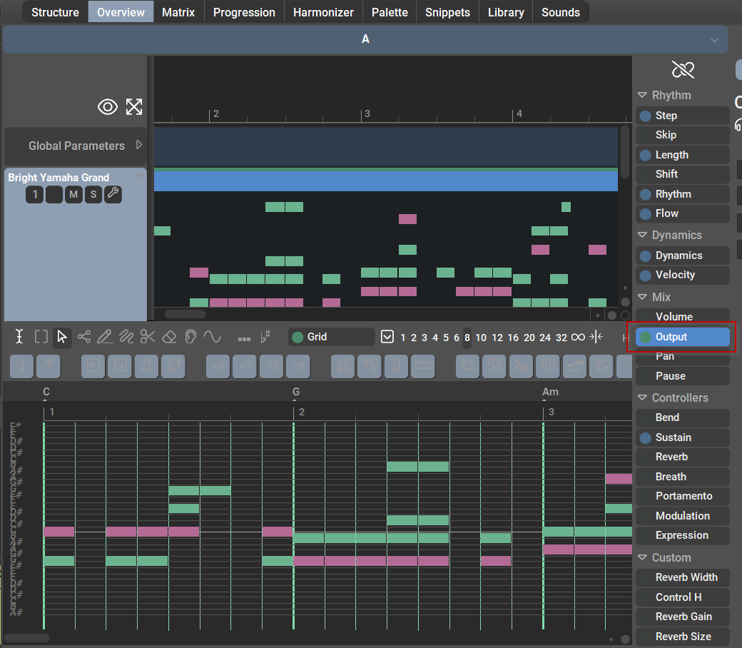
Please have a look to the screenshot attached. Should it look like this or do I have graphics issues?


Sun, 2022-10-16 - 20:39 Permalink
> I just assumed there might be some grid or delimter lines.
I tend to agree with AndreasHe. For actually reading this output -- at some later stage -- it would indeed be helpful to have the usual elements of a pianoroll page, which includes the bar lines, ideally the full grid, a piano keyboard at the side to know which high corresponds to which pitch, and a horizontal grid.
Then it would be possible to use the Overview display basically for proofreading (e.g., when evaluating different Interpretation settings). In its current form, the Overview page provides much less information than it could offer.
Sun, 2022-10-16 - 21:17 Permalink
BTW: It seems the colours of the Overview page correspond to the key, instead of the horizontal or vertical scale, which is misleading when using user-defined scales (i.e. not just major or minor), e.g., as horizontal scales. For example, plain chords consisting only of chord symbols can result in blue (scale) and even red (out of scale) notes in the Overview page in my projects, which is unexpected.
Sun, 2022-10-16 - 20:57 Permalink
> is that thing displayed already the final note
I may be missing something, but AFAIK the Overview page only visualises the musical result of Synfire, and cannot be used for editing (e.g., it colour codes the harmonic role of a note like whether it is is not chord, scale or out of scale). If that is so, then why not actually show the real pitches? Anyway, as I said, I may be missing something here...
Mon, 2022-10-17 - 08:25 Permalink
> Colors should be according to the vertical scale.
Ah, I see. That might explain it.
Would not be more suitable to make it depending on the horizontal scale -- at least as an option, because as I understand it that scale is more stable and thus more influencial for the piece (perhaps dependent on style and the Synfire symbols mostly used for the relevant piece)? Or how about at some later stage making the colouring somehow depending on the relevant symbols (e.g. for horizonal or vertical symbols)?
Anyway, even if the vertical scale is used as a reference, how can a chord containing only chord symbols end up be shown with red symbols in the Overview? Perhaps when using user-defined palettes based on user-defined scales, the vertical scales are not necessarily automatically assigned to scales that are completely suitable? (I rarely use these in such situations so far.)
Mon, 2022-10-17 - 10:37 Permalink
The piano roll could be improved, but it actually isn't one.
Maybe it's just me, but I always hated piano rolls, because you constantly need to scroll up and down only to see what's going on. There's room for maybe two octaves and everything beyond that is clipped. Not very useful for an overview. And since you can't edit anything, a vertical grid is not needed either.
In the phrase editor, if we added black/white keys as a legend, you'd have this constant scrolling up/down all the time.
Output is there to gauge what is going on harmonically (the colors) and where notes are merged or split and how segments wrap around at the margins of a playing range, etc. Besides that, you rarely need to know the exact pitch, velocity and duration of a note. If so, select it and the parameter inspector will show you that information.
I never look at the output, except for debugging render code. After all, the benefit of prototying is that you don't need to bother with the details and just rely on your ears to judge the results.
how can a chord containing only chord symbols end up be shown with red symbols
Magenta. Because the bass is often part of the chord. Red is a very different beast that agressively stands out.
The scale used as a reference determines whether to show red (chromatic) or blue (in scale). If we used the horizontal scale, quite a lot of red notes would appear (for all accidentals). The purpose however is to indicate a warning that things are out of harmonic context.
Mon, 2022-10-17 - 19:01 Permalink
> Magenta [...] the bass is often part of the chord.
Of course, thanks for pointing that out. My bad.
> Maybe it's just me, but I always hated piano rolls
:thumbs_up: I also prefer reading common music notation instead (more easy to read rhythm and more concise notation).
Anyway, guess the point here is I would really like to be able to actually read the Synfire output during the composition process, and judging from the comments of others before I guess I am not the only one. While being able to read the results in music notation would be preferable, that is not really an option in many situations, as discussed elsewhere. So, having a pianoroll would be the next best thing. The output parameter is not fully a pianoroll (yet?), but it is at least something relatively close, so thanks for that.
> If we used the horizontal scale, quite a lot of red notes would appear (for all accidentals).
Hm, perhaps you are right. I just feel that I control the horizontal scale explicitly when using custom palettes, while the vertical scale "just happens" and I am usually not using vertical symbols anyway. So, I would prefer at least having the option of making the horizontal scale the reference for Output parameter. I basically would like to have all those accidentals highlighted.