

Posted
Hi,
Consider this picture:
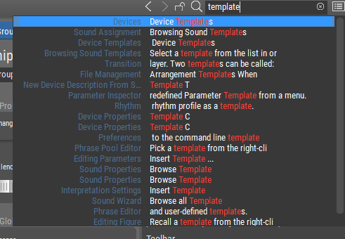
For me (and others?), the text in the column on the left has so little contrast with it's background that it is virtually unreadable.
The text on the right is perfectly clear. That should be possible for the text on the left as well. Thanks!

Sa., 10.01.2026 - 20:38 Permalink
Hi.
The contrast is definitely better on on the left side in Synfire version 3.0.6
for all unselected items. Thanks for that!
However, for the selected item, the blue bar and the new text color combine to create almost complete invisibility on the left.
There are 4 combinations of:
Left text, right text - unselected background, selected background
We could say "3 out of 4 ain't bad", or we could say "3 down, 1 to go". <g>