

Posted
Hi,
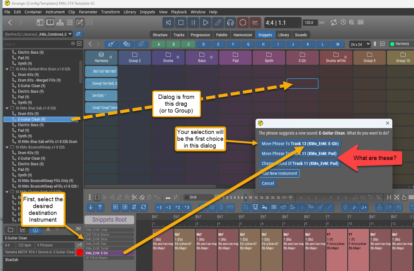
After study and experimentation, I have determined what I will normally need to do when I drag from a Library onto the Snippets grid. My instructions to myself are in Yellow.
I'm still short of understanding the entire dialog though.
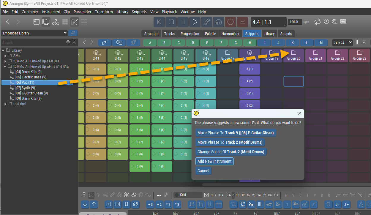
My question(s) have to do with the 2nd and 3rd items in the dialog (pointed to in red).
What are those items? Where do they come from?
Is there truly any reason for them to be there (they really confuse things, IMO)?
If so, what is the reason?
Thanks!
Fr., 19.12.2025 - 22:14 Permalink
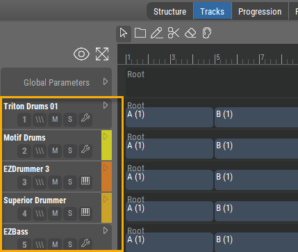
I note that the list of instruments shown above is not my full list of instruments (which is much longer) as shown in the Structure or Tracks view.
So, what defines this subset?
Don't we conceivably need to be able to pick any instrument out of our full list of instruments in this situation?
Fr., 19.12.2025 - 22:21 Permalink
In the dialog is the word "Track" being used as a synonym for "Instrument"?
It seems so.
If the answer is a simple "Yes", then I can live with that, but I do think it is confusing to the user's attempts to fully understand Synfire not to use the same terminology throughout.
OTOH, if there is a clearly expressible distinction between "Track" and "Instrument", then
a) what is it?
b) is this dialog respecting it? (by using the respective terms appropriately)
It's not clear to me why the dialog should be speaking of both Tracks (e.g. 'Move Phrase to Track ...') and Instruments (e.g. 'Add New Instrument'), unless they are actually two different things. If they are the same, best to just use one word only in the dialog, I think.
Fr., 19.12.2025 - 22:26 Permalink
I note that the list of instruments shown above is not my full list of instruments (which is much longer) as shown in the Structure or Tracks view.
So, what defines this subset?
Don't we conceivably need to be able to pick any instrument out of our full list of instruments in this situation?
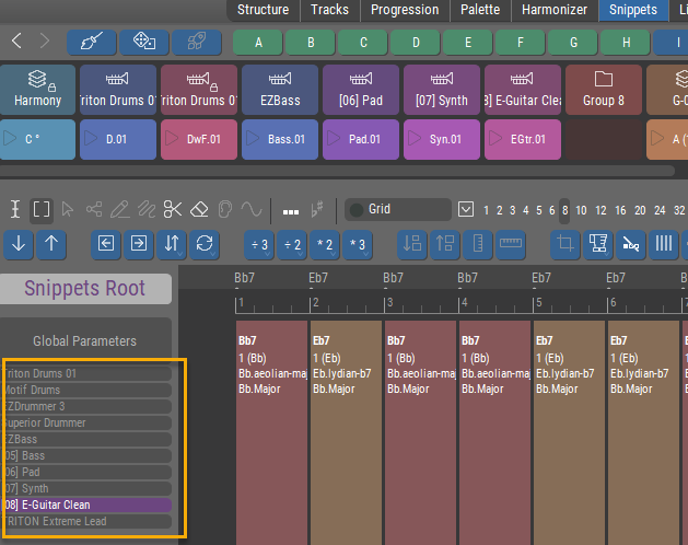
OK, I just sussed out this one.
It's a scrollable list! (via the mouse wheel) but no scroll bar
Very high potential here for user confusion (as I am the case in point!) IMO.
Please add a scroll bar here, if at all possible. Or, 2nd best, at least add some graphical element, like a double-arrowhead vertical line, to indicate that there may well be more here than the user is seeing at any given moment.
Fr., 19.12.2025 - 22:29 Permalink
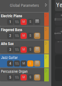
Now, if one does manage to scroll the list so that the top is visible, you get this:

Are these not Instruments? (rather than Global Parameters)
Will they ever be anything other than instruments? If so, what?
Is there a reason not to label this list 'Instruments'?
Fr., 19.12.2025 - 22:34 Permalink
Fresh from my review of Concepts(1),
https://users.cognitone.com/tutorial/concept-1-terms
you can see I'm crushin' on the idea of Instruments! <g>
I think it would really help for all presentations, labels, etc. throughout the program that are about Instruments to be highly consistent everywhere.
Thanks for reading! (and for allowing me to be your useful idiot!)

Sa., 20.12.2025 - 10:53 Permalink
Yes, labeling the buttons in this dialog more intuitively is a valid point. Let me explain them. Maybe you have better suggestions.
- Move Phrase To Track 13 (Selected Instrument): The phrase will be assigned to the currently selected instrument.
- Move Phrase To Track 11 (Instrument with similar sound): Another instrument with a similar sound as used in the library already exists. The phrase will be assigned to that instrument.
- Change Sound Of Track 11 (Instrument with similar sound): Same as above PLUS the sound of the library will be copied to the arrangement and assigned to the instrument.
- Add New Instrument: Create a new instrument with a copy of the sound used in the library and move the phrase there.
Track and Instrument are somewhat synonymous. A track is permanently tied to an instrument (1:1 relationship). When you rearrange tracks only their numbers change. It is called "Track" here to distinguish multiple instruments with the same name by their track number (they may use the same sound). It also reminds the user that these are the same instruments as on the Structure, Tracks pages.
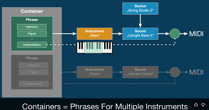
A snippet is a container that may include parameters for any number of instruments. Only if there is no doubt about the target of a dropped phrase, the dialog will be skipped.
It's a scrollable list! (via the mouse wheel)
Some indication that the instrument headers are scrollable would indeed be helpful, thanks.
Are these not Instruments? (rather than Global Parameters)
That's not a heading. It's also a track you can select. The bigger size may suggest otherwise. Would making it the same size help?
The questions you bring up are very helpful. Thank you for that. These small details can cause a lot of head scratching with users and they are easy fixes.
Sa., 20.12.2025 - 16:39 Permalink
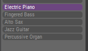
That's not a heading. It's also a track you can select. The bigger size may suggest otherwise. Would making it the same size help?
Ha! That was my confusion.
Yes, I think same size for individual list items and distinct separate headings, in some way, shape or form would help.
I don't think it is an immediately intuitive connection between this list at the lower-center-left of the screen, and the display it affects (which might not even be currently visible) in the right-hand column of the screen.
I realize that real-estate usage is a real challenge, and I do think it has been well solved! So, no major redesign, just potentially some extra clarity in labeling and distinctions.
Maybe something like the below, answering the questions:
a) what is this list?
b) are there different categories of things in the list? (yes, there are)
c) what are the available, active individual list items?
(More to follow later re: the rest of your comprehensive reply! Thanks.)
---
Right Sidebar Display Choice
General -
Global Parameters
Instruments -
all
of
the
instruments
Sa., 20.12.2025 - 23:06 Permalink
OK, digging into that dialog a bit ...
I think an accurate formulation for what we (and this dialog) are doing here would be:
"Assign Phrase to Instrument ..." or perhaps "Play Phrase with Instrument ..."
Why? Because an Instrument plays a Phrase (from Concepts(1)).
So I'd suggest keeping the terminology strictly consistent. The word "Track" (at all!) is of no help here, and can only create confusion, IMO.
- Move Phrase To Track 13 (Selected Instrument): The phrase will be assigned to the currently selected instrument.
And speaking of a track number (e.g. "Track 13") is even worse. None of Structure page, Tracks page, Snippets page display tracks/instruments with numbers. The user has absolutely no reference for the concept of track number, so I see no point in speaking of such in this dialog.
OTOH, the sentence you've written above: "The phrase will be assigned to the currently selected instrument" tells us exactly what pressing that button will do. That's what will happen and what the user wants/needs to know. Here's a possible replacement text for that first button (in the above case):
Assign Phrase to currently Selected Instrument (KMo_EvM: E-Gtr)
- Move Phrase To Track 11 (Instrument with similar sound): Another instrument with a similar sound as used in the library already exists. The phrase will be assigned to that instrument.
Great explanation, but nothing in the dialog provides it!
First I must ask, what constitutes a similar sound?
(That part could be explained off-dialog in the Help)
Here's a possible replacement text for that 2nd button:
Assign Phrase to existing similar Instrument (KMo_EvM: Pad)
- Change Sound Of Track 11 (Instrument with similar sound): Same as above PLUS the sound of the library will be copied to the arrangement and assigned to the instrument.
I'm not sure this is exactly right, because behind this button is a two-step operation which requires further choice by the user. That ideally would be explained up-front.
Possible replacement text could be:
Assign Phrase to, then choose replacement for, existing similar Instrument (KMo_EvM: Pad)
- Add New Instrument: Create a new instrument with a copy of the sound used in the library and move the phrase there.
Simple enough. To make slightly clearer, possible replacement text could be:
Assign Phrase to New Instrument (created using sound from Library)
But if there were one of these to just leave as-is, it would be this one, IMO.
"Add New Instrument" is so simple and to-the-point that the incompleteness of the explanation in the dialog could be left to the Help system.
Track and Instrument are somewhat synonymous. A track is permanently tied to an instrument (1:1 relationship). When you rearrange tracks only their numbers change. It is called "Track" here to distinguish multiple instruments with the same name by their track number (they may use the same sound). It also reminds the user that these are the same instruments as on the Structure, Tracks pages.
Good explanation. Thanks! I think I now see where/why the Track # idea crept in.
If you want to keep that there to specify the landing point in case of multiple instruments with the same name, perhaps just being silent about the word "Track" would be better than introducing it.
IOW, throughout the above (KMo_EvM: Pad) would become (11 KMo_EvM: Pad).
Then, if people ask "What is that number?" you (and/or the Help) can tell them: "It's the location in the Instrument list, because sometimes Instruments can have the same name."
--
Whew! All the above FWIW.
I'll just add a general suggestion not to worry too much about a trade-off between brevity and clarity.
Instead, prioritize:
clarity is essential (must have)
brevity is desirable (nice-to-have)
And if the dialog must grow in size to accommodate, that's OK. It's about to disappear anyway. <g>
Cheers!

Sa., 20.12.2025 - 23:38 Permalink
For me, your solution could be a further source of confusion, probably bigger than referring to track numbers. What if you have similar sounds on multiple 'tracks'? You might assume one track is the target and be happy to replace that sound or add to that track, without realising synfire has chosen a different track you didnt notice that also has a similar sound. You'd then struggle to work out what had happened, because a different track got changed to the one you assumed. It might take a while to find where the clip went or find that your whole snippet grid sounds completely different.
For me I assume, similar sound is a sound with a similar/same category as all instruments have to be assigned to a category in the device description/instrument setup.
Whilst track number may not be mentioned much, most people assume each instrument/row is a track, especially when first moving to synfire from a daw. In fact the earliest hurdle is learning about containers, inheritance, harmony and avoiding something "static" that looks like it was created in a daw with long figures. You also have the list of instruments in the other part of the screen, if that showed the 'track' number might that help?
Better wording or accessible documentation would lower the learning curve, but once you understand the different options, the current wording lets you pick the option that gives you the results you intended. Just mentioning a similar instrument actually has consequences if you and synfire don't pick the same 'track' with a similar instrument.
So., 21.12.2025 - 00:09 Permalink
What if you have similar sounds on multiple 'tracks'?
The Instrument name is now (and always suggested) to be displayed. So long as the Instruments have different names, you'll know what's being targeted, so I don't see a problem in that case.
You also have the list of instruments in the other part of the screen, if that showed the 'track' number might that help?
Yes, I think that if the dialog refers to Track Number at all, then all the displays of tracks anywhere in the program should list them with the # in front.
That's full disclosure, and solves your case, I think (?).
For me I assume, similar sound is a sound with a similar/same category as all instruments have to be assigned to a category in the device description/instrument setup.
It's an interesting subject. There could be many sounds present in, say, Category: Synth - but the dialog is not offering a choice between them. Neither the current situation nor my suggestion address that.
once you understand the different options, the current wording lets you pick the option that gives you the results you intended.
Only if you know that Track and Instrument are near-synonyms, and that the various track/instrument lists (which may not be fully displayed) actually have "hidden" numbers (which are not displayed anywhere).
I am in favor of full information as needed, so if you think that dispensing with "Track Number" in the dialog is a failure to provide full information then I have to say "Alright, more information!". (i.e. display the lists with numbers in front).
Given Instrument lists with #s in front of each Instrument name, I still think simply putting #s in front of each Instrument name in the dialog (as suggested near the end of my screed) is fine (because there is a 1-to-1 visual match).
So., 21.12.2025 - 13:03 Permalink
Tracks have clearly visible numbers. The number is important to distinguish instruments that use the same sound (unless you rename instruments manually - most users are too lazy to do that, including me).
Similarity must be with high confidence to make it appear as an option. A category match alone is not enough. Can't look into the code right now, but it's the same suggestion you get when using the sound wizard. IIRC, all instruments are ranked by a score and the top candidate is suggested.
You can always drop a phrase directly on the instrument you want (in the headers column). The dialog only appears when you drop on the grid, where the target is not clear.
Assign Phrase to currently Selected Instrument (KMo_EvM: E-Gtr)
Assign Phrase to existing similar Instrument (KMo_EvM: Pad)
...
Yes, the options could be more verbose to make them clear. Square brackets around track numbers might suffice, without using the term Track. Buttons should not have extremely long labels, though. This requires a different layout with a bullet list or something.

So., 21.12.2025 - 15:02 Permalink
You can always drop a phrase directly on the instrument you want (in the headers column). The dialog only appears when you drop on the grid, where the target is not clear.
When I drop on a so-far unused Snippets column header, I get the dialog.
So, you must have meant something else. Sorry, but I don't quite follow your meaning on this one.
Thanks for your other comments, which I do follow.
So., 21.12.2025 - 22:19 Permalink
I see no track numbers on any of Structure page, Tracks page
1, 2, 3, 4, 5 ... under the name ;-) There are none in the (left) headers column next to the phrase editor though. Not sure of they would be needed there. Space is tight.
When I drop on a so-far unused Snippets column header, I get the dialog.
Ah, ok. That's not the column of track headers I was talking about. That's snippet groups. The track/instrument headers are left of the phrase editor at the bottom where you select an instrument.
So., 21.12.2025 - 22:38 Permalink
1, 2, 3, 4, 5 ... under the name ;-)
Oh gosh, now at least I see where you mean, but
Looks like a button, is colored the same as all the other buttons, is butted against them just like it was one of them, seemingly meant to be clicked (but isn't) - IMO this is supremely confusing!
Looking at an example like this:
I see no lack of room directly in front of the names. I would, first-choice, put the numbers there (00, 01, etc. so you still get a nice, neat alignment of the left side of the names.
However, if you feel you must put the numbers on the 2nd line (why?), then please put them hard-left, not shaped like a button, in a color all their own. They are labels, but they look exactly like active elements - this is fixable!
Probably the most powerful reason not to put the number on a 2nd line is when there is no 2nd line:
If the numbers simply preceded the names ( e.g "00 Electric Piano", "01 Figured Bass", etc.) then they would never be un-visible, would clearly be labels, and could easily be present in all Instruments lists anywhere.
And again, the numbers to be a different color than the names.
Those are my suggestions, and I think they would result in clarity and the removal of a whole lot of existing potential for confusion. Thanks.