Posted
Hi,
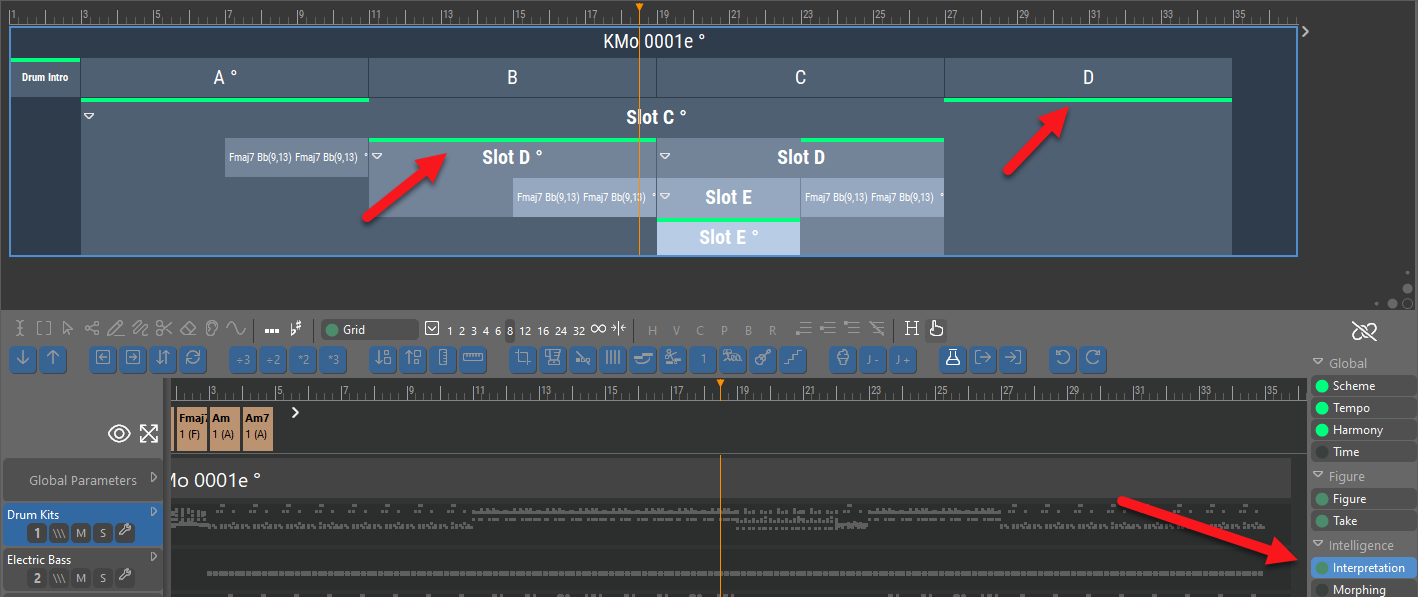
Is there a reason, or something being indicated, by the fact that governing Interpretation lines in the Structure display are bright green and easy to see:

whereas governing Harmony lines are darker and very hard to see:

If this brightness (and thickness?) difference is indicating something, what is it?
If the visibility level is not indicative, could we please have the governing Harmony lines be made as visible as the governing Interpretation lines?
Mi., 14.02.2024 - 09:18 Permalink
The dimmed color indicates the parameter is inherited rather than physically present for the selected instrument. If you select the Global Parameters "track", which owns the Harmony parameter, the lines will turn bright (Harmony is a global parameter).
It is debatable whether this strict interpretation is intuitive or not. Suggesting that Harmony is a parameter that could be set per instrument (when it is not) isn't helpful. On the other hand, global parameters affect all instruments alike, so why not show them as if they were physically present?
You might have stumbled upon something that is worth a reconsideration.

