Posted
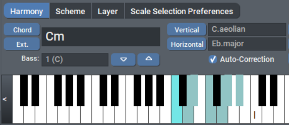
Right now, keys that represent a scale/chord are the same color as the white keys:

This is very confusing and greatly impedes orienting oneself visually on the virtual keyboard, because orientation is done via recognizing the two different groups of black keys.
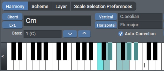
Please change the black keys color to something like this:

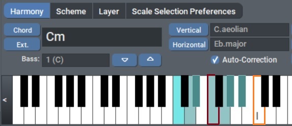
Moreover, I would personally love to have the tonic and the dominant of the key of the piece (the global key), highlighted as well, e.g. like this (if I'm in F Major):

or some Roman numeral inside the key, whichever.
Finally, it would be useful to display the bass note in red even when "All Octaves" is checked, maybe only on one single key, the default one. This will allow improvising an accompaniment, highlighting the note that you should emphasize.
These may seem like minor things, but that's if you let Synfire do all the work: however, if you actually want to play the music yourself with your keyboard, or if you simply want to better understand what's going on harmonically, these are very important IMHO.
So., 14.08.2022 - 16:36 Permalink
Good point
Do., 18.08.2022 - 13:12 Permalink
Do you think this could be done for the next version, or soon enough? Thanks.
Do., 18.08.2022 - 15:49 Permalink
FYI, the keyboard display has already been improved, at least for catalogs -- though the scale tonics are not explicitly highlighted.
Do., 18.08.2022 - 16:37 Permalink
The darker shade is a no brainer (next patch). The other suggestions need more thought.
Fr., 19.08.2022 - 17:45 Permalink
The darker shade is a no brainer (next patch).
Thanks.


