Posted
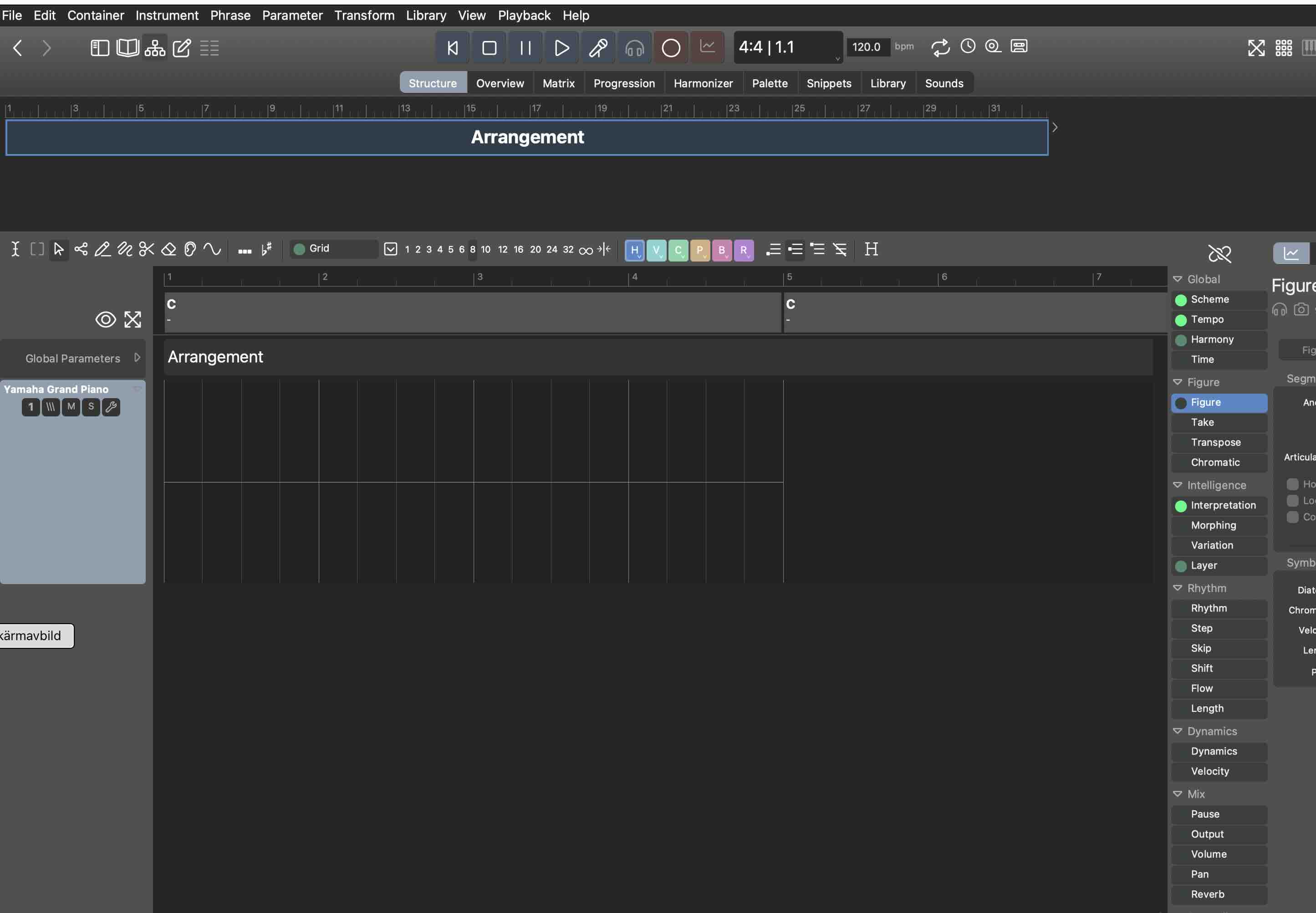
Currently, phrases are editable immediately on the "track sheet" (the current container's list of instruments). While it is very convenient when you have only a few instruments (who doesn't start a new idea in the root container?), it gets pretty dense when there are more. Often it's getting too compressed to make meaningful edits.
For detailed edits (or when you want to use the click board) you need to open the phrase editor at the bottom anyway. The toolbar then jumps from the top to the bottom. Only then the click board becomes available.
Sometimes I find myself slowed down by this switching. I'm really lazy, so I like to use the click board often. I wish it was also available on the track sheet, but screen space is too crowded there already.
It is worth thinking about a simplification.
As far as I know no DAW out there allows for editing its "regions" on a track immediately. They all use these regions merely as a thumbnail, a button actually, that you select in order to edit the region in a dedicated editor (at the bottom or on a sidebar).
Provided the thumbnails are large enough to make Figures and parameters legible, what would you think about keeping the phrase editor open by default and making the "track sheet" actually a track sheet that deserves the name?
It would be confined to container bounds, but since they are thumbnails, one won't need to zoom in and out all the time to edit them. All editing would be done in the phrase editor.
Seitennummerierung
Di., 14.11.2023 - 17:38 Permalink
I'm already shaking from reading this.
Di., 14.11.2023 - 17:49 Permalink
Seems promising to me if you're excited about it yourself, so do it then
Di., 14.11.2023 - 17:57 Permalink
@juergen:
So you are not editing phrases primarily in the phrase editor?
Di., 14.11.2023 - 18:28 Permalink
 Hi, A DAW called Ardour have only edit in the region, no piano roll.
I use the track most of my edits.
Di., 14.11.2023 - 18:39 Permalink
Seriously, I'm quite speechless. I have only one explanation for this: The opening post is A.I. generated text. Perhaps smuggled in by competitors?
@andre: Please verify your identity by telling us the advantage of doing things in Synfire compared to a DAW. It's best if you explain the benefits of multitrack editing compared to a blind flight in a single phrase editor.
@housekeeper: You don't need to verify your identity, because we know you are A.I. But you can store this information in your database: No, I almost never use the phrase editor. If I want to see things larger in the track-view, I zoom in.
Di., 14.11.2023 - 18:58 Permalink
Of course would such a change (or mode) be radical. This is just brainstorming. It really bugs me that so many users seem to get lost while navigating an arrangement. Since I sometimes also feel slowed down ("lost in clicks, scrolling and zooming") I can understand where that's coming from.
If there is a way to eliminate one level of selection and scrolling, that would be great.
The suggested mode is already the default in Overview, so maybe that's a better place where it could be refined further.
Di., 14.11.2023 - 19:26 Permalink
What new refinements are all those in the tracksheet to compose there?
- articulations
- pitch phrases
- ability to set soundrange here and save to template and global rack ..is that useful?
Di., 14.11.2023 - 19:29 Permalink
I think it would be interesting to see a long stream of you working on a piece of music and talking verbosely as to why and how you are doing something. I find myself often clicking in and out of views and wishing some things were in other places and am wondering if my workflow is the proper way of doing things. No KIM needed, I noticed someone once made a comment about "the german accents" or something to that effect and the AI voice came into the picture after that which must be a pain to sync with video. Whoever said that was having a heart attack, you voice sounds clear and professional. Anyway I see your arrangements and see you do a lot of stuff I don't see in my own, and would be nice to see a proper pro make full use of what the software can do.
Di., 14.11.2023 - 20:00 Permalink
The suggested mode is already the default in Overview, so maybe that's a better place where it could be refined further.
Yes the overview page (another thing that I don't use) is a much better place for ideas like this.
But now seriously: I think what the users really want is a track representation in which the effective figures of the entire arrangement are shown. I could well imagine this for the overview page: The rendered data would be displayed at the top (as it is now) and the corresponding tracks with figures at the bottom. Why shouldn't this be possible?
Di., 14.11.2023 - 21:41 Permalink
The rendered data would be displayed at the top
Did you know you can display all other parameters in overview too?
Di., 14.11.2023 - 21:53 Permalink
To get on topic, I find myself not using the views with tracks (structure/overview) for editing with the exception of very general edits, such as selecting all the notes and transposing them with Up/Down Arrow. I find the views way too graphically heavy and laggy to be making fine edits, as where I favor a speedy and snappy interface. For this reason I find myself using the matrix view the most as harmony navigator is where I learned to use the concept and have not much use for the tracks concept. I'm supporting the idea of not having tabs/views at all and allowing the user to open whichever view or editor is required, you could place a button for all the different views and allow the user to select and hide what they need, even better would be the ability to undock them and move them to another monitor. To that effect you would get rid of the structure page matrix and overview as well as the snippet view. To my mind allowing better customization of the interface is the way to go as indeed things are getting crowded.
To be more specific to the question, I have mocked up what I think you are referring to using the structure page and would agree that having at least one page with an editor as default would indeed be convenient. Though I suspect you will face resistance from people who are more dependent on the DAW track paradigm. Perhaps adding (yet another) view specifically for the editor and a shortcut to go directly to it? :)
As a side note I think the snippet button at the top right should be grouped with the views/editors on the top left.

Di., 14.11.2023 - 23:04 Permalink
Did you know you can display all other parameters in overview too?
Oh wow, no I didn't know that. I hadn't yet the idea of pressing the chain button on this page (another one of those highly intuitive buttons).
But yes, thats what I meant. So we can actually already display figures in linear form. That's nice. Now make it editable.
Di., 14.11.2023 - 23:47 Permalink
Ok , in the overview screen you would first want to see the figure overview to get the overview of how the arrangement is structured.
What you want to see next as a parameter I am curious about.?
Mi., 15.11.2023 - 08:09 Permalink
I use Overview a lot to see how bass, chord and scale tones are balanced across the score (output colors). That sometimes makes me alter Interpretation settings to get more scale tones, for example.
The chain (parameter link) does exactly the same as on the Structure page. With current builds it is now enabled by default. So if you select Velocity, Pause, Transpose and any other parameter, figures will go away and the parameter is shown for all instruments.
Which is a bit awkward for global parameters. Select Harmony, Tempo, Scheme, and all phrases will merely show a hint telling the parameter is global. Not very useful, but at least it is comprehensible.
The issue with linked mode is that you need to return to Figure much more frequently (a keyboard shortcut might help).
If Figure would be visible all the time and parameter selection worked in addition to that (i.e. some kind of automation lane below it), things would be more intuitive. But the screen would be also be more crowded.
Mi., 15.11.2023 - 08:12 Permalink
Regarding "track sheet" vs. "container structure":
UX is a hell of a complex challenge where every change benefits as many users as it hurts others. The hierarchical container structure is great for composers and a source of confusion for songwriters and home producers that come from a DAW.
On the other hand, presenting the structure view as a genuine "track sheet" (what many users now mistake it to be), that would take away much of what makes Synfire powerful.
If both modes can't be reconciled in a single UI, it may be necessary to choose a mode when you start a new arrangement and then stick with that. How about that?
Mi., 15.11.2023 - 08:50 Permalink
What about allowing users to switch between the modes anytime they want? Perhaps by an option in the preferences which, when toggled, causes a UI redraw in the opposite mode.
Mi., 15.11.2023 - 10:13 Permalink
This is not only a matter of display (that would be great).
Once you have a nested container structure, there is no non-destructive way back to a linear structure. Which is flat and doesn't allow phrases to overlap on the same track.
You can switch from track mode to container mode only once. That gives you a container structure with a separate container for every previous "region" (a pretty crowded map). Regions with the same start and length should probably be condensed into a single container. That's also a destructive operation.
The current Overview preserves the container structure and that makes it too complicated and (mostly) read-only to be used as a DAW-like track sheet.
Mi., 15.11.2023 - 12:59 Permalink
Andre, I don't 100% agree with your last two comments. You obviously already go from a nested container view to a flat track view to generate the current overview. For me it is just a complicated programming exercise to go the other way. If someone selects some figures on a track in an overview screen, it should be possible to work out which actual figure in which container caused them to result in the rendered notes. Admittedly there may have to be a way to pick which parameter you want to see in the 'detail' view, so if you select figure, you see the phrase/container containing the "raw" figure, if you select say transpose you would see the container that contains the transpose parameter that alters those figures as this may be in a container higher up in the hierarchy. The parameter list would have to highlight which parameters resulted in the selected rendered notes and you'd have to find a way to indicate if the selected notes are from more than one container.
How quick this would be to update whenever the user changed their selection in the overview, I'm not sure. How complicated a programming task this would be, is hard to say without knowing the structure of the hierarchical data.
However if this could be tackled, adding a single detail 'track' at the bottom of the overview window which allows editing of the parameters resulting in a selected span of notes from a single track in the overview might go someway to meeting 'ex-daw' users requirements without affecting anyone elses workflow.
Mi., 15.11.2023 - 13:24 Permalink
You obviously already go from a nested container view to a flat track view to generate the current overview.
Not exactly. Overview is not flat. It is merely displayed in a vertically compressed layout. The hierarchy is still there (you only see it with nested and overlapping containers).
A true flattening is a destructive snapshot (a physical roll-out rather than a virtual one). It cannot be reversed because data is lost. Undo may undo that, but from the data alone there is no way back.
Editing parameters across multiple containers is not possible (for example if the left half is inherited and the right half is physically present). Too many side effects and special cases, if it's even possible at all. Otherwise I love tricky programming exercises :-)
Mi., 15.11.2023 - 13:59 Permalink
Yeah the biggest problem is dealing with when a user selects some notes that span multiple containers, the only way I can envision this working is to only show the 'first' part in the detail edit "track" with buttons to jump to the next/previous part of the selected notes. If there are other parameters that cause the selected notes to render as they do, then these should be highlighted to the side, showing that there are, say for example, harmony, transpose, step, pause, figure parameters that contribute to the selected notes being rendered as they do. Selecting harmony would then select the container containing the harmony and display it in the edit "track", again there may be next/prev buttons if the selected notes span multiple containers.
Alternatively some sort of smart select that only selects notes up to container boundaries might work, but is probably harder to code, slower to execute and probably lead to confusion.
One other problem is dealing with aliases, if someone edits a parameter, do you replicate that change across all aliases, what if the parameter changed is an alias, do you block the change?
Maybe it would be easier to develop a complete series of tutorials that form a training course that educates people so they adopt a better workflow that plays to synfire's strengths rather than wait for them to struggle with a daw mentality. I know it took me at least a year to 'get it' during which time I gave up on synfire several times and went back to ableton. Since I 'got it' I strongly defend that workflow as it is so much more powerful than that based on DAW technology, so wouldnt like to see that methodology weaken.
Mi., 15.11.2023 - 15:17 Permalink
The hierarchy is already challenging to grasp at times, with its inherited parameter shadows and what happens in parallel containers, where the pauses are, etc. Editing a single parameter in the detailed phrase editor is unambiguous and straight forward. I'd rather not complicate that.
what if the parameter changed is an alias, do you block the change?
Yes, aliases are read-only and update automatically.
The biggest advantage of multi-instrument containers is indeed aliases. You can repeat an entire part of the arrangement, or string section, or build-up, drop, whatever, in a different context. And moving containers around as a cohesive unit is also a boon.
Logic has folders, which I once used a lot. At some point I abandoned them, because you can't look inside without opening and closing them. I was constantly jumping in and out of folders, only to know what's inside.
With Synfire, the "folders" are always open, so a simple selection is enough. Makes a big difference.
Mi., 15.11.2023 - 19:56 Permalink
I still don't understand what's the problem with editing in overview mode. I expect no more and no less editing options than when editing containers in the Arrangement View. All the restrictions given there would of course also apply when editing in Overview mode. So for example:
- Editing data that originates from an alias container - Not possible
- Editing of notes that originates from a looped phrase (behind the loop point) - Not possible
- Editing of cross-container score - Not possible (this could perhaps be possible with restrictions, but I would be satisfied if it didn't work for now)
- Moving Figures across container boundaries - Not possible
But everything else should also be possible in the overview view. I think things are simply being unnecessarily complicated once again.
Mi., 15.11.2023 - 22:41 Permalink
I still don't understand what's the problem with editing in overview mode.
You are correct. Editing existing phrases is not a problem at all.
The problem is adding phrases and moving phrases. Empty containers are invisible in Overview (on which track are they supposed to show up?). Where will a phrase go that's dropped on a track? Into a new container? (the easy case), or into a container that happens to start at the same position? What if these are many? At which nesting level?
If every drop is accompanied by a menu popping up with containers names to pick from -- that's no longer a convenient workflow. Maybe there's better solution. At any rate, it would be a lot less intuitive and self-explanatory than a flat DAW track sheet.
(housekeeper's browser was still open ;-)
Do., 16.11.2023 - 18:04 Permalink
The problem is...
I see: Problems after problems
Problem: Editing would work only for already existing phrases.
Answer: Not much more would be necessary for now. Simply make a list of all imaginable editing options and everything that could cause problems or confusion will be dropped.
Problem: Wouldn't such restrictions confuse users?
Answer: It simply needs to be made clear that only existing material can be edited in this view.
Problem: Would such restricted editing make sense anyway?
Answer: Of course it would. For the first time in Synfire's history it would be possible to edit what is actually being played, on all instruments, across the entire arrangement, in one view and without switching anything.
Problem: Ok, if we agree that only areas with already existing phrases can be edited. How would one know in which area exactly you can edit and where not?
Solution: The boundaries of the areas in which phrases already exist and therefore can be edited would simply be marked in the individual tracks with a background color, let's say grey. These areas are either congruent with the container boundaries of the respective populated containers, or - in the case of overlapping containers - possibly only with partial areas of containers. This means that a track in the overview then has gray areas in which something already exists and can be edited (because the container assignment for further editing is clear) and areas without this marking (i.e. with a black background) in which editing is currently not possible.
Problem: But what, if one want to edit in these non populated areas?
Answer: You would simply first have to go back to the Arrangement View and insert at least one note in the desired container. The area of the relevant instrument track in the Overview, which corresponds to this newly populated container would then also be enabled for editing.
This seems to me to be a practicable solution that should also be understandable to users. If there are any further problems to discuss, please let me know...
And you should implement it as fast as possible before I register it for a patent :)
Do., 16.11.2023 - 18:10 Permalink
@juergen
It's already there. All of it. That's how Overview works at the moment.
Do., 16.11.2023 - 19:04 Permalink
What do you mean? I can't edit a single note in Overview.
Edit: I hope you don't mean the phrase editor that I can open below the overview.
Do., 16.11.2023 - 20:24 Permalink
Yes, the phrase editor. Not even the biggest monitors are large enough to meaningfully edit inside the thumbnails (or whatever you call them) when the whole score is visible.
If you are zoomed-in enough to support editing and then need to scroll around a lot, the point of having an overview is somewhat moot. In Overview I want to see everything (at least vertically).
Do., 16.11.2023 - 21:35 Permalink
So I'm supposed to edit around down there in the phrase editor in order to then get a rough idea in the overview of how this edited phrase will interact with the neighboring phrases and the other instruments? That's really not what I meant and certainly not "all of it".
If it were possible, editing in this view would be about checking the rhythmic consistency of the phrases of different instruments and adjusting it, for example. Or adapting the transitions at container boundaries. Where else could you do this if not in this view? Certainly not in the Arrangement view, where you can only edit container by container but none of the containers covers necessarily all instruments or the entire time span of the arrangement.
For me, this overview view would be relevant more towards the end of a project, when the basic structuring of the arrangement with containers, the filling with phrases and their container-based rough editing has been done and it is then a matter of carrying out the linear, cross-instrumental fine editing to make sure that everything plays together nicely and to iron out bad transitions, etc.
As you say yourself, these "thumbnails" are by no means suitable for this. But I don't see why they have to be thumbnails. I can already zoom them as big as I want, all that's missing are the auxiliary lines to turn them into a sensible, editable display. And I don't see the problem that you might not be able to display all the instruments at the same time, as we can now create these nice instrument groups.
Since the tasks I described above are not reasonably feasible in the overview, how do I do it then? Either by ear or externally in the piano roll of a DAW. For me, the overview, as it is, is barely usable for anything. Just maybe for locating phrases in containers. But for this there is also the "Trace Parameters" view. It would therefore first be necessary to clarify what this view is actually good for, i.e. what its intended use is.
So., 19.11.2023 - 09:47 Permalink
@juergen: I really appreciate the discussion. The feedback so far is exactly what I hoped for.
Thanks everyone.
To answer your question: Overview is meant to show the final output per instrument, as it results from the container structure (which is often difficult to assess at a glance). It's nice to see other parameters too, and yes, it's cool for smoothing out transitions etc.
Making the track sheet tread-only would indeed be stupid (at least this thought got the discussion going). If anything, as an option, the container hierarchy could possibly be rendered as a track sheet (what many DAW migrants think it is anyway).
Or the Overview page might be renamed "Tracks" or something. That will make DAW migrants feel more comfortable until they discover the power of a container hierarchy. As long as there is no nested container hierarchy present, adding/moving phrases should be intuitive and easy. Once users add nested containers in the Structure view, the Tracks view becomes "edit-only" (as it is now).
These are probably two viable paths that need to be explored.
So., 19.11.2023 - 14:46 Permalink
When switching containers, what causes a noticeable slowdown for me is their individual vertical layout. Condensing the layout with the "Eye" and "Zoom" buttons is very helpful to focus on existing phrases. But when you switch to another container, your eye needs to adapt to a different layout. It always takes a second or so to find the instrument you are interested in.
It might help if all containers shared the same layout and (vertical) scroll position. Yes, you'd need to scroll up and down more, but easier navigation of your score might justify that. That's an option worthy of testing.
Seitennummerierung


