

Posted
Hello Andre and community,
as mentioned in the German forum, I wanted to draw my personal Idea of next Synfire 3. After many hours I spent, here the result …
Main aspects are:
- Increase usability of the GUI, especially with window-management and zoom.
- Make it easier to create songs by eliminating the complexity of multiple instruments in containers.
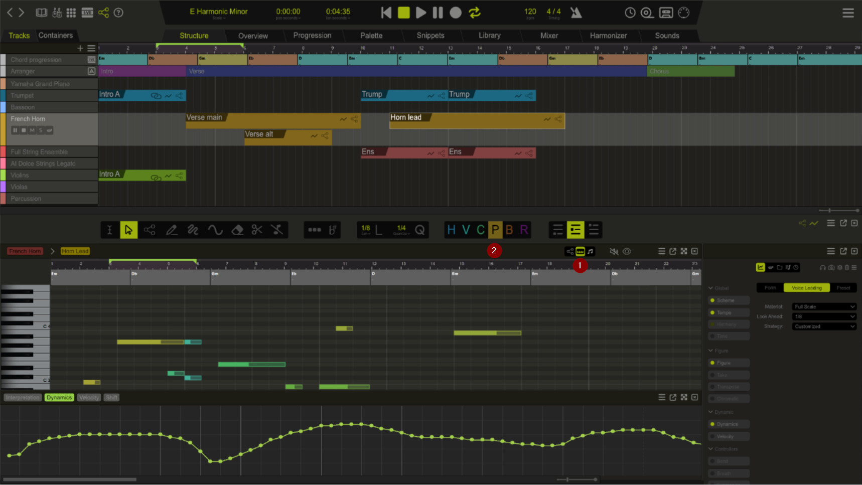
So I present you my idea with “Tracks” and “Containers”. The concept is designed in a way, both can be used and Synfire is downwards compatible to older versions. More later …
(The numbers and positions in the picture are wrong; it is about the design, so ignore them.)


Let me now describe some elements

Working with containers (classic way)
- 01 Navigation to open or show different panels like libraries, instrument etc. New here is:
- Open palette directly (new window), based on defined scale (see in the control section)
- Toggle the view of the second half of the screen with the details editor of the figure editor.
- 02 Define the scale (optional). If this is done, you can directly open a default palette (button on the left side). And maybe also future logic can indicate e.g. if notes are out of scale or something like that.
- 03 Total song length. Maybe with a dropdown to change from seconds to some different unit.
- 04 Switch on metronome (also for playback please!)
- 05 Universal menu to show a dropdown menu where you can go to global sound, but also to toggle view of different windows the page.
- 06 Switch from (classic) Containers view to Track view.
- 07 Symbols are indicating if a container holds definition for: harmony, figure or any other attributes.
- 08 New way to select the length of a not but now also the snap raster for quantization. The L or Q is a button to apply it to selected figure.
- 09 Some new and standardized window icons
- Show/hide figure editor
- Show/hide attributes curves-window (at the button of the page)
- Menu to have more options. Also with checkboxes inside to show/hide different windows.
- Also use that to show/hide more editor options, which are so far in “phrase-editor” – so customize your bar.
- Undock the whole window to work on a different monitor
- Close the window. (to show it again, go to the main menu on top-right and toggle the view for it.
- 10 Shows that you work in container “Horns” on the instrument “French Horn”.
- 11 Toggle view of the below editor section:
- Figure editor
- Piano roll (to preview but also to edit with absolute pitch)
- Notes view (Ok, that is for sure complex)
- 12
- Toggle to play notes on select
- With the “eye”, show in background of the current figure, also the figures of other instruments of this container.
- 13 Maximize button, to extend the figure editor to the border of the monitor left+right (and hide the instruments list and properties editor). After doing that, a “shrink” button must be there, to shrink it back.
- 14 List of instruments
- The one currently used in figure editor is brighter and shows the typical buttons. (I change the wrench to horn symbol)
- Brighter text+green bar on the right side, indicate there is a modification inside. Otherwise it was not used for this container.
- 15 Shows a list of parameters, which have been modified. If you want to add more, use the list from the properties window as usual. The highlighted (here green), is the current one you see.
Now a total new thing; The Track-View

Working with Tracks
I thought a lot about how to make Synfire easier and analyzed what are main issues of getting into it or where navigation can create frustration. So I think many people are used to DAWs. Especially the functionality a container can serve multiple instruments may drive one crazy sometimes.
The concept is design to support both ways and you can switch from Tracks to Container-View anytime.
- 01 Switch from Tracks to Containers-View
- 02 Chord progression. Sure in the background it uses a container.
- If you create a new chord where non was before, create a new “harmony” container in background or use the “Arrangement” container.
- If you edit an existing chord, determine, in which container it is defined, and change it there.
- 03 Arranger to define parts of the song. If you move a block, it shall move all the tracks in that range as well (Studio one does that quite good). So this is maybe not a container, but a total new list of objects with start-end information.
- 04 Plus button to add a new instrument
- 04 Menu to do more. Eg. Show/hide the arrangement, chord progression and maybe also “Marker” and “Lyrics” bar.
- 05 List of instruments
- 06 Here you see 2 containers feeding the same instrument. With the old rule, the below overrules the above.
- 07 You see “Intro A” twice, because it means there is 1 container with 2 instruments in use. If you move one, the second is also moved in parallel. The link symbol indicated that there is at least 1 in parallel linked.
- 08 The selected container you edit in the figure editor below.
- 09 Indicates you are working in the container “Horns” on the instrument “French Horn”.
Editor for fix pitch with piano roll
- 01 Piano roll view enabled
- Shows rendered container as final notes.
- Shall also be useable as editor for fix pitch entries
- 02 Switched to “Fix pitch” automatically
Some ideas for usability regarding shortcuts
- In Arrangement-Editor
- With focused container
- ALT+horizontal mouse -> clone container to new position
- With focused container
- In Arrangement-Editor (Track view)
- With focused container
- ALT+vertical mouse -> clone container to new position, but use the figure + parameters on other instrument.
- STRG+G -> merge containers to one.
- With focused container
- In any editor:
- STRG+Mousewheel -> zoom in/out
- In Figure editor
- Make Copy/Paste that it works (simply does not do what expected on Windows).
More improvements in my homble opinion
- Remove the double-click on container goes to “Overview” section. That is not what you think it should do.
- Any double-clicks should not trigger a zoom or something similar (e.g. phrase editor)
... What do you think?

Fr., 10.11.2023 - 20:10 Permalink
There is a lot of study in that, nicely done.
The feasibility of Synfire 3 should be investigated.
Is also thinking about using multiple instruments in 1 container whether that is clearly visible in the arrangement?
The advantage of this is that the container structure becomes more organized.
In the Overview tab you can see how the arrangement is structured which was newly introduced in Synfire 2 and it works well.
I thought there was a setting in Synfire to see what the content ( what instruments) of the container is?
note: in the overview screen : the container name is noted
Sa., 11.11.2023 - 07:37 Permalink
I'm going to take more time to look over your proposals with more scrutiny, but I like many of the suggestions I see so far. Like you, I use Studio One as my main DAW. So I appreciate how you've taken the look and some of the most popular features of Studio One and brought them into Synfire. It may be a simple think, but an editable piano roll view would be much appreciated. Of course, Synfire 3 seems like a long way off at this moment. Were not even at 2.5 yet. I'm curious to see what new parameters and factories Andre is working on for the near future. But this is a good vision of what could be work towards by the time we get to version 3.

Sa., 11.11.2023 - 10:15 Permalink
That design looks much more DAW-like (which is not a bad thing as most users are familiar with that). The overall look and colors however won't change that dramatically, but I spotted some nice design elements.
The idea of having separate parameter views for Figure and other parameters has been on my wish list for a long time. It somewhat resembles automation lanes. It comes with new challenges, but that's probably solvable.
Make it easier to create songs by eliminating the complexity of multiple instruments in containers.
I understand what many users want is a "DAW with Figures". I can imagine Synfire Sparks working like that. We need to be careful though, not to reduce a dynamic prototyping system to merely another DAW with a chord track.
Arranging individual phrases on tracks is intuitive at first. But it makes working with aliases and nested parts harder (e.g. parts with their own Harmony, Scheme, Tempo, phrases, and child containers that introduce temporary changes). Non-destructive prototyping would be all but gone.
For pop songs and dance tracks this is fine. For arrangements with structure, it is a return to the static times.
The concept is design to support both ways and you can switch from Tracks to Container-View anytime.
Overview is supposed to eventually become a "Tracks" view. It can be further improved and maybe re-labeled. Adding and moving phrases is not yet possible (and a challenge when there's already a container structure in place). It is likely that once there are containers with multiple instruments, the tracks mode will become read-only as it is now.
It's a challenge to reconcile the two modes within a single program.

Sa., 11.11.2023 - 11:33 Permalink
What can be added is that it is already absolutely possible to operate Synfire with a track based workflow approach. Nobody forces you to store multi-instrument phrases in a single container. You are free to assign only one instrument to each container and arrange the containers in a "track-like" way. Then add a nice chord track container on top and the DAW view is complete. This is what it might look like:

Sa., 11.11.2023 - 12:37 Permalink
What can be added is that it is already absolutely possible to operate Synfire with a track based workflow approach. Nobody forces you to store multi-instrument phrases in a single container. You are free to assign only one instrument to each container and arrange the containers in a "track-like" way. Then add a nice chord track container on top and the DAW view is complete. This is what it might look like:
I know. I use it like that. But I stumble quite often into the wrong instrument. So I do not want to remove that feature, but make the clearer on which instrument your are.
So in my drawing, it shows only ONE instrument's figure, but with the "eye" symbol, you can display the others in background. Seeing them all at once and necessity to scroll in a small window, is IMHO not good for editing. But yes, I wanted also to eliminate the "advanced editor" by given the user a way to simply show/hide sets from the toolbar - there is enough space and may even break to next line if required. Better to have a way to enlarge the window (13) or even work on a 2. monitor.
The track view does also alow to use multiple instruments per container, but by default it creates a new container per instrument. For sure it might be easy later to "merge" containers from there to one container if prefered. But however, if you prefer using classic container view, just use it from start.
Sa., 11.11.2023 - 12:51 Permalink
We need to be careful though, not to reduce a dynamic prototyping system to merely another DAW with a chord track. .
But it makes working with aliases and nested parts harder (e.g. parts with their own Harmony, Scheme, Tempo, phrases, and child containers that introduce temporary changes). Non-destructive prototyping would be all but gone...
It is likely that once there are containers with multiple instruments, the tracks mode will become read-only as it is now.
Yes, that is the biggest challenge. So the idea with having those "Substracks" (no 06), was the idea to show there are 2 containers with a prio.
So with the harmony/chord-progression;
Sure I understand what you mean. My thoughts here are like this:
- If you create new one, in the track view, send them to a specific container (e.g. Arrangement).
- If you edit a part of it, determine, which container you see and alter it there.
But I understand the point that track view can not do all the things a container view supports. But if someone wants to have it more advanced, he always can switch the view. In track view, the chords are just flattened, as you do now also with the resulting read view. But as I said, write can be also done, if it knows where to write it to - and moving things later from one container to another is always a way.
However it might also be a possible way to use for chord-progression bar a track view, where multiple containers can be displayed, like it is used for the intruments.
So, track-view has limitations but also advantages. The toggle between gives full capabilities. IMHO my recommendation would be also to have a look into Studio One and get inspired how it handles different things. Not all is perfect there, but it is indeed a modern DAW which learned from others. So learning from it, is fair enough ;-)
Sa., 11.11.2023 - 12:53 Permalink
To know if multiple instruments are assigned to a container, Synfire could also note this in the container anyway.
How a container will automatically record this which instruments are in a container?
Little space also in a container to write anything.
Manually you could set the track numbers or just set an indication that it is a multi instrument container
- Multi
As soon as you start using multiple instruments in a container mark the container as "multi".
Would be even nicer (instead of text) if there is a visual sign on the container so you can immediately see in the container structure that is a multi -instrument container
Sa., 11.11.2023 - 13:00 Permalink
To know if multiple instruments are assigned to a container, Synfire could also note this in the container anyway.
Maybe a small number before this icon can indicate if there are more than 1 instrument used (for figure or other parameters):
![]()
And this indicates also the usage of multiple instruments or parameters:

In general I wonder how many users work like that and use multiple instruments per container?
Sa., 11.11.2023 - 13:09 Permalink
Fortunately, Synfire 2 introduced the overview screen
In Synfire 1 it was impossible to derive an idea from the container structure, how the arrangement was built.
But fortunately that has all changed and if a multi instrument container can now easily be recognized in the container structure, the overview screen can also be of service.
For example, if in an orchestral arrangement you have a container with brass written on it, then you just assume that there are multiple brass instruments in the container, but that doesn't have to be the case.
So a multi-instrument icon on the container would provide clarity
Sa., 11.11.2023 - 13:16 Permalink
I wonder how many users work like that and use multiple instruments per container?
Almost everyone, I would guess. The song templates and tutorials all point to that workflow. Repeating parts (aliases) and resizing them is super easy. No need to move a lot of individual "Regions" around manually. And nothing to worry about if containers overlap or conflict with each other - Synfire sorts that out automatically.
Sa., 11.11.2023 - 13:33 Permalink
it is already absolutely possible to operate Synfire with a track based workflow approach
When you first brought this up it was eye opening to me. I never thought of building a structure this way. Clever solution. But your example also illustrates where the approach has limits. What if you want to insert a part in the middle? Or shorten a previous section? Or repeat a section later on?
There is no way to group these child containers across "tracks" any more.
This layout is probably best for short and linear arrangements with only a single part, like a 30 sec. ad clip, a jingle or an audio logo. Or an ambient atmosphere.
Sa., 11.11.2023 - 13:34 Permalink
For me, the current container concept is a core element of Synfire. It is essential that a container can contain data for a single instrument, for a group of instruments or for all instruments, or only parameters or combinations of all kinds. This is - together with the "data inheritance" from top to bottom - the crucial point.
This concept should not be pushed into the background. The sooner a new user comes into contact with this concept and becomes familiar with it (and gets the tracks out of their head), the better. In my opinion, it should therefore already be included in Sparks in any case.
Sa., 11.11.2023 - 13:40 Permalink
I don't do this but grouping them into a container to keep them in a bundle
That's basically what a container already does for you: Group multiple phrases.
I think the confusion many users seem to experience is because the structure view is thought of as a track sheet. In fact it is more like a map for navigating the arrangement.

Sa., 11.11.2023 - 13:47 Permalink
Something like this would probably ease the learning curve for people moving from a DAW to synfire, which would be great from a support point of view. However I'd hate to loose the current workflow and fundamental design of synfire, especially after taking all this time to learn it's different but powerful workflow. Additionally Synfire would make a very expensive daw, with limited daw features, in a saturated market. I bet most of us already have a daw of choice, where we perform the final mixdown, add additional 'mastering' effects and maybe tweak the odd phrase or two before producing the wav file to prepare for distribution (or whatever).
One other problem with a big change like this, is backwards compatibility, I'd hate to loose the ability to load up music created on previous versions or have them rendered in a different way.
Maybe the answer is to adopt this style/workflow for the cut down versions of synfire. At a lower price point, the support costs can quickly eat into the profit, so reducing those by adopting a more daw like interface might make sense.
Sa., 11.11.2023 - 13:53 Permalink
The discussion somehow reminds me of text editors and word processors.
Most users (like 80%) don't use structured formatting. They just type ahead and insert blank lines for spacing. If they need a heading they make it bold, increase font size and insert an empty line after (and decrease font size again). This is absolutely intuitive and works ok for short documents.
Once you have a lot of text on multiple pages, and maybe with images and tables in between, things start getting awkward when you delete or insert additional text.
A text editor can serve both workflows without sacrificing anything. I wish this was also possible with Synfire. Start with intuitive brute force and move to structured arrangements later (if you need it). No idea yet how this could be achieved.
Sa., 11.11.2023 - 14:12 Permalink
The whole point is: the current view is often confusing. There is nothing wrong with containers. It is more a question of usability and not being confused where I am.
I guess improving this aspect e.g. like I tried with first picture, is an important thing. Currently I have to scroll inside a small window to the right instrument and see there a lot I don't want to see. Even if I work with multiple instruments per container, it should be clear and straight forward what instruments are inside the container in use. The rest I don't want to see.
Currently I work on a project with ca. 15 instruments and it is not very easy to address them.
Sa., 11.11.2023 - 15:26 Permalink
Currently I have to scroll inside a small window to the right instrument and see there a lot I don't want to see.
Have you tried the "Eye" button? Unused instruments take up only a tiny space. Just large enough to make them visible again when you need them.
Maybe that can be improved further by completely hiding them behind a drop-down menu or something?
For me, the "Eye" and the "Zoom" button next to it are the most frequently clicked buttons. They are very convenient to clean up the view and avoid scrolling.
Sa., 11.11.2023 - 16:05 Permalink
Thanks Andre, for the Eye thing - good hint.
Just to show, what I see (ok even 19 instruments):

Sure I understand now, that I can also use then the Phrase editor. Its just, those different windows was not intuitive for me. That is why in my design, the phrase editor is kind of standard and other instruments might be selected on the left side anytime. For sure, just a different philosophy how to show multiple instruments per container. Maybe another very similar apporach might be a filter button or another mode for eye button to show only selected instrument - but IMHO seeing the list of instruments on the left side and select anytime another is also good.
For example:

With such a design, provide the eye/filter-button to "show all on right side" vs "show only selected" on right side. What would mean to clean up right side from any unused things.
At the moment, e.g. also confusing is, if I am in phrase editor and select a different container, it shows me the same instrument there - what is somehow not my expectation if that container is even not using that instrument.
So, it is all about a different way to do the same thing. And I just say, that those things I had trouble from begining until today. Maybe it is different for other users.
Sa., 11.11.2023 - 16:29 Permalink
Currently I work on a project with ca. 15 instruments and it is not very easy to address them.
I agree, that working with a large number of instruments can be a bit of a pain. But the problem is not the container concept, but the windows concept.
I was never fond of this "one-window-for-everything" concept with tabs and buttons to switch the views, that was introduced sometime during Synfire 1. And it has gotten worse and worse over the years (as the number of views and features has increased). I think we wouldn't be having this discussion at all if it were possible to set up three monitors, for example, so that the container view is on one monitor, the instrument list on the second and the output view and perhaps the phrase editor on the third. Instead, we constantly have to switch tabs and then additionally we need to press some view buttons with cryptic icons with eyes, arrows, grids and whatnot, that I still have to think for a second about what they mean every time.
Yes, I admit that I'm not a big fan of the user interface either. But instead of restricting the flexibility even further (which would in any case hinder the workflow of some users), I am in favor of making it more flexible again so that everyone can decide for themselves where and how each of the windows are displayed. And by the way: I would like to have a transport panel as separate window.
Sa., 11.11.2023 - 16:35 Permalink
I appreciate the discussion. It is important to reflect on this to improve the user experience and nothing is better than feedback from informed users. But as you noted, every user has a different perspective.
At the moment, e.g. also confusing is, if I am in phrase editor and select a different container, it shows me the same instrument there - what is somehow not my expectation if that container is even not using that instrument.
All navigation boils down to Container => Instrument => Parameter. While it would be possible to have independent such selection states in different views (or per container), whenever possible this is a global selection state. So yes, if you switch to another container, you'll see the same instrument and parameter even if it's empty.
A global selection state is also required for drag & drop. If you drop a phrase on a container (e.g. from a library), you always know it will go the the currently selected instrument.
IMHO seeing the list of instruments on the left side and select anytime another is also good.
I like the idea of having track headers left of the big phrase editor. It could help avoid the confusion you just described, as it clearly indicates where you currently are and selecting a different instrument doesn't require a pop-up menu.
Sa., 11.11.2023 - 16:45 Permalink
I was never fond of this "one-window-for-everything" concept with tabs and buttons to switch the views
There is no way around this all-in-one layout nowadays. Three monitors and views in separate open windows is a setup I also like very much, but we are a minority inside what is already a niche (I do indeed have three monitors, too). The majority of users is running Synfire on a Laptop.
Single-window layout also makes it easier with multiple arrangements open at the same time. Imagine the confusion if all of them had multiple windows.
Sa., 11.11.2023 - 17:57 Permalink
There is no way around this all-in-one layout nowadays. Three monitors and views in separate open windows is a setup I also like very much, but we are a minority inside what is already a niche (I do indeed have three monitors, too). The majority of users is running Synfire on a Laptop.
Thats why an "undocking" would be nice (e.g. Studio One does this quite good). Just bought a 4th monitor as my tracks are quite large ;-)
Just an idea: Maybe you may consider adding a "help developer by gather some usage statstics" feature? I mean, I would like to give some meta data of e.g.
- OS
- Monitors
- size
- What I clicked before altering figures
- How many instruments per container
- .. and maybe then a "I am lost" button for feedback, that you can record if somehow is lost.
But overall, maybe you have somehow the chance to give Synfire to some total new candidates for testing with some goals to see how they navigate and note down what their feedback is.
Sa., 11.11.2023 - 18:03 Permalink
Three monitors and views in separate open windows is a setup I also like very much, but we are a minority inside what is already a niche (I do indeed have three monitors, too). The majority of users is running Synfire on a Laptop.
I didn't mean that three monitors should be the minimum requirement for using Synfire :) Of course, I also want still to be able to use it on a laptop. I was only thinking about adding flexibility.
When I look at Cubase, for example: There is also the concept that the screen can be split horizontally and the tracks view can be displayed at the top and the piano roll view for example at the bottom, But I can still open each window separately and place it wherever I want. That's what I mean. Additional flexibility.
Sa., 11.11.2023 - 19:03 Permalink
As newcomer to Synfire and one who has invested so much time into learning the software coming from 2 DAW's since 2003, I am really leaning towards what Jurgen is saying.
I dont think the containers is the true issue, for me its the layout. Having said that, that is one thing many DAW's are good at implementing. They have many mixing and editing features and they have to present it to the user in an intuitive way.
One Idea is to just seperate screen layouts for Phrase editing and Containers. Everything else has its own very detailed screen, the Matrix, Library, Snippets etc.... If we can get an entire redesigned layout for Phrase editing and Container editing that would definitely keep me from scrolling around so much. Im not sure how this would look but we'd be able to put alot more information about our current tasks in the layout in an intuitive way. Phrase editing is one of the most powerful things about synfire and should have its completely own separate Tab.
This shouldn't be to hard to implement and then we could have the ability to have each Tab or layout open on different monitors. That would supercharge the workflow without changing any features.
