Posted
Andre
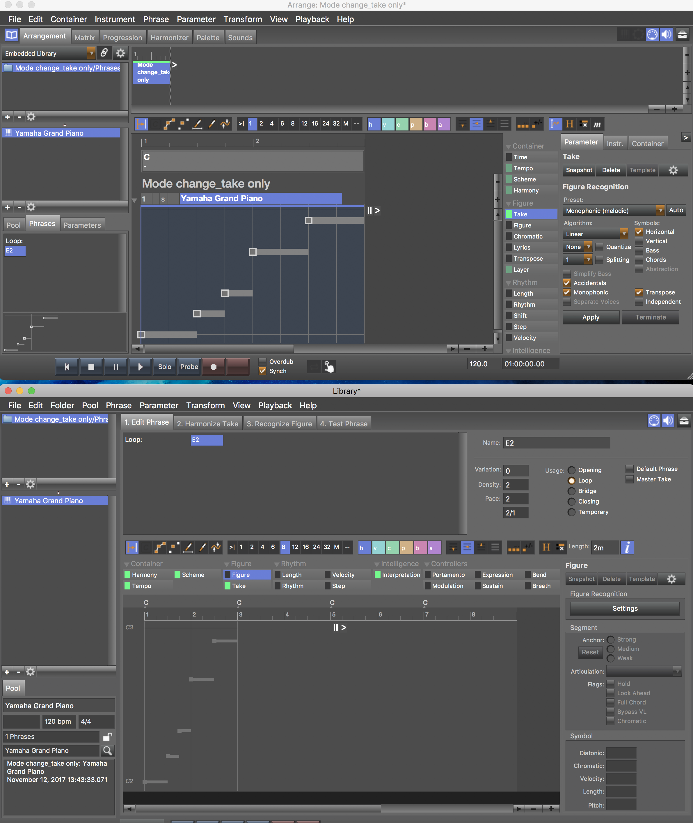
I noticed that dragging Figure on Harmony in the Arranger window, you get the very same result you would get into the Harmonizer tab after setting Transition on Generic.
In other word you have a partially duplicate function but in two different environments.
IMO the Harmonizer tab could be eliminated and replaced by a dialog box that opens when the user drags the Figure green box on the Harmony green box. In this manner you can harmonize a melody in the Arranger, without having to jump from here to there.
I think the user should be able to do everything in the same window whenever possible. A DAW-like UI would be very appreciated.
Fr., 10.11.2017 - 02:23 Permalink
For the same reason I think you could get rid of the Progression tab. Now you can manipulate the chord sequence in not less than three different views: Arranger, Palette, Progression. I guess that the work environment of Synfire can be reduced to two tabs only: Arranger and Palette. The editing options can be set via dialog boxes.
Fr., 10.11.2017 - 02:28 Permalink
Dialog boxes or context menus. For example I would consider the opportunity of selecting the segment type (blue, turquoise etc) via context menu rather than toolbar buttons.
Fr., 10.11.2017 - 18:37 Permalink
The harmonizer has been a popup-style window in earlier versions of Synfire, which was pretty confusing to some. The tabs make sense in that their contents switch with your container selection (each container can have its own harmony, for example).
The progression can be edited from multiple places, but it's still the same progresison. On the progression tab, you get the full set of controls that other places don't have enough room for. Also, it's important to view a progression broken down by rhythmic scheme (rows and columns).
I agree some of the multiple options could be joined somewhere, but doing away with the tabs may be too limiting.
Most users don't use drag & drop that much. Although it is very powerful, hiding all features behind some drag & drop magic would be very elegant, but even more difficult to explore for new users.
Fr., 10.11.2017 - 18:59 Permalink
he harmonizer has been a popup-style window in earlier versions of Synfire, which was pretty confusing to some.
In this case I would consider a third way: keep the Harmonizer tab but add a dialog, eventually with a checkbox "don't show this dialog next time", when dragging any parameter elsewhere. I was caught by surprise when I dragged the parameter Figure on the Harmony parameter and chords suddenly appeared in the top ruler. I could finally understand this behavior only making an empirical comparison with a similar operation in the Harmonizer tab: unless I have missed something, the user manual does not contemplate this behavior.
The app Finale, to say one, uses lots of dialog boxes which can be annoying but also give the user a very accurate control on any aspect of the score. Synfire is a complex tool, and IMO there should not be operations with unexplicated or unpredictable results, at least as far as possible.
Fr., 10.11.2017 - 19:28 Permalink
On the contrary I found the drag and drop capability very practical and up to date: think of Ableton Live, to say one, where you drag almost everything and work in just two complementary eviroments. The Synfire Palettes and the atomistic separation in horizontal and vertical elements are powerful tools, there is no need nor scope to oversimplify them, reducing your flagship to a rubber dinghy... ;-)
So., 12.11.2017 - 14:11 Permalink
Another example (there are many).
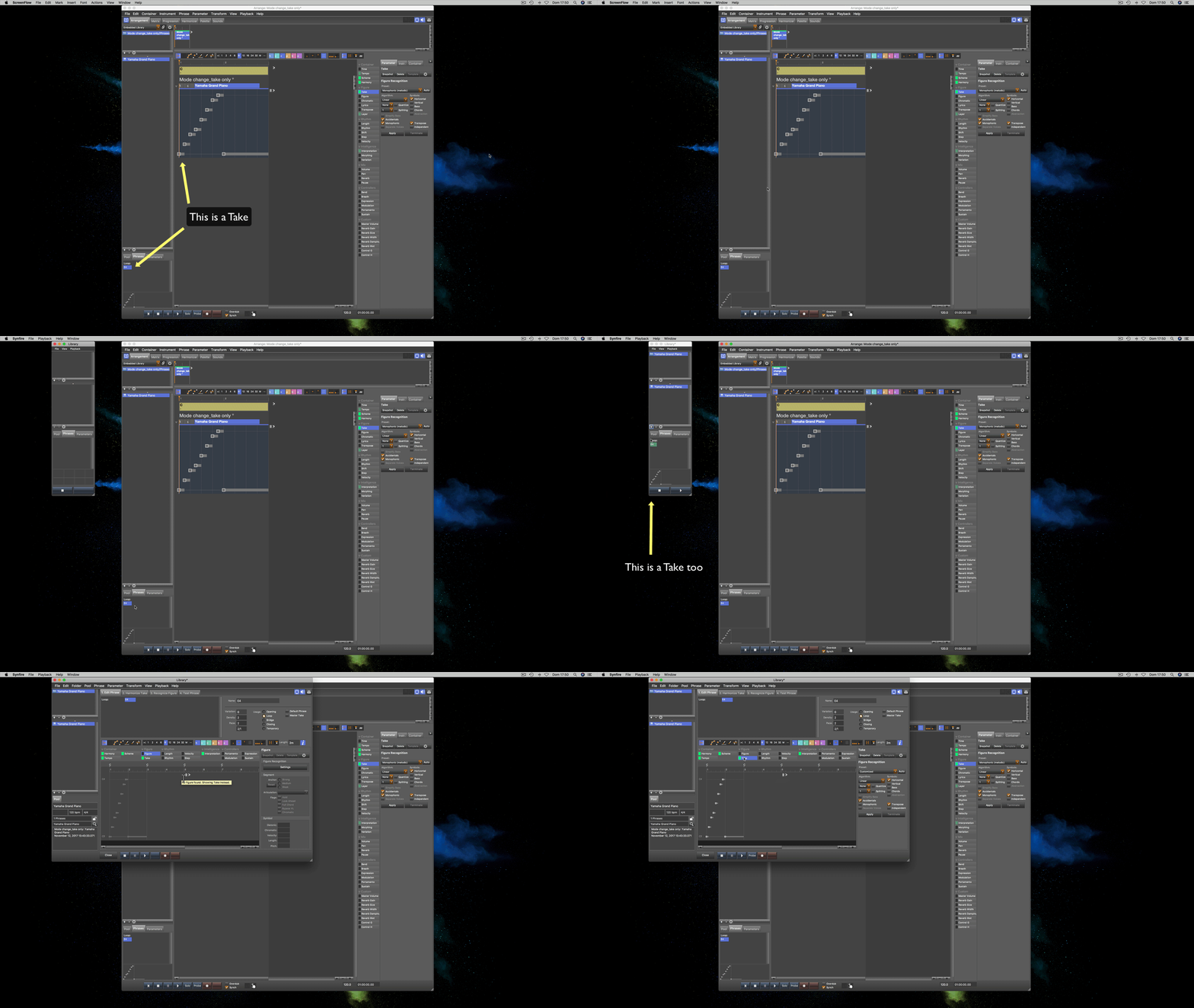
If I have a new Take and double-click on it into the Arranger pool. nothing happens apart from hearing the take playing. But if I export the take into a new Library and double-click on it, I get the Harmonizer procedure window.

IMO this is confusing, Andre. I would like to double click on any clip in any pool and get always the same window (or, at least, if I double click on a take into the Arrange pool, I'd expect a Take editor popping up).
Synfire per se isn't too complex. On the contrary, to me, the workflow is a bit messed up (let me be frank: I just try to help improve the ergonomics of the software).
All the best,
Roberto
So., 12.11.2017 - 14:06 Permalink
In my opinion and generally speaking, the most obvious flaws of Synfire are the few inconsistencies in the workflow: the same operation produces a different effect depending on the window in which it operates. If you will uniform the behavior of the program in all the different workplaces, Andre, it will become perfect ;-)
So., 12.11.2017 - 16:52 Permalink
I agree there is room for improvement and streamlining of the UI is already in progress.
However, a double-click as such does have a different meaning depending on context. With the embedded library, it means "use phrase" or "insert phrase into arrangment", while with a standalone library editor, it means "edit". A bare take is of no use (it is an incomplete phrase). That's why nothing happens on a double-click. If you really want to use the Take as an isolated parameter, you would grab it from the Parameter tab, or drag it with the mouse.
A library can not be edited in the arange window. The embedded library view is merely a sort of clipboard for phrases and parameters. This is indeed not consistent.
So., 12.11.2017 - 17:06 Permalink
Another detail:
Figure can not serve as input to the harmonizer, as it has no pitch information. If you nevertheless drop a Figure on the Harmony indicator, it needs to be converted to pitch behind the scenes (i.e. compile a MIDI sequence). That conversion is totally opaque and a complete mistery to the user (even I don't remember what it actually does, without looking into the code).
On the other hand, dropping Figure on Velocity, for example, is straight forward and makes sense: It extracts the velocities contained in the Figure.
Instead of attempting some cool type conversion magic, Synfire should be blunt and show a message that no meaningful conversion is available (or just disable the action). THIS is where Synfire is too complicated: Too much hidden magic.
The mere existence of some 20 or so data types however makes some complexity inevitable: Potentially 400 ways of converting one thing into another.
So., 12.11.2017 - 18:02 Permalink
A bare take is of no use (it is an incomplete phrase). That's why nothing happens on a double-click.
I'm afraid I explained badly. Take a look at the following animated gif. In both cases the Take is only a series of data, or MIDI absolute pitches, but a user remains disoriented because in one Library behaves in one way, and in the other in a different way. That is, in a library it serves, while into the other is useless. I would take care of this (apparent?) inconsistency.

All the best,
Roberto

