Posted
The changes posted in this thread are currently in the pipeline. I thought it makes sense to share them in advance, so everyone can be prepared or give early feedback.
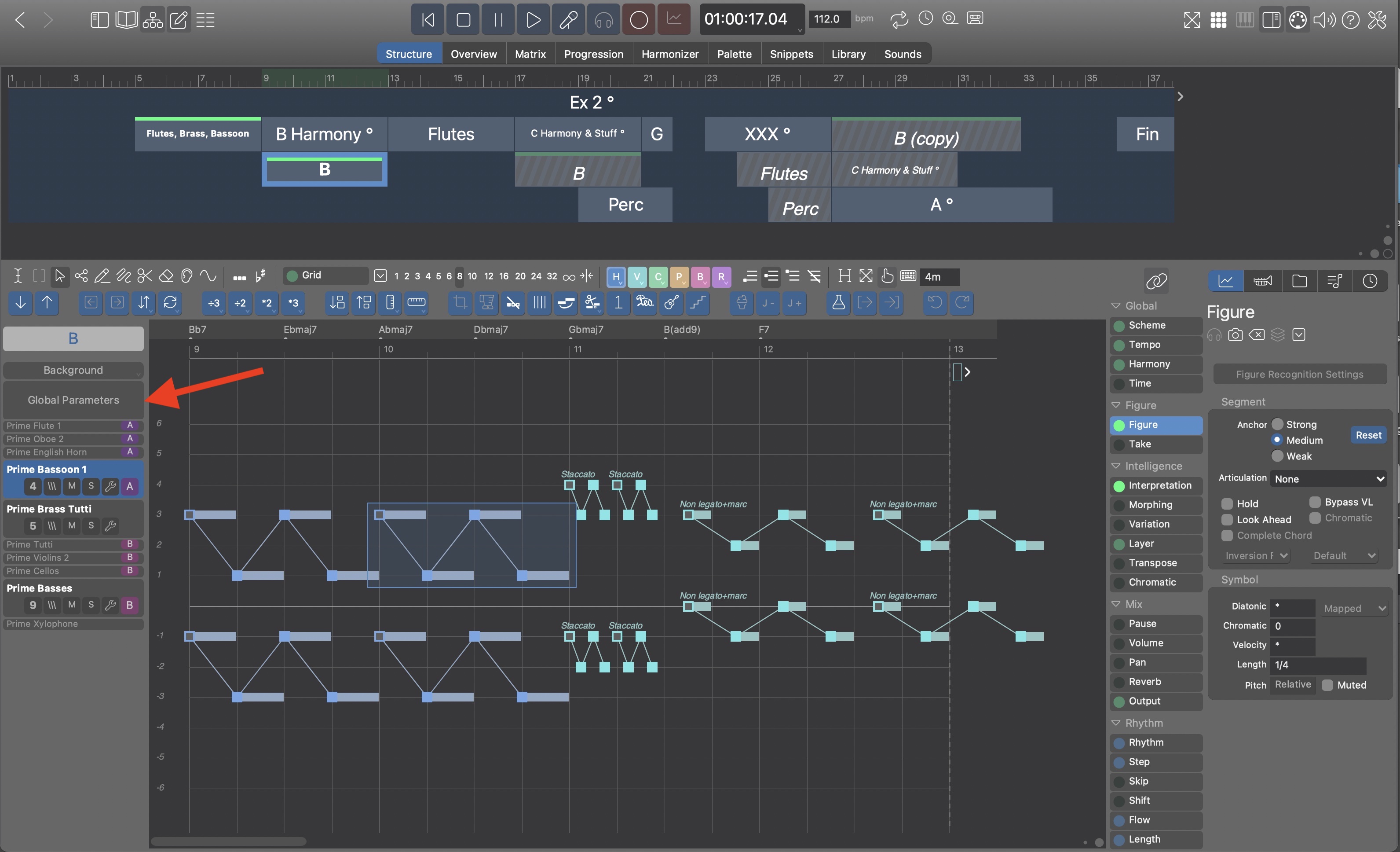
When the phrase editor is open now, there is no way to select a different instrument without going back to the full instrument sheet. This will be changed. The instrument headers will also be visible when the big editor is open. This simplifies navigation a lot. I already found myself operating in "full detail mode" for long stretches of time, even across multiple containers. Much more convenient.

As always, double-click on an instrument name or inside the parameter view goes back and forth between the full editor and the multi-tracks sheet.
Wed, 2023-12-20 - 17:25 Permalink
Currently there are multiple inspectors for Harmony with different layouts (the one at the bottom of the Progression page uses a horizontal layout, while the inspectors use a vertical layout). They also show different controls for editing. This is confusing.
The inspector will be unified such that all settings are available everywhere Harmony is editable. It will look and behave the same on all pages of the arrange app and it will be always on the sidebar, roughly in the same place.
It will no longer be necessary to switch to the Progression page only to make certain settings. Muscle memory and eye focus will be more intuitive.

