Posted
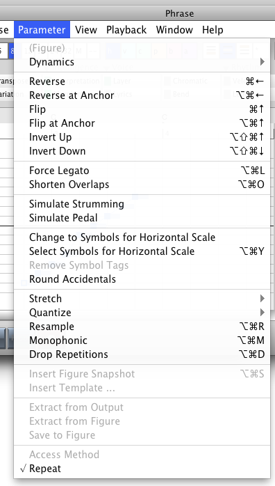
The "Parameter" and "Vector" menus always confused me, that is, I confused them. For quite a while now, I am thinking about eliminating the distinction and joining them under a single "Parameter" menu.
In theory their distinction is clear:
- Parameter = affects a parameter as a whole, refers to its role in a phrase.
- Vector = affects the data set for the parameter, the stuff thats "inside" a parameter.
However, that's theory. In practice, more often than not, I find myself intuitively grabbing the "Parameter" menu where I actually wanted to edit vector data. Also the term "Vector" is a bit artificial and technical, not really helpful.
Many of you probably experience the same obstacle and I ask myself if there are any arguments that would justify to keep it as it is now. Joining the menus will make the menu longer, of course, especially for the Figure parameter.
Question: Should I keep it as is, or join them into one "Parameter" menu?
Di., 21.02.2012 - 11:25 Permalink
Not sure. The menu will become very long.
Di., 21.02.2012 - 14:34 Permalink
From practical use you must see this for a new users of SFP.. it must be as simple as possible ofcourse
Do you think that your idea for one parameter is working for a new user ?..what is the new workflow than?
Becomes it more userfriendly? ... you are the only person who can try out this out with a new GUI
As user you must understand what a parameter is and a vector
A not mathematical person should say it is a variable
But this must be seen in SFP ..practical so there is translation necessary
Di., 21.02.2012 - 15:03 Permalink
Compromise...
Stick a vector submenu on the parameter menu?
Di., 21.02.2012 - 15:23 Permalink
Tried the submenu, but then many frequently needed functions are difficult to access.
The menu could be shortened by moving some of its functions to the figure inspector ... (upside/down, invert, etc.)
Di., 21.02.2012 - 19:37 Permalink
here is my proposal. analogous to the edit window I would also build the arrange window.
Di., 21.02.2012 - 19:37 Permalink
This is how the menu would look like ...

Di., 21.02.2012 - 21:19 Permalink
Think it's a good idea. You omitted the Cut/Copy/Paste/Clear commands which also can be executed from the parameter inspector. Makes sense.
Mi., 22.02.2012 - 03:27 Permalink
As long as there are keyboard shortcuts, I don't care where you put them. ;)
Mi., 22.02.2012 - 05:15 Permalink
I think your idea and jpg are good. "Vector' sounds a little sci fi, just the word alone confuses people.
Mi., 22.02.2012 - 12:38 Permalink
The most helpful function of the "Vector" menu is that it lists many keyboard shortcuts. Once you got them, you probably never do things like "Reverse at Anchor" via the menu anymore. Way to slow.
Hence my thought was to move them to a toolbar kind of thing on the inspector. A tool tip could explain their keyboard shortcuts.
Or I could just move these commands to a "Transform" submenu, so they can still be looked up for reference ...
Mi., 22.02.2012 - 14:03 Permalink
Yes Mark@ for the new user is the challence to give a meaning to the word "vector" in SFP
In abstract sense a vector is a dataset of parameters for a quantity
Mi., 22.02.2012 - 16:47 Permalink
I don't use keyboard shortcuts. So I wouldn't be happy if an access to the commands via menu would be more complicated than before. But the proposal you posted above would be okay for me.
Mi., 22.02.2012 - 21:21 Permalink
This is not an easy program to simplify, simply because it does so many things no previous software has attempted. The point is we want to get it down to it's lowest denominator (simplest interface) but still gives us access to all i9ts functions. The more people who contribute their viewpoint, the better it wil be for all of us.
So., 04.03.2012 - 21:20 Permalink
Sadly, after experimenting I found that merging the Parameter and Vector menus does not work. The simple reason is that both menus may refer to different objects:
- Parameter Menu: Refers to the selected parameter in the parameter block.
- Vector Menu: Refers to the currently visible graphics display of the parameter data!
Unless the tool button for making the vector graphics follow parameter selection is active, both menus cannot be merged :-(
Now I'm thinking about renaming the "Vector" menu to "Selection" or "Data" or something less alienating.
Any better ideas for that name?
Mo., 05.03.2012 - 05:15 Permalink
All entries of the vector menu are intended to transform the vector data. So, the title of the menu could be called "Transform".
Mo., 05.03.2012 - 07:06 Permalink
+1 for "Transform"/"Transformieren"
Mo., 05.03.2012 - 12:29 Permalink
Good idea. "Transform" looks good and seems to be intuitive.


