

Posted
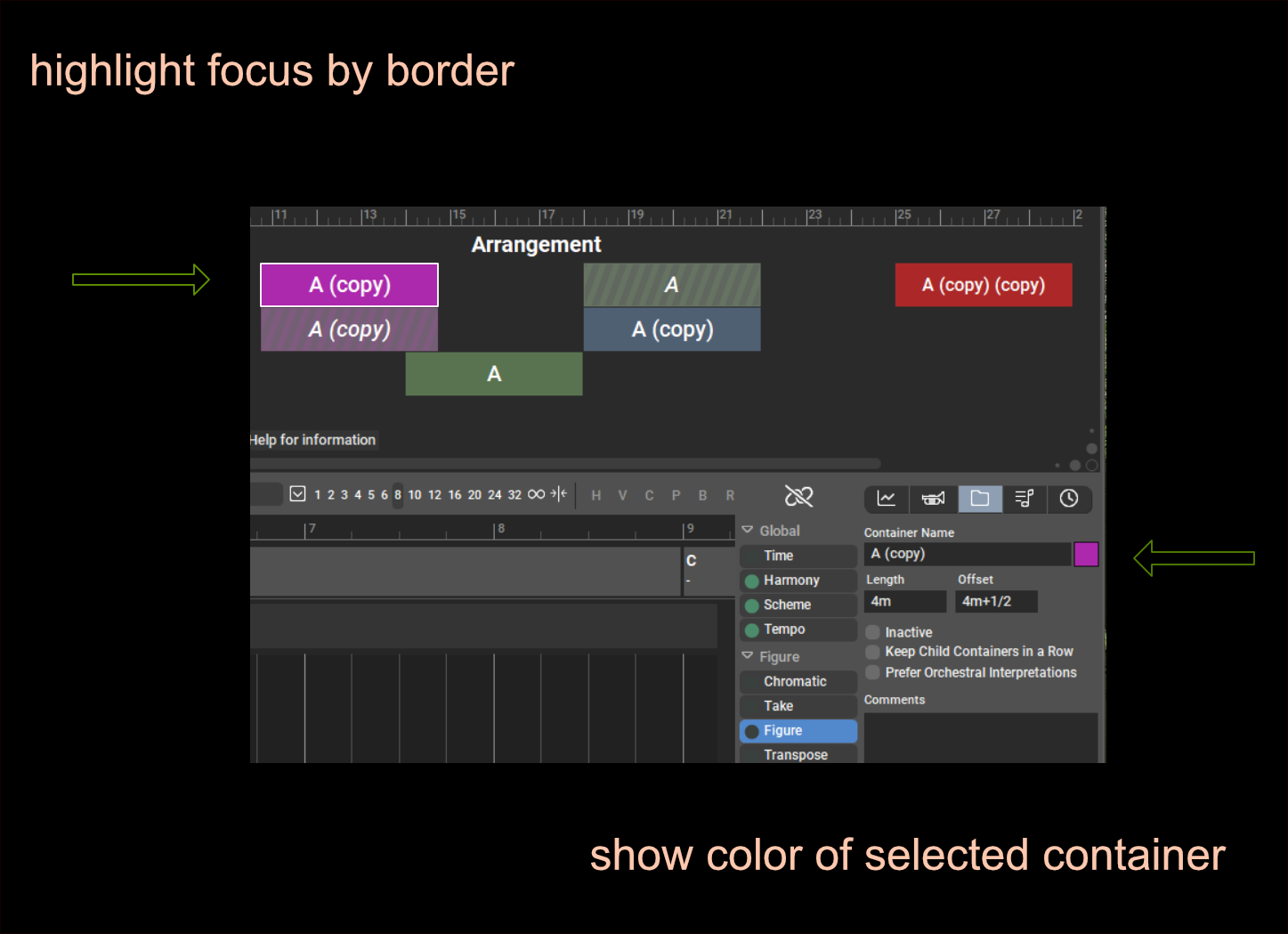
Just to make it more intuitive. To be honest, I had to consult the help already the second time for "how to change the color of the container". And also a bit confusing if you work with colors: the focused container has the blue color and not the given color anymore.
What do you think about such a solution?:
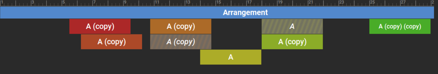
Maybe also a very nice idea would be to set a new color automatically for each new container. This is what some DAWs like Studio One are doing and you will get a kind of rainbow.
Then the example from above would automatically look like this:
If someone does not like this, make it possible to switch off by preferences.

Mo., 17.10.2022 - 16:37 Permalink
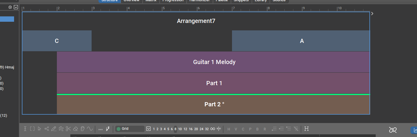
I had suggested a border too, because just coloring the selected container blue is not enough to highlight it, if you have other colored containers.

Mo., 17.10.2022 - 17:30 Permalink
Just tested a frame selection and it seems to work. Unless your container is blue, of course.
It's difficult to reserve one color for selection that is not used anywhere else. Using white would have a guaranteed contrast in this specific view, but break with the standard, which is never a good thing.

Fr., 28.10.2022 - 17:48 Permalink
I must say that I am not a fan of this border marking thing. But anyway, if people like it...
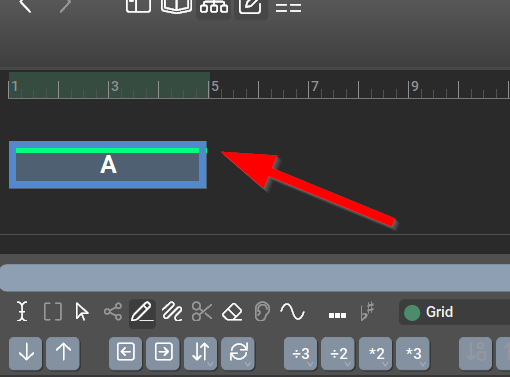
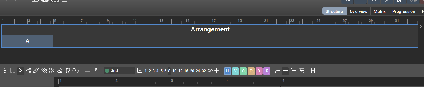
But I do have one question about it: When the root container is selected, a thin border line is now displayed around the whole arrangement. Does this make sense? I find this confusing. It' s the root container that is selected and not all containers of the arrangement. This way of visualization could lead to the assumption that, for example, parameter changes are executed in all containers and not only in the root container.
Fr., 28.10.2022 - 20:30 Permalink
As you can also add a container into another, the border around 2 countainers would then also be. Means root just behaves like any other container with subcontainers.
A multi-selection, e.g. for all containers, looks different.
But IMHO the small blue border is more elegant than the thick one and it could be the standard for selecting a container.
Sa., 29.10.2022 - 11:36 Permalink
This way of visualization could lead to the assumption that, for example, parameter changes are executed in all containers and not only in the root container.
Which is exactly what is happening.
Unless a child container overrides the parameter, which is indicated by the green trace.
I didn't like the frames much at first, too. But after getting used to it, I think it makes more clear the tree nature of an arrangement. The old way of indicating selections as bars may have led users to think that containers are a kind of region glued on a track sheet.
Sa., 29.10.2022 - 12:10 Permalink
I think it makes more clear the tree nature of an arrangement.
At least the root container should get a gray color, so that one recognizes that it exists at all. In the current representation it appears as a kind of ghost container and I'm not sure if that helps understanding the concept.
I also tried assigning a color to the root container. With the effect that all other containers get this color, but not the root container. Is this behavior intended?
Sa., 29.10.2022 - 15:14 Permalink
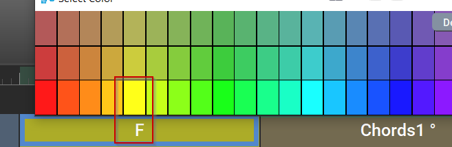
Grey for root? Maybe something to test how it looks - But what if someone is using not dark-mode but white mode? Let's simulate that:
I like the small border around root-container in blue. IMHO the same small border would be enough for the single containers if in focus - just look more elegant.