

Posted
Hi,
This is just a suggestion post re: consistency in the Instruments display on different pages in Synfire.
Consider:
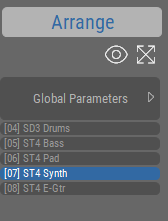
Arrange page
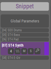
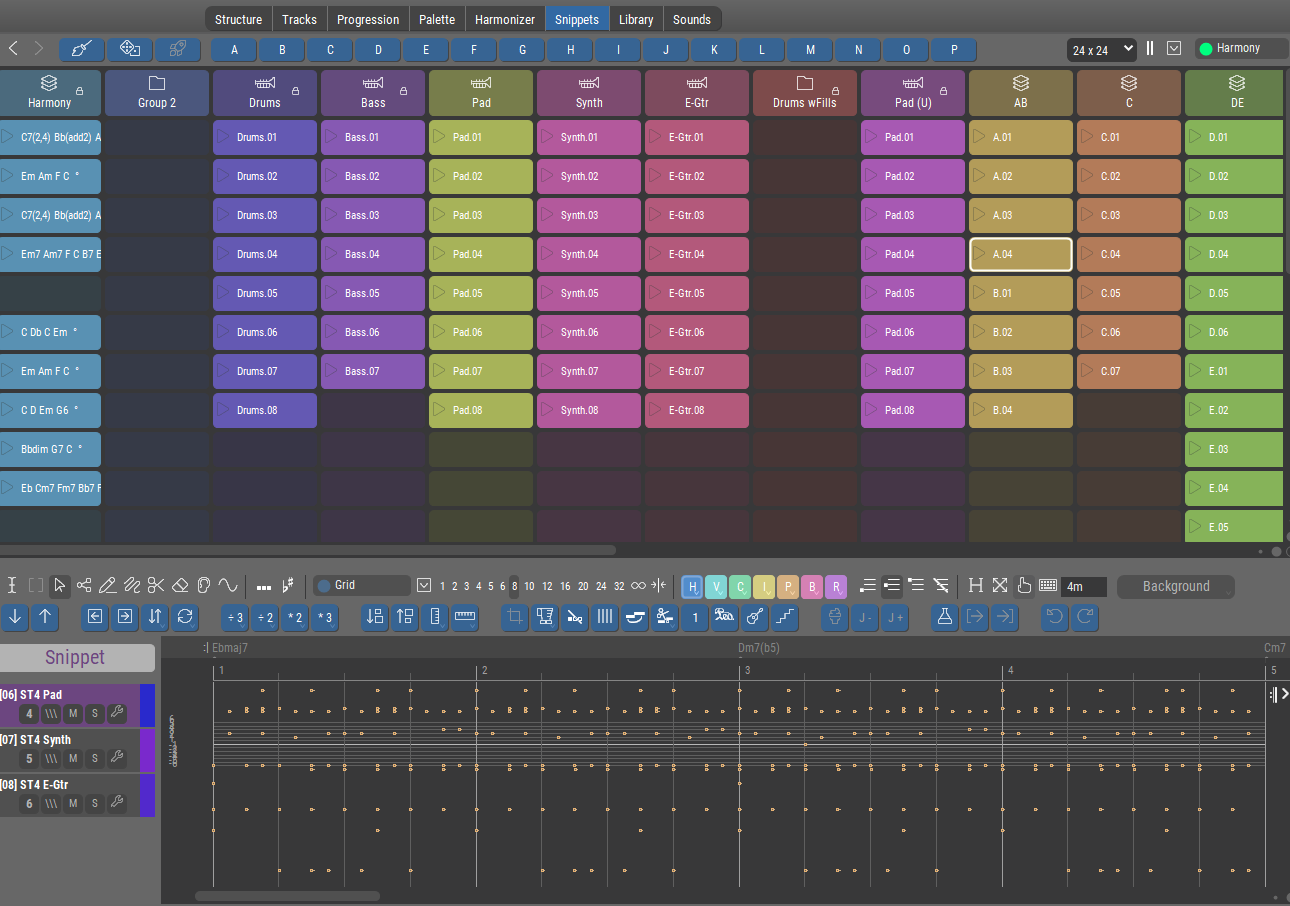
Snippets page
Tracks page
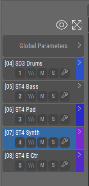
Notice the differences.
Two of these have titles, one does not.
Two of these offer the eye and zoom icons, one does not.
Comments:
Perhaps all of these should carry the title 'Instruments', as Instruments are what is listed, and as the governing page is already displayed in each case here:
![]()
but if not, then at least add the title 'Tracks' where no title is currently displayed. This would make it consistent with the others.
The eye and zoom icons are always useful, and it would be both consistent and helpful for them to be displayed in all cases.
None of this is critical, but I do think increased consistency would be a good thing here if there are no specific and significant contra-indication to doing that.

Fri, 2026-01-09 - 11:23 Permalink
You certainly have a point. Things should be as consistent as possible and seemingly minor things can make a big difference.
The Arrange vs. Snippet title (and their distinct colors) is there to indicate the type of content you are editing. Both types can be edited on the same page depending on what you selected last (e.g. a snippet at the top of the Structure page, or a container in the structure view). There is no such title on the Tracks page because there is no way to select snippets on that page. Don't know if showing the title is useful when it doesn't include any selection state information.
Same for the eye and zoom buttons. They only make sense where they can be used. Next to the full-size phrase editor they would have to be always grayed out. The layout may be visually consistent but a disabled tool that is never enabled is probably more confusing.
I'm not sure about the formatting of the track numbers yet, but the suggestion is very useful.
On a side note, we are sometimes slow to implement layout changes because doing so might require redoing a lot of existing tutorial videos from scratch. Therefore, we postpone some layout improvements until a general video overhaul is due anyway.
Fri, 2026-01-09 - 13:58 Permalink
Thank you for the explanations, very helpful!
The Arrange vs. Snippet title (and their distinct colors) is there to indicate the type of content you are editing. Both types can be edited on the same page depending on what you selected last (e.g. a snippet at the top of the Structure page, or a container in the structure view).
OK, I track that. Makes sense, and is helpful.
There is no such title on the Tracks page because there is no way to select snippets on that page. Don't know if showing the title is useful when it doesn't include any selection state information.
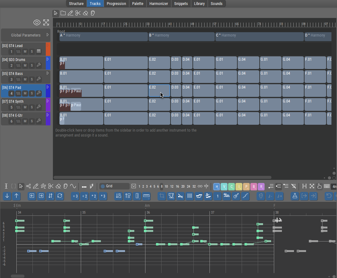
On the Tracks page, we see the (I'll call them) "track blocks". They are selectable, and when you select one the data in it is editable in the bottom pane.
These are actually instrument sub-sections of Structure containers, right?
If so, then by the logic given, wouldn't 'Arrange' be an appropriate title in this case too?
Fri, 2026-01-09 - 15:33 Permalink
If so, then by the logic given, wouldn't 'Arrange' be an appropriate title in this case too?
Yes, 'Arrange' would not be wrong, but since it can never show 'Snippet', why show it at all if it isn't useful information? Tracks are the arrangement by definition. The look would be consistent but the function would be not. That's like showing a LED that can never go dark.
it seems to me that the Eye and Zoom would be exactly applicable (if they were present) just like on the other pages.
Not really. Track layout and zoom don't apply to a single clip/phrase. It's always full-size and full vertical zoom. Horizontal zoom is on the editor's toolbar.
I agree that a block of controls should look the same everywhere. But the user will then also expect it to work the same way everywhere. That's not given here.
Fri, 2026-01-09 - 17:05 Permalink
Tracks are the arrangement by definition.
Well, that's higher knowledge of a sort. While I (now) do in fact understand that editing the Figure (or other parameter) of a "track block" is actually editing the contents of a container on the Structure page, this was not immediately obvious to me.
The look would be consistent but the function would be not.
I was rolling with your statement that
title (...) is there to indicate the type of content you are editing.
and to me, in line with the rest of the explanation, the type of content being edited is Structure (or Arrange) content. Especially since editing here has effects on another page (Structure) that is currently not visible, the label would in a small way help to indicate that (IMO).
Personally, I would find having the label more clarifying than not having it, and the "LED always On" thing would never cross my mind. But YMMV. 'Nuff said about that.
Horizontal zoom is on the editor's toolbar.
Yes, where one has to know it is there, and then hunt for it (it is sometimes off-screen). This represents why I bring it up. The zoom next to the eye establishes for the user: "click here to see/fit everything". From that POV, the function would be exactly the same. Vertical zoom vs. Horizontal zoom is irrelevant to the user when the goal is simply to "see the whole thing".
I spend a large percentage of my clicks in the program trying to "see the whole thing".
I really wish that was the automatic default
But lacking that, having one single reliable, always visible place to click would be a real help.
Anyway, those are my perspectives. Eventually I'll develop enough muscle memory not to care.
I appreciate your replies, they help me, and the discussion here may possibly help others at a later time.