

Posted
Trying to figure (no pun intended) out how to configure the factories to create “thought crafted” results, I got stuck on a very basic setup, which makes me wonder if I misunderstand the concepts or if the documentation does not really reveal how things work (hidden interactions between the configurable parts) or if there is a bug that create these factory results that should not be possible – as I thought I understood the factory parameterization.
I tried to create a very simple factory configuration, a set of very narrow settings in order to understand the inner workings of the available factory parameters and the outcome.
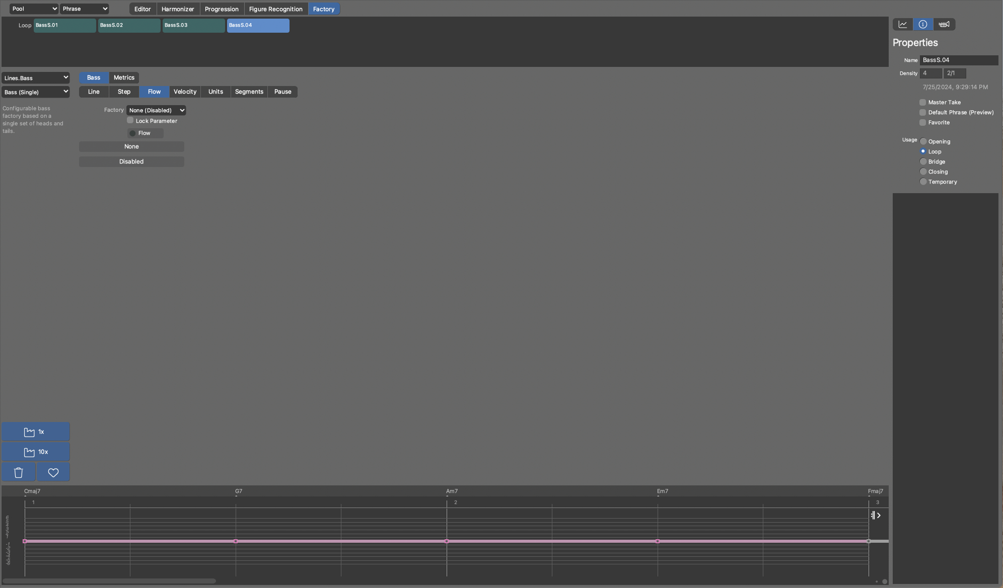
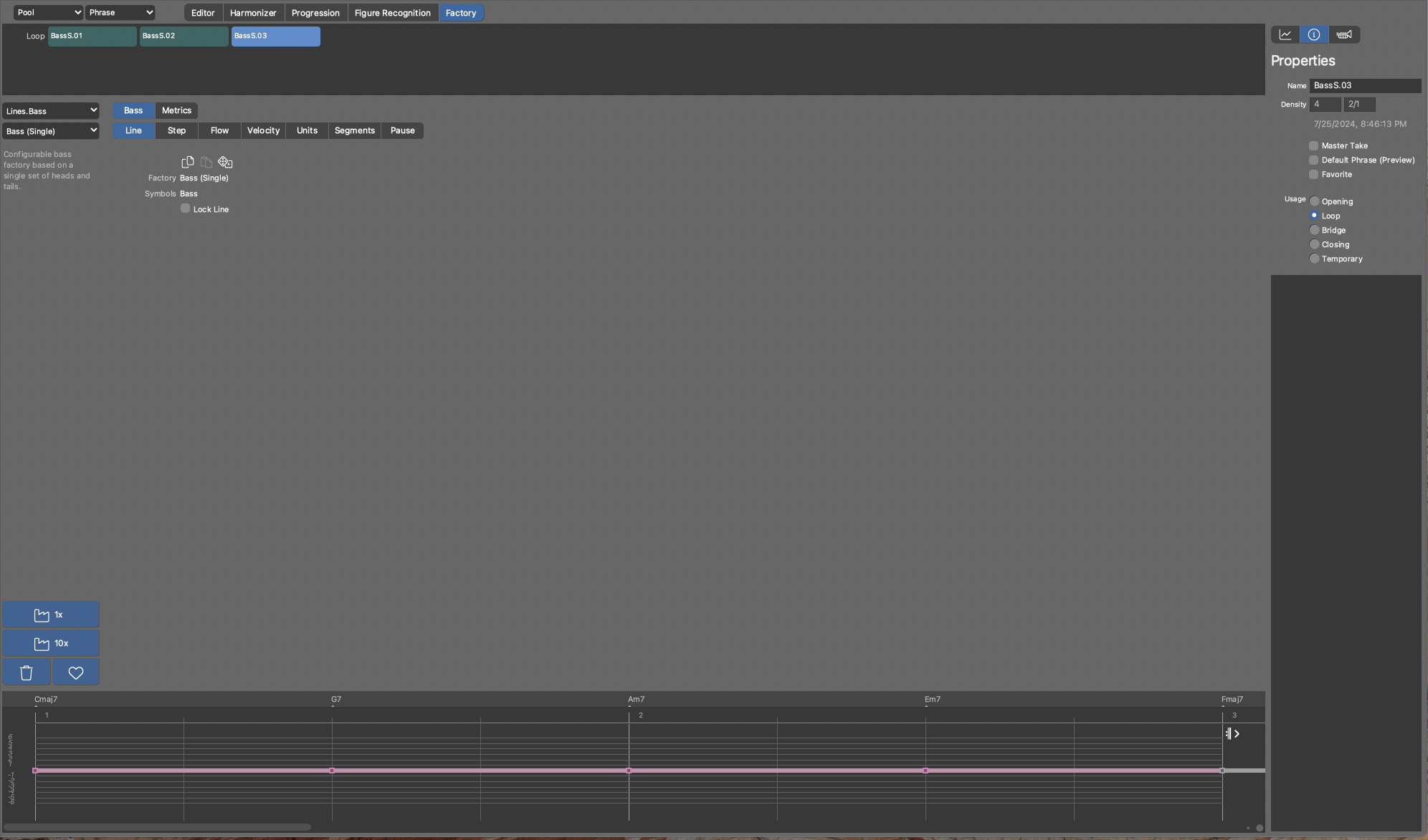
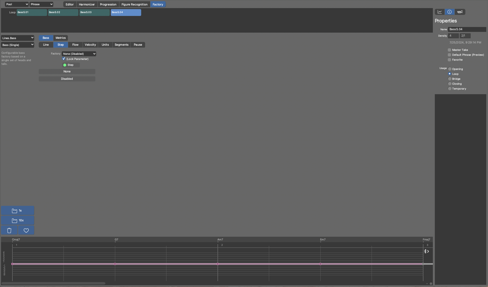
First aim: understand how the rhythm structure of the phrase (essentially the figures) are created. Therefore, I used the Line.Bass + Bass (Single) Factory.
Concept for the research:
(1) control step and hence the onsets or note-on positions.
I have done this by creating a simple figure with a quarter note on the first and third beat in the Structure view (arrangement) and extracted the step parameter to the embedded library. After that I changed over to the Library view and dragged the Step parameter (Phrase) from the embedded Library over onto the Step outlet of the Step pane of the Bass Factory, which automatically checked the “Lock Parameter” – which is fine.
Assumption: this will restrict the factory to create “something” only on the first and third beat of a bar – which it does so far.
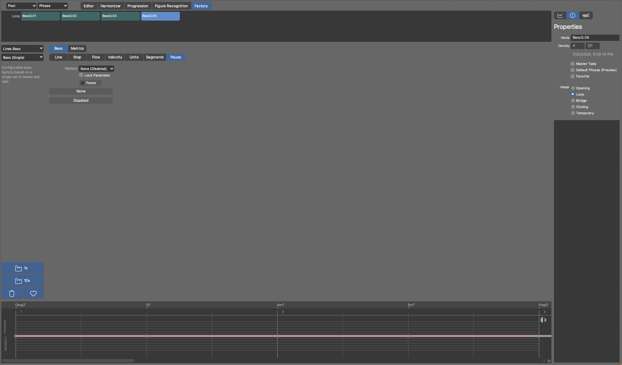
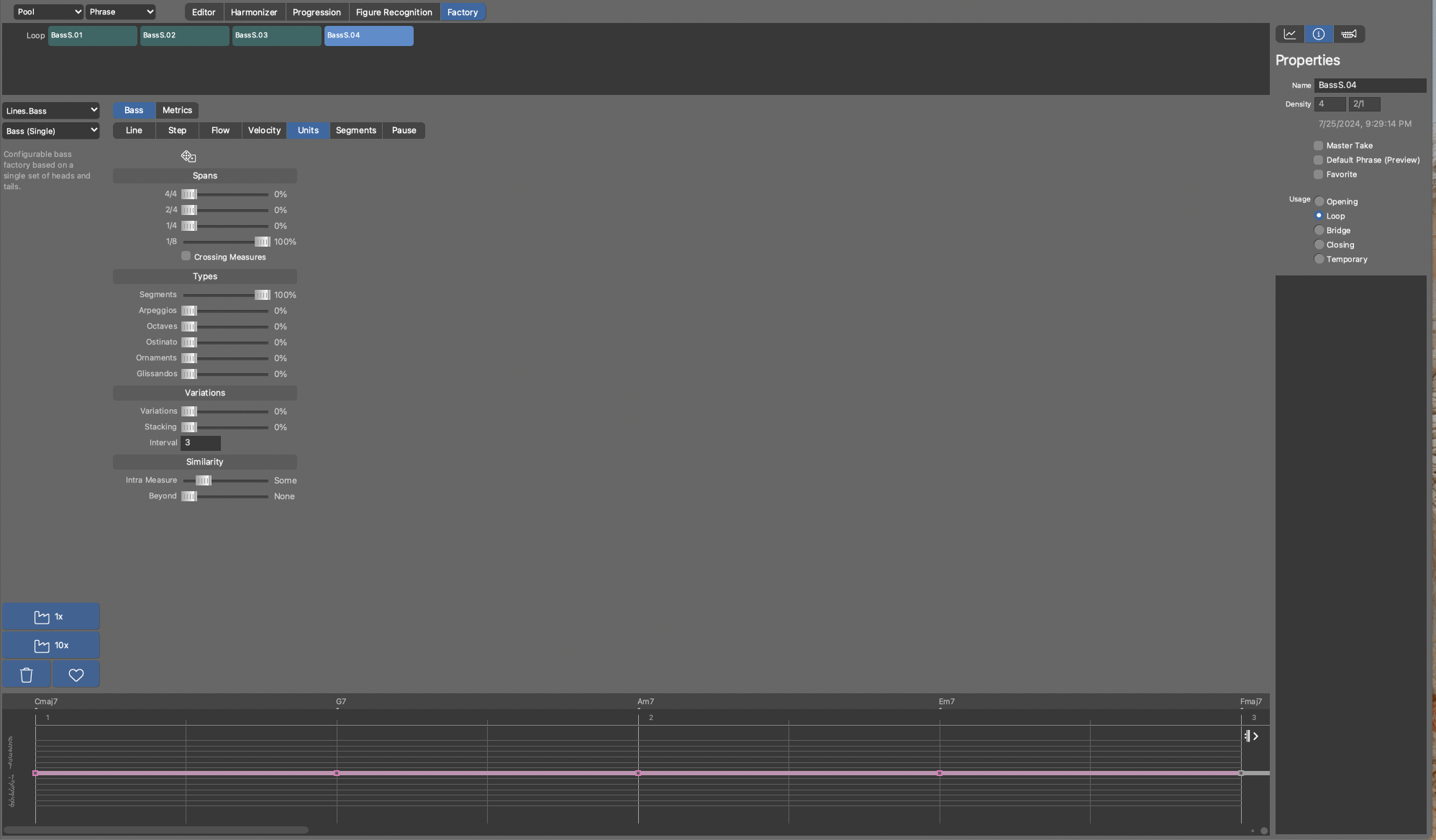
(2) control the length of the generated Figures by 1 specific Span and disable Flow & Pause to prohibit interference
On the Units pane in the Spans section, I chose 1/8 = 100% and in the Type Sections Segments = 100%, so that no Type specific note length variation will come into play, and the pitch contour I defined in the Segments pane will be used
On the Flow pane I chose “None (disabled)” in the Factory drop-down
On the Pause pane I chose “None (disabled)” in the Factory drop-down
Assumption: this will restrict figures segments (sequence of figure symbols) to a length of 1/8 – which is not the case.
+++
Surprising output: the factory creates figures that have half-notes (1/2) on the first and third beat.
What causes this output?

Fri, 2024-07-26 - 07:01 Permalink
The 1/8 setting at the segment span setting can not be seen as a note length setting,I guess. I interpret it as the setting that the series of notes per segment is restricted to the span of 1/8. But the notes itself can be also longer notes. And because you have disabled Pause you get 1/2 notes.
Fri, 2024-07-26 - 09:53 Permalink
Notes always sound until the next note starts. Unless Flow shortens them. If you want 1/2 step with 1/8 note length you need to use Flow to shorten them.
Spans are filled with units. Units come up empty if no step falls inside a span. Units are clipped to fewer notes if the span is too short for a full segment.
Docs here.
Fri, 2024-07-26 - 18:20 Permalink
Hi housekeeper,
thanks for your insights, but I still don’t get it (but coming closer, I think), and the docs are not that helpful to be honest, and I will explain why in another post.
But first I want to understand your explanation of spans and units.
(1) Spans are filled with units.
Assuming we are talking about the Units pane, which has 4 sections: Spans, Types, Variations and Similarity.
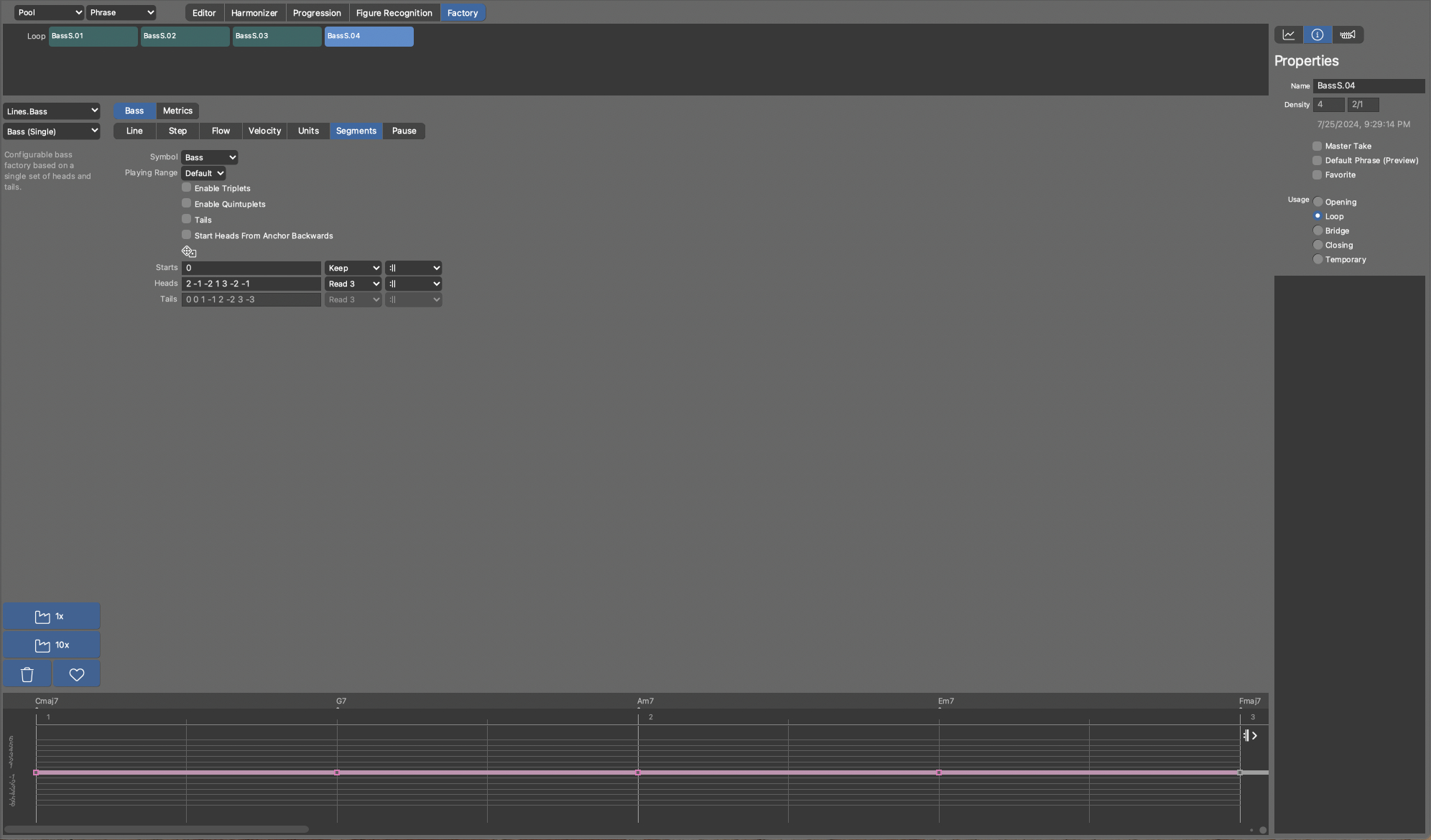
So, Spans are like a frame of time in which the Types of the Units – Segments, Arpeggio, Octaves, Ostinato, Ornaments and Glissandos – are placed (or filled).
But the note length used for the Span is only an overall (initial) time frame and has nothing to do with (respectively restricts) the note length of the figure symbols that will be used by the Unit Types (Arpeggio and so on).
Which means, I can have a Span of 1/8 and if the factory creates an Ostinato, that Ostinato figure segment might be 1 bar long and may contain symbols of every note length from 1/1 down to 1/32 (if I remember the docs right).
So, Span has no influence on the creation of the initial Figure Segment (of the randomly chosen Unity Type).
Only in an upcoming pas (or step) the Span is used to clip (or shorten) the initial Figure segment and this the clipping is done only on note-on?
Which means that a note-on has to be inside the span, but the note-off can be outside the span.
As this is the only way that I can imagine why I see ½ notes coming up in my example shown above.
Or in other words: Span is a frame for the note-on (or onsets) of the figure symbols and not the entire length of the figure segment?
Please note that I differentiate figure symbols and figure segment and correct me if I am wrong – because this is crucial.
(2) Units come up empty if no step falls inside a span
This is not easy to understand and the illustration in the docs you have linked only helps a little bit – the blue boxes should have notes inside them to understand the process.
Initially I thought (but now I think it’s wrong), that spans are always aligned to the Steps parameter.
Which means that the process of the Span generation happens in free context – a span is just a frame of time in the void, so they are just containers that can be placed anywhere.
I thought that the generated “Span containers” were then aligned by the Step parameter – especially as I used an extracted Step parameter in the Step outlet of the Step pane in the factory. According to what is described in the Docs about the Step parameter (https://docs.cognitone.com/synfire/EN/parameters/Step.html).
But your explanation leads to another view: Span container must have a position in time or there could be no logic for “steps falls inside a span”.
So, my guess is: Span Containers are generated in a sequence and if there is a probability greater than 0 for more than 1 note-length, we get an irregular pattern (onsets) of Span Containers, like seen in the docs illustration. Is this correct?
If there is only 1 Span defined, as in my example 1/8 = 100%, all Span Containers have the same length of 1/8 and hence they form a regular 1/8 pattern.
Or in other words (as seen in the docs illustration) they are timely sequenced.
First Question: does the onset of the Span Container matter? Or does the Step Parameter act as a filter on the Span Container in the sense of that it picks up certain figure symbols and all figure symbols that start on positions that have no active step will be dropped – but only these and not the entire figure segment.
Second Question: Pause only has an impact for the note-on (onsets) of the figure symbol? If a Pause occurs (= 1) in the middle of figure symbol, it has no effect? Which means Pause do not act like cookie cutter, but as a counter complement to the Step Parameter ONLY on the onsets.
+++
In the end, I think it would be very helpful, also for all the other users, to create a clear illustration with a vector graphics tool to explain the process of the factory algorithms and what’s the impact of the configuration settings with several hands-on example (generated phrase figures), which means “pimp the docs & let them shine” ;-).
I can image that doing it right is time consuming, but if these concepts are not clear and easy to grasp, the Synfire Factories are degraded to rolling the dice and are no better than the mainstream KI tools that are statistically driven copy & paste mechanisms of human composition history (machine learning stuff).
To that regard I would like to remind (and motivate !!) Cognitone to their mission statement (see the “our pledge” section): https://www.cognitone.com/company/mission/page.stml?a=5&lang=1.
I can imagine that Synfire Factories are capable of delivering the promise and being a tool of craftsmanship, but it’s not clear nor well documented how to achieve it and in the meantime, it’s more like rolling the dice, which by the way a computer or CPU can do much better than a human ;-).

Fri, 2024-07-26 - 19:19 Permalink
Note lengths follow Step. Notes always sound until the next step. The only way to modify note length is Flow.
Spans are like a frame of time in which the Types of the Units – Segments, Arpeggio, Octaves, Ostinato, Ornaments and Glissandos – are placed (or filled).
Yes.
Which means that a note-on has to be inside the span, but the note-off can be outside the span.
Note-off is where the next step is. That may also be outside a span.
the process of the Span generation happens in free context
Yes. Spans are created based on rules defined in a factory. Spans and Step are totally independent. Think of Spans like a filter that determines which steps are used for the type of segments that was chosen for a span.
By the way, the vast majority of selections are NOT completely random. Probabilities apply for some initial choices but most subsequent choices are based on rules.
Pause only has an impact for the note-on (onsets) of the figure symbol?
Yes. Not like a cookie cutter.
Factories might look like classic algorithms but there's rule-based inferencing behind the scenes (not "AI" in the currently popular sense but symbolic AI in the expert systems sense). Factory settings just define the constraints that allow certain rules and terms to fire (or not) depending on context. That's why factories share the same settings for different sets of rules and taxonomies.
Fri, 2024-07-26 - 20:07 Permalink
Is there actually a tutorial special for factory to start making music there on the cognitone site or am I looking over it ?
Indeed if you look at the docs of factory , it does look shabby and not inviting
Spans ?: how must a user now what a span is if he sees this , no idea ...this is sad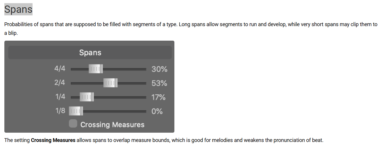
Sat, 2024-07-27 - 16:32 Permalink
In between my thoughts on the Factory documentation. Dear people from Cognitone don’t get me wrong on what comes next – I know that writing documentation isn’t that easy, I even believe it’s a discipline on its own, integrating knowledge about cognitive psychology, visual arts or illustrations and more … it’s a profession on its own.
In a small software company often, there are no resources to get a great documentation done – there are so many things to do, to develop, fix bugs and so on, there is even barely time for writing the documentation at all and keep it up to date. I know that. I know that quite often writing a documentation for software developers is even a pain – facing the backlog of things to do, not being trained in the discipline of writing documentation, so it’s the last thing that will be done and not seldom it’s done in a rush … it’s sad but common.
Sad, because it gives us users a very hard time to wrap our head around the great piece of software you have put out.
+++
In general, I think there are 2 functions a documentation on whatsoever software should serve:
(1) up to date and not misleading
(2) helpful for the user and hence created from a user’s perspective (and not a secondary developer documentation or a copy & paste from the feature design or description the developer had to implement)
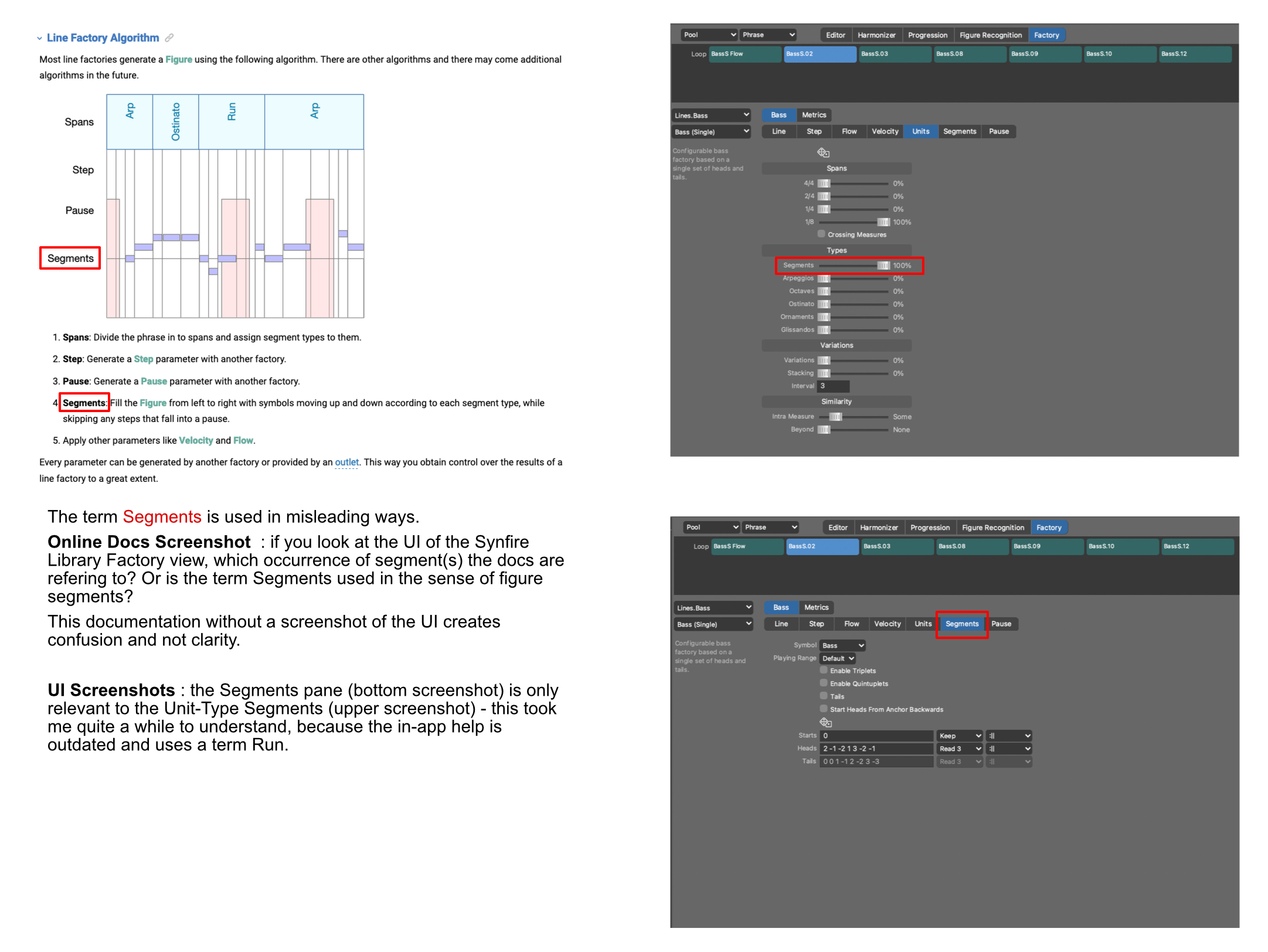
I attached 2 collages of screenshots from the online manual and Synfire user interface to show examples and make it obvious what is misleading and confusing in the existing online documentation.
One important point: visual illustrations are crucial, especially with this kind of software. If something is described by words only, the reader only has a chance to understand what’s described when there is a 100% match in the terminology.
And that’s not easy, as I have pointed out with the segments in the collages e.g. – that’s not the fault of the one who has written the documentation, it’s just an insane job to do it that way, as humans tend to use the same word in several contexts and each time it feels right, as we have ongoing pictures in our mind, which clarifies the meaning of the word in the current situation – but its “naturally” enclosed in the head of the individual.
That’s the way humans “tick” – we create ourselves an individual perspective, which is often based on mental imagery, colored by emotions we felt while we experienced something similar or related in the past.
If the reader of a document or a forum thread (same challenge ;-) cannot create a nearly fitting imagery in his mind, the written things cannot be understood as intended by the writer – no way.
So, in my opinion using clear illustrations and screenshots in a software documentation is key.
+++
Another thing is, that a lot of aspects of the factories are just briefly touched in the documentation, and it lacks an overall picture that could only be explained visually in a dedicated place like the online help – whereby I really like the in-app help, to remind myself about details or Synfire’s terminology, this is really helpful.
For example the Factory Lines.Melody + Develop A : https://docs.cognitone.com/synfire/EN/kim/Lines.Melody.Develop1.html .
The concepts of Anchor Step and Melody Step are explained in just 1 short sentence – no way to grasp what impact a change in the values might have, so they become dices (dice = untransparent randomness).
Especially if you think about the concept of a Step used in the arrangement view versus in other factory (whereby @andre has shed a little light on it in his last answer).
But I also understand that its tricky to come up with an appropriate documentation for the Factories that fits the needs of the users, without diving too deep into the mechanisms of the (symbolic KI) algorithms.
So maybe we can come up with something useful in a continuous and evolving approach in a per Factory Forums Thread also exchanging editable Vector Graphics based Illustrations (I would prefer Affinity Designer 2 – as I own it and its affordable ;-), see below.
+++
If I interact with the factories: it feels like I see a mine of treasures in front of me, I can grab a wonderful piece of it, hold it for a while and then it disappears right in my hand respectively in my creative mind.
This analogy does not fit 100%, as the generated phrase is saved automatically in the library, or I can switch over to the Library Editor and change the figure and other phrase parameters to my liking.
But the creative process is lost – the way this treasure manifested itself is not transparent, I cannot consciously (design thinking) interact with the Factory algorithm to create myself something similar.
I always must do it “post KI” … and that does not feel right from a human creative perspective. It feels like I am a slave of the KI or algorithm – instead I wish & want to be the conductor of the KI or algorithm.
@andre: if I understand you correctly, your point is: the rule-based KIM factory algorithms are designed in a way that makes it impossible to describe the way they work by documenting the parameters?
Or in other words: the complexity of the rule-based Algorithm is so high, that you cannot follow a thought process driven approach by choosing specific parameter values of the Factory?
But as you say, the parameter create constraints, it means they create a kind of structured boundary, or think of it as a map of paths on a landscape that has theoretically indefinite paths to walk on.
And it’s the actual chosen parameter values by the user, that create a restricted set of predefined paths (in a sense of a constraint), and the current run of the algorithm chooses which paths are actually taken (and it’s only a small amount of the possible paths or a route over these paths).
Whereby the user chosen parameters do not sculpt the paths – that’s done by the rules of the KIM factories – but they select them, they create a predefined set of them (hence a constraint).
As the sculpt of the paths are musical contours of rhythm and pitch (or the figure symbol abstraction of Synfire) it should be possible to explain them and hence create a helpful documentation.
What do you (@andre) think about of trying to demystify the parameter per Factory (e.g. Line.bass + Bass (single) or Lines.Melody + Develop A) each one it its own Forum thread – one after the other in a process over the time (because this will be time consuming).
Using some Factory generated phrase / figure examples and I could imagine creating an Affinity Designer 2 Document (editable Vector Graphics Illustration) that contains the parameter of the factory in questions and some annotations and some simple flow graphs as a starting point for the discussion, that I can upload in the post as well, so that you and anyone else can grab and edit it, to explain ones point of view and understanding and post a new & updated version of it - alongside written words in the post.
This way we could get a visual illustration growing, that reflects our (interactively grown) understanding, that is created and evolved from a users perspective and clarified + corrected by the developers (the wise man ;-), and in the end, can serve you as a template that you can finetune for the Synfire documentation.
Sat, 2024-07-27 - 17:41 Permalink
@janamdo
the only Synfire Factory tutorial alike content I know is from the user Blue Phoenix, exploring an early pre release version of Synfire : https://youtu.be/dlNp9awqycc?feature=shared.
Sat, 2024-07-27 - 19:51 Permalink
Thanks, yes, this video is not made by cognitone , the developer of the software
"In between my thoughts on the Factory documentation. Dear people from Cognitone don’t get me wrong on what comes next – I know that writing documentation isn’t that easy, I even believe it’s a discipline on its own, integrating knowledge about cognitive psychology, visual arts or illustrations and more … it’s a profession on its own."
This is something that i pointed out a long time ago here on the forum, writing factory documentation is a profession.
Also writing software without proper documentation is useless, because trial and error learning is the worst learning strategy and limited.
The developer nows all ins and outs from his software and the creator, so let him try to explain how his software works on a extensive way
This is something I pointed out a long time ago on
I actually wonder if developer André is aware , if he thinks he is going to explain the operation of software with a picture where it is totally unclear what it stands for to someone looking at it for the first time.
What is he thinking to do this?
Have also once suggested the idea of imagining that the subject is completely new to someone and he should start explaining the operation.
All to no avail and he just continued as before and is hard-learned.
Problem was also that the software also kept changing and so did the manual and that was an argument for him to do as little as possible about it
Surely, as a user of the software, you don't want to go into constant discussion in question and answer to get something clear on a forum.
I don't buy it all to read how great the software is for a user, but you don't tell how it works.
Wonder if there is going to be progression in it or is he going to let it run its course again?
Isn't it strange that no tutorial was made by Cognitone to explain all the ins and out of the factories ?
Sat, 2024-07-27 - 21:44 Permalink
@janamdo
I get your points and to confirm your statements, this is my third attempt to learn Synfire and compose (make) music with it.
The consequence of missing documentation: people put the software aside after the trail has expired or they only work with the software in a fragmented manner because they cannot grasp its features entirely or cannot find a workflow for themselves.
It can only be in Cognitone’s interest to change this.
And yes, you are right, it is not actually the user's job to create the documentation and nor to look up all the pieces in the forum - but it can also have a learning effect that allows you to understand the software in depth, if it happens in cooperation with the developers. However, this deeper knowledge comes at the cost of a lot of time - I mean a lot of time.
An example of what good results can be achieved when dedicated users (https://manual.synthv.info/ ), instead of the manufacturers (https://synthesizerv.com/manual/ ), create documentation can be seen, for example, in Synthesizer V – the unofficial manual is awesome and the one of the manufacture is let’s say “hard to take” ;-).
But the situation for Synfire and its Factories is different, as the functionality of Synthesizer V needed from the users perspective is immediately visible (you can try & error and understand the results).
Or in other words: all the hidden AI or algorithms logic of Synthesizer V is not relevant for the user’s workflows, but in Synfire’s Factory they are crucial for the creative process or at least it is crucial to know how to direct or conduct the AI by the means of the available parameter.
+++
Purely pragmatic question: are you interested in an AI / algorithm-based composition workflow, given that you work with Synfire on a Mac and have a Logic Pro license? Or you have an iPad and use Logic Pro for iPad.
If so, I see a good opportunity to create a simple yet creative workflow between Logic Pro and Synfire - until a usable Synfire Factory documentation exists or is gradually created. If you're interested, we could expand on that in another forum thread.
This is also a workflow that makes "mainstream AI" (Logic Pro Session Players) output transparent (via Synfire MIDI Input & Figure Recognition) and accessible in a creative manner, so one gets away from the statistically based copy & paste of human composition history ;-).
Sat, 2024-07-27 - 21:58 Permalink
Have revisited the factories documentation and it is shocking how incomplete and user unfriendly this has been done.
No one can make sense of this and get clear how to work with the software and only Cognitone knows exactly how it works sadly.
Also a point I have often stressed the user friendliness of the software.
This is a joke, if you look at it that way
Sun, 2024-07-28 - 02:47 Permalink
completing my post from above ... a third fundamental function (beside that it has to exist in the first place) of a documentation
(3) it has to be usefull
Which means a documentation has to lead the user how to create results with the software - clearly & visually (as software is used by means of a visual / graphic user interface) lay down the path of workflows for the user.
Get the user a substantial value, which means not only providing the steps to take (bullet list alike) - which is like copy & past - but explain the concepts behind the features along the way, so that a deeper understanding can be achieved.
Concepts here, workflow there is disintegrated and is not useful, but theoretically (its like an academic paper which has to fulfill certain structural criteria). Explaining the Concepts in dedicated chapters or areas is great for getting a first impression, or looking it up for a refresher.
But the fundamental concepts have to be explained again in the context of workflows - that is in the context of use-cases ... this is a form of user friendliness.
Concepts in the context of a workflow means that the theoretically concepts turn into practical elements the use interacts with (sometimes these elements may only work in the background and are not visible in the UI, which makes it even more important to mention them).
This is crucial, so that the user can come up with new ideas for new workflows, that the developers may not even thought about that its possible.
This is what software for creative purposes is all about ... be creative ... be creative in the usage of the software, which is only possible having a clear & deep understanding of how the software works.
And this is the stage where a user forum comes into the creative play and can create real value, if user share this new techniques.
+++
Another important thing regarding user friendliness of Synfire's user interface: Synfire does not benefit what users have learned from using other software, as it uses its own user interface controls and "UI language".
Andre mentioned that this is due to make Synfire cross platform - which makes it recognizable, but sadly this does not solve the problem ;-).
So there is no intuitive way users (as a result of using other kinds of software) can explore how to use Synfire (in the sense of workflows).
For example the way the parameter view works in conjunction with the arrangement view and the containers is quite unusual (which does not mean its bad !!, it's just different and it takes time to get use to it).
Consequence should be (in my opinion): the docs needs to explain it with dedicated illustrations very well & unambiguous clear.
Or in other word: as Synfire uses a different UI language and unusual UI layout concepts, its effort in documentation must be even greater than a software that follows the design principles and guidelines that one of the leading operating system vendors had established and users have adopted.
And by the way : it does matter which one you chose (Apple, Microsoft or Google), as they are not that different, and in the end it's a matter of taste.
Sun, 2024-07-28 - 12:49 Permalink
@sound unfold: I appreciate you taking the time to put together this detailed and thoughtful feedback. You certainly know the challenges a small enterprise faces with a complex and evolving product.
Factories are a creative tool that is still very much at an experimental stage. If they were a mere technical solution to an engineering problem, documentation would be more straightforward and final. Any extensive documentation written now will become obsolete at some point, at least in part.
Therefore I feel it's most productive and helpful to pin down the most confusing elements and focus on them first. Input like yours helps with that.
I like the idea of having more diagrams. Parameters like Velocity, Flow and Pause, as well as the general mode of operation are simple enough. Visualizing rules and inferencing as a flow diagram however is not possible. KIM isn't based on if-then-else. It is more akin to the PROLOG language. Thus factories are best described with words that explain their function.
There is a video in the pipeline for Factories that focuses on workflow, i.e. how to select and run factories and use them as part of a library. Going through all the settings of each factory in a video is not very helpful as the videos would be hours long and impossible to search for keywords. We'll have to delegate that to the written manual. That's not to say that we won't have a specific factory in a video here and there.
Or is the term Segments used in the sense of figure segments?
Yes. "Segment" always refers to a Figure segment.
because the in-app help is outdated and uses a term Run
Good to know. Easy fix.
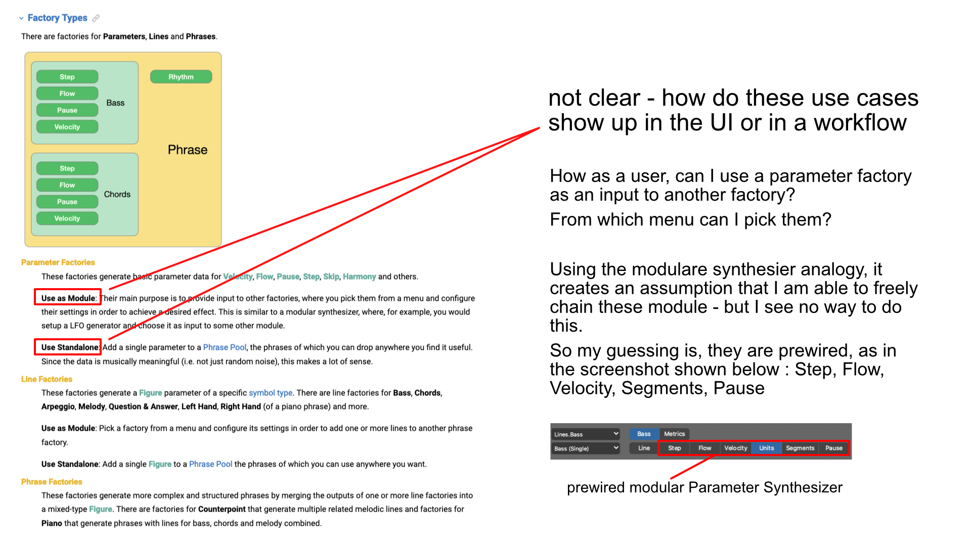
How as a user, can I use a parameter factory as an input to another factory?
You pick them from the pop-up menus that show up in a Factory's UI everywhere (think of them as input slots). If you want to use a parameter Factory standing alone, you simply select it as the top-level Factory instead of some "Phrase" or "Line" Factory.
But the fundamental concepts have to be explained again in the context of workflows
Yes, cross references (links). I agree the manual could use more of them.
the way the parameter view works in conjunction with the arrangement view and the containers is quite unusual
I am aware that users want a "DAW with Figures" and a flat track sheet. We could easily do this to make more DAW migrants happy and flatten the learning curve significantly.
But that would blow up most benefits of music prototyping. Users would happily use Figures instead of MIDI and otherwise stick with their old flat workflow. No moving parts around, no reusing existing parts in other arrangements, or non-destructive "what if ..." experimentation any more. It would be akin to removing paragraph formatting from a word processor because, you know, carriage returns and fonts also do the job.
Oh, and half the user base would probably kill me for that ;-)
Apart from the container structure and overview, what other elements of the UI are uncommon? Synfire uses decades old standards like sidebars, toolbars, tabs, inspectors, generic widgets, trees with a search function, etc. I mean, there are many of these elements and it takes a while to check them all out. Other UIs (e.g. Blender, Unity) are much more complex and impossible to grasp if you don't already have a thorough CGI background.
Apart from the content it displays, what's unusual with the Synfire UI?
Mon, 2024-07-29 - 00:41 Permalink
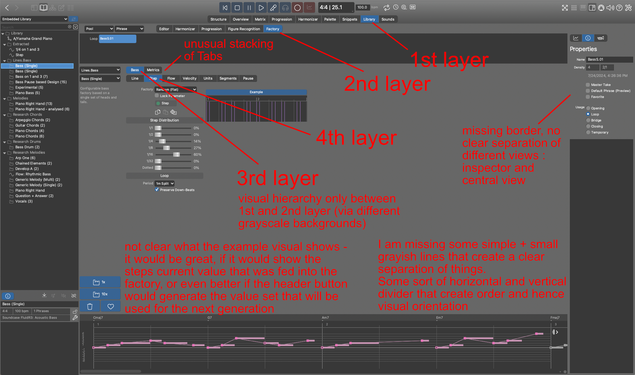
@andre, as you asked for it, I attached a collage that shows 1 example of what I mean with unusual UI language.
Yes, Synfire uses well known UI paradigms like Tabs, Sidebars, Inspectors, nested Views and so on – but it lacks a clear visual indication of them, which others may call a visual hierarchy.
But there are lots of terms in the field of user interface design out there and ways to describe them – terminology in the field of UI design is a language on its own.
One can argue that’s not true, Synfire just uses a flat design without any shadows, and has just has no visualization of depth (for which others often use variations of grayscale values – e.g. to visual the depth of order in nested views) and argue why should it even have one. That’s also correct.
None of the things I am pointing to are a “no go”, as I said it’s not bad, just unusual, which I think needs some extra explanation in the docs – e.g. just as I did in the collage, but just in an explaining manner (and more beautiful of course, than my fast, rough & ugly sketching ;-).
This would be especially helpful for the main view (labeled Structure), because there are 3 levels of selection: container, track and parameter (sidebar), that influence what’s shown in the center (parameter view) and in the inspector (right most). This could be especially helpful as the parameters unfolds (or essential is) the complexity of a phrase – which means it’s a deep access into the fundamental concept of Synfire.
This can be done with some screenshots and a thoughtful & stylish collage technique - if its visual appealing, its attracting users – but most importantly, it clarifies the logical and visual hierarchy of Synfire’s concept and UI.
Especially a collage of different container arrangement situations, nested and parallel container (and all the other possible container techniques - I mean ALL of them: let your users know what they can create with Synfire !) and what’s the effect on the output, always clarifying what's shown in the parameter view and why the output view may show something different – this can be illustrate with a collage quite easy and is hard to describe respectively understandable with words only.
Yes, there are YouTube videos about that, but they also show a lot of other stuff in quite a fast pace. For such a complex software like Synfire, its crucial to point out the essentials in a standalone visual map – no need to scrub YouTube Videos, get distracted by YouTube ads and all the other side effects.
It’s nice to have this YouTube tutorial, no doubt – they are even essential – but in my opinion, not sufficient, for beginners to wrap their head around Synfire and get used to it.
Don’t forget that some users will use Synfire not on a daily basis, maybe only at the weekends – maybe not all of your users are full time composers ;-), so they need a easy & fast visual map / illustration to get on the learning track again.
So, with all my posts, I just wanted to give some hints, why I and maybe some other users have a hard time to warp my / their head around Synfire.
I think it makes no sense to discuss the UI of Synfire further more – if my hints do not immediately trigger something in your mind or imagination, first of all it is okay and second if there is no resonance, then there should be no change. It’s that easy. It’s your software, it’s your vision and should stay yours or the ones you are working with.
+++
I can confirm (;-) that Synfire factories are experimental.
Bug no 1: Line.Drums + Bass Drum Factory: if I set MIDI pitch to C1 and generate a phrase I still get B0s.
Bug no 2: Sound selection. If I choose another sound in the 2nd drop-down in the Inspector for the sound, nothings changes, I have to use the wrench icon to do so.
+++
Oh, and half the user base would probably kill me for that ;-)
I guess over 80% of your user will then stop using the software for a good reason, as the non-destructive approach you realized with the container feature is at the creative heart of Synfire, which makes it SO USEFUL !!.
Which means, I did not say the container feature is strange, it’s great, but it needs an easy-to-understand documentation, as I mentioned above e.g..
My guessing: if you know a professional designer who is experienced in creating illustrations, and has some musical background, and sit down with her or him for 1 day, you will get a visual map and illustrations that will speed up the learning curve for beginners of Synfire dramatically.
Targeting the main view (labelled Structure) and the core concepts of Synfire – that’s it, and you have one or more great visuals for your website as well and with some additional effort (it’s worth it) a so-called landing page (Goggle’s bots will love that as well, if you get the SEO of that webpage right), which shows off the Synfire's essentials at a glance on 1 webpage (integrating it into the docs as well, of course).
Mon, 2024-07-29 - 08:40 Permalink
+1 on the 'easy fix' for updating the Segments manual https://docs.cognitone.com/synfire/EN/kim/Lines.Melody.MelodicElements1.html Run? Heads? Tails?
No clues at https://docs.cognitone.com/synfire/EN/parameters/Figure.html
Should be done before releasing the known unknown Factories video.
Thanks
Mon, 2024-07-29 - 10:11 Permalink
We largely rely on layouts to frame themselves by way of text and widget alignment. Borders and 3D are a 1990's concept that is obsolete today. Tabs are always nested from the top down, so different background shades would not add any information (Synfire uses 10 shades of gray already). I understand that it takes some getting used to this flatness, especially on very deeply nested pages like "Factory" and "Sounds".
There is always room for simplifications. Measuring user behavior and doing ergonomics and UX right is a year round full-time job. We need to make do with incremental improvements for now. Small changes can also make a big difference.
@Raymondo: Heads and Tails are metaphors used internally by the factory only. They have no meaning elsewhere. I agree that should be explained. (head = before the anchor moving backwards, tail = after the anchor moving forwards)