

Posted
Hi.
I would find it very helpful if somehow it could be made much more obvious, visually, which snippet is the currently selected one.
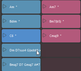
Using the given blue in every situation sometimes results is near-invisibility.
Maybe the selected box could be outlined? Maybe the selected box color could vary depending on the background color? Maybe use transparency?
BTW, the blue that I'm currently seeing - is that a user definable color? Maybe I could go to bright yellow or something as a stop-gap.

Sun, 2024-03-31 - 14:16 Permalink
Yellow is only good as long as you don't meet a yellow object. Indicating selection with a color is generally not ideal when objects themselves have different colors. Drawing a focus ring outside of an object comes with a host of other problems. Blinking might help.
Sometimes I have to look at an inspector or title bar to know for sure what is currently selected.
Sun, 2024-03-31 - 15:07 Permalink
Yellow is only good as long as you don't meet a yellow object
Right. And etc. for any color. But still, if the selected color were user-settable, and stored with the composition, the user would have a tool to mitigate with as needed.
Personally, I wouldn't care for blinking here.
Another possibility that crosses my mind is to show selection by drawing the box with some sort of hash pattern.
The goal is to make it clearly different, visually, but without making it annoying.