

Posted
While development is going on, I want to share some details about what is to come with the next update. We are in the middle of a pretty huge refactoring and restructuring that eliminates long standing technical debt we have accumulated over the years and that we need to get rid of before we can move forward.
The goals are
- More intuitive navigation and less confusing parameter selection
- Make the overview page work more like a track sheet in a DAW (linear arrangements)
- Make racks feel more like a DAW mixer with more insert slots
- Better tutorials and marketing videos based on a new simplified user interface
- A new surprise product we can't yet talk about
This effort is also in preparation for eventually porting some of Synfire's features to C++ for better integration with DAWs and a more industry standard user experience for everyday workflows. It is still a long way but making Synfire (or parts of it) a plug-in is a possibility.
Simplification doesn't mean we will dumb it down. We are just looking to hide some of its complexity and make the screen layouts more unified and intuitive. It's mostly small changes here and there that add up and make a noticeable difference.
I'll share a few screenshots soon.


Sat, 2025-07-12 - 19:22 Permalink
The main pages will share more of the same layout (most detail views are still optional). It bugged me for years already that each page had parameters in a different place and shape. I don't know about you, but the distinct layout on every page slowed me down.
- Parameters are now always on the right and always vertical. Even on the Library page and even the Palette and Progression pages have their Outlets now placed on the right (the only exception is the small "Parameters" tab in the lower left of the library browser). Need to reach for a parameter? Reach to the right. Small change - huge difference.
- There's a small parameter toolbar (like the one on the parameter inspector) on most pages now.
- Container structure and Snippets grid can be opened on every page (optional), so you can drag & drop content to and from either side. On a big monitor you can have all of them open at the same time which is convenient.
- The Matrix can no longer be confused with a mixing console. This confusion frustrated some users with false expectations. It is now more like a telephone switchboard, which is its intended purpose.
There's more to come.
(EDIT: Can't upload screenshots - Apple's Preview crashes all the time, wait ...)
Sat, 2025-07-12 - 19:47 Permalink
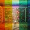
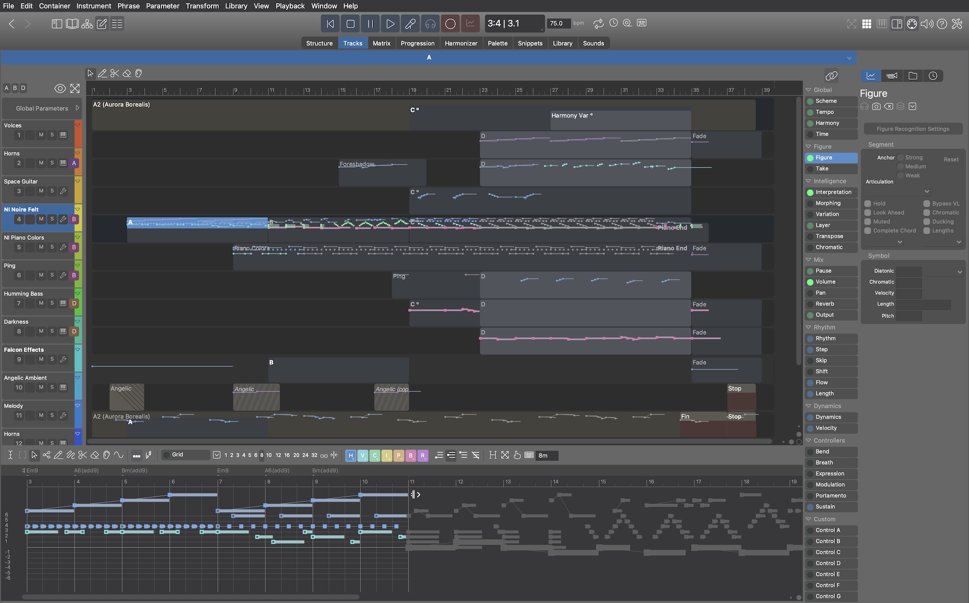
Snippets: Parameters on the right
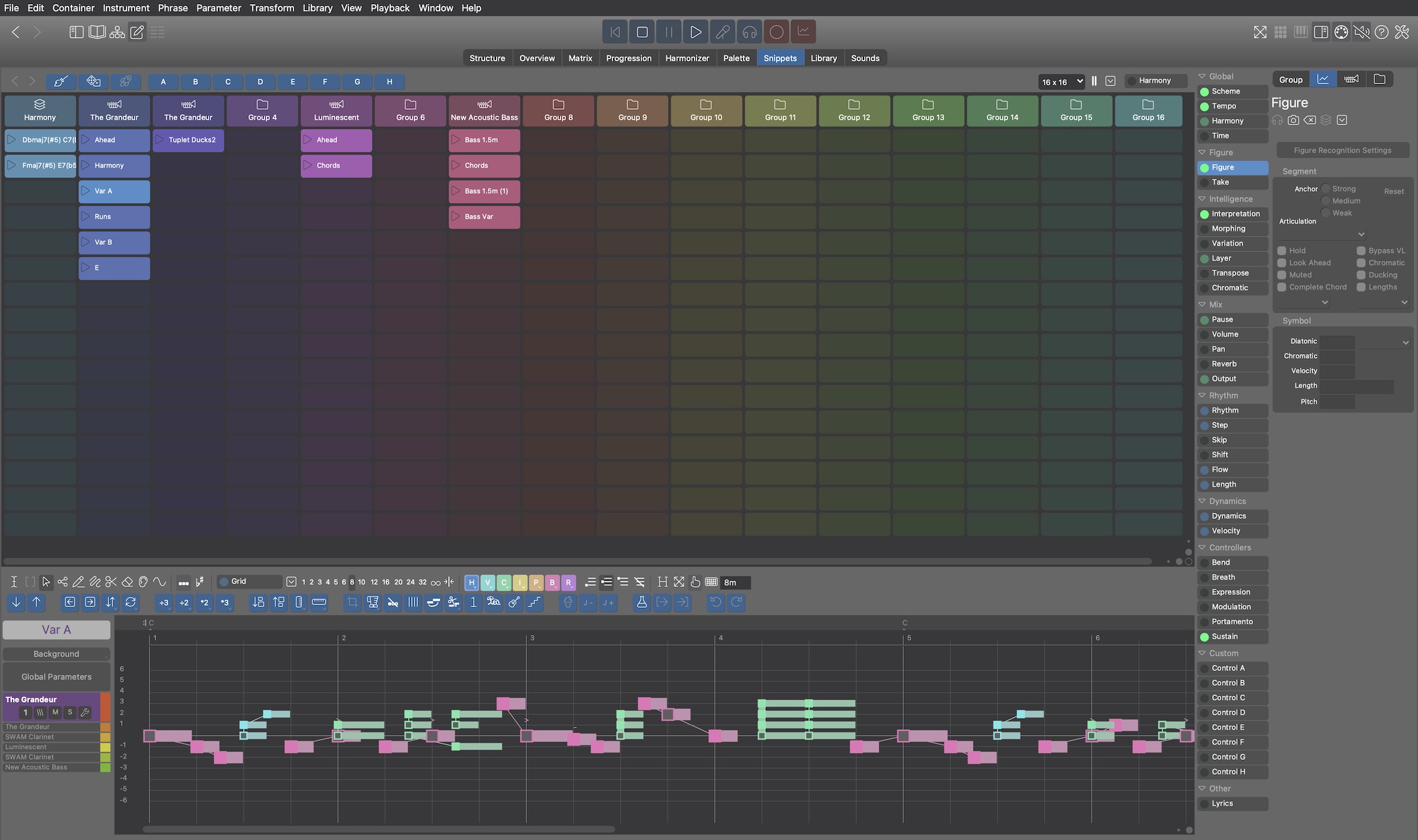
Library (parameters also on right)
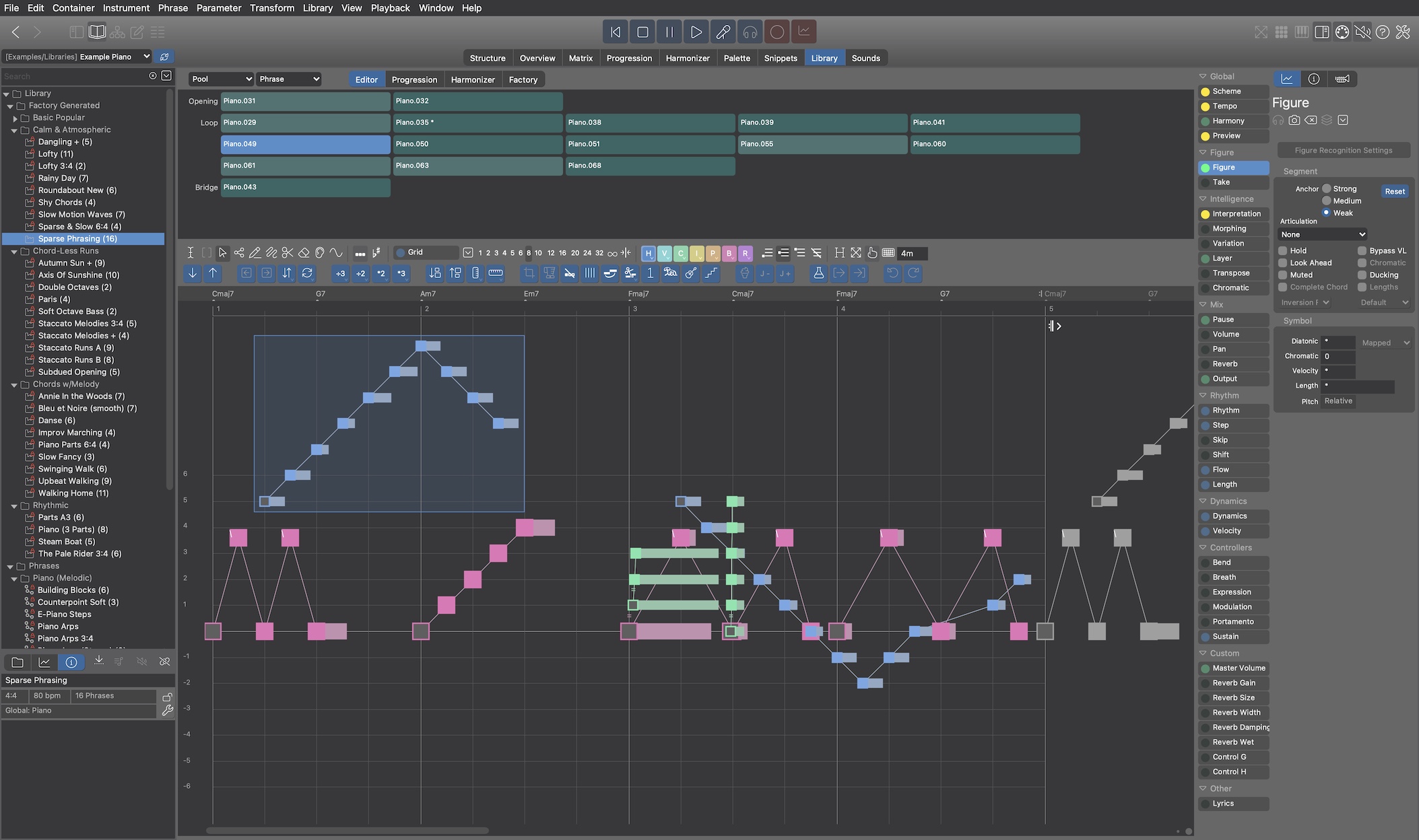
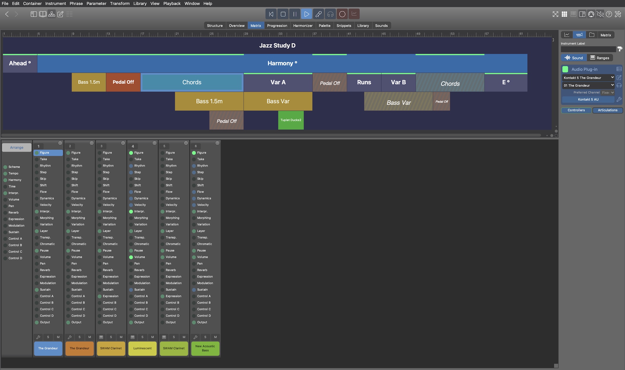
Matrix (parameters not on the right, for obvious reasons). Opening the phrase editor however will make the vertical parameter block appear as usual.
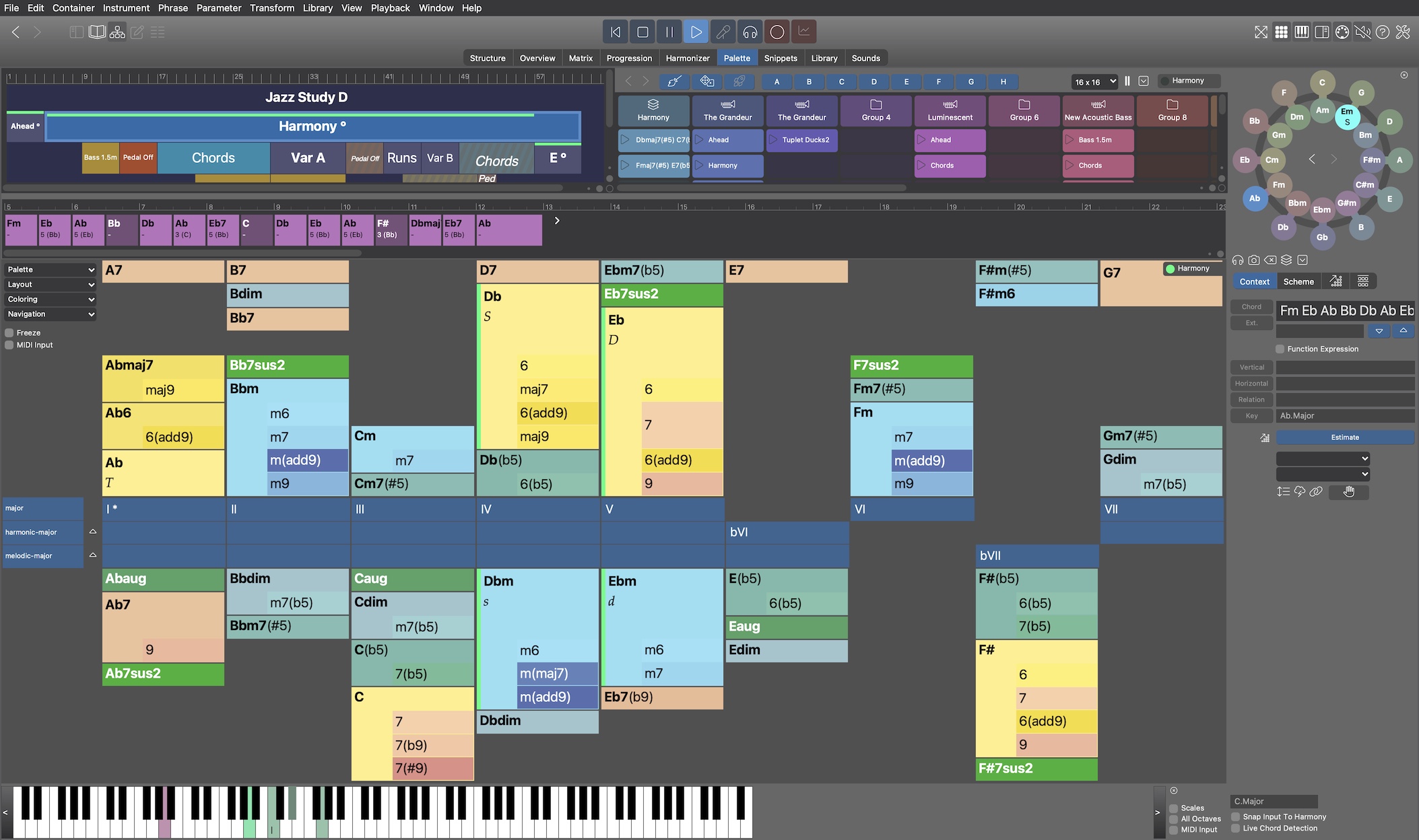
Palette (outlet on the right). Also note the parameter toolbar under the circle. Container structure and snippets grid are open here, which is optional. Select a container or snippet to edit its Harmony on the Palette.
Sun, 2025-07-13 - 11:39 Permalink
Layout changes seem minor but are important in the larger context.
The "Overview" page will be labeled "Tracks" and offer tools for drawing new "regions", each filled with a single phrase. Multiple regions with the same position and length can be grouped, which moves them into a single container. The container still appears as individual regions in this view (not sure yet how to best indicate their belonging together). The phrases can then be moved around as a unit. Overlaps within the same track are possible but since the view is flat they are hard to spot and their precedence can only be told from the resulting output.
Compared with the "Structure" page, the "Tracks" page has severe limitations. But nobody coming from a DAW will miss what they don't know! At the time users want to structure their arrangements in more flexible ways (which the dynamic nature of prototyping encourages them to), they will likely turn to the "Structure" perspective.
The lower part of the "Tracks" page will have a phrase editor plus an extra lane for "automation" of parameters other than Figure. Ultimately the "Tracks" page will be a "DAW with Figures" that many users will find more intuitive to work with.
We are still figuring out how to best manage parameter selection. The vertical parameter block needs to control three separate views: Tracks, Phrase and Automation. It could work like any toolbar, i.e. control the view you last activated (clicked on). If you have other ideas, let me know.
Sun, 2025-07-13 - 22:02 Permalink
The new layouts look much clearer and more intuitive. Anything which means I don't have to hunt for things is very welcome. Thank you. The new "track" view should make newcomers feel more at home - I expect you're already working on a new "getting started" video to match it.
Almost seems like Synfire 3!
Mon, 2025-07-14 - 13:08 Permalink
Select a container or snippet to edit its Harmony on the Palette.
Synfire's palettes are a defining, superior feature. This is going to be great!
I'd like to mention a use-case for consideration here. Suppose I have a short progression, or portions of a longer progression, say, 4 chords.
The chords are close to what I want, but not quite. Say there is something not quite right about the 2nd chord. It's close, and maybe I can't actually improve it, but I want to try. So, of course, using the palette to swap out that 2nd chord is the way to go - experiment and iterate.
But suppose all the experiments are failures. I need that 2nd chord back!
In fact, during the experiments, I will often want to compare the latest experiment to the original to see if it is better or worse.
IOW, the need is to be able to use the palette for chord substitution (for example, while a section plays on loop) with the substitution being non-destructive/undo-able until the decision is made: "Yes, that's it, bye-bye old chord!".
I'm not sure exactly what the UI would or should be for this workflow, but I am sure that this workflow is an important one. It needs to be as close to frictionless as possible. So, I thought I would mention it for consideration as the new paradigms are being created. Thanks!
P.S. KARMA software, another favorite of mine, makes good use of "compare buffers" to let the user get really crazy, and yet still be able to get right back to where they were. The "crazy" and the "reference" can always be swapped with just one touch. Possibly Synfire could make use of something similar in one or more places.
Mon, 2025-07-14 - 17:20 Permalink
For the workflow you describe, let's call it A/B comparison, I drag the original progression to the embedded library and drag it back if I need to restore it. It's easy to tell multiple variants apart and if everything fails you can go to the Library page and examine the details.
Another thing: We want to get rid of the white color themes. I don't think anyone is using them anyway. They are a strain on the eye and it's also very hard to maintain consistency with the dark themes. The feel of the app is so extremely different, using them for night/day switching doesn't work either.
Wed, 2025-07-16 - 10:05 Permalink
Almost seems like Synfire 3
Adding a fully functional track sheet with a toolbar, selections, drag and drop, copy and paste, etc is a major effort for sure. We are exploring the path (and it's going well) but it is unlikely that this feature will be included with 2.7 already.
On the other hand it is unclear if the "Tracks" view can be useful without all that.
Wed, 2025-07-16 - 21:28 Permalink
Structure and tracks can be navigated at the same time.
That's very nice!
I hope there will be an ability to automatically set/lock together the location/scaling/alignment of the structure and track timelines. Otherwise, I forsee alot of repeated user time and motion devoted to attempting to do so manually!
Thu, 2025-07-17 - 07:50 Permalink
Container structure and tracks are just different views on the same data. You edit one and it immediately reflects on the other side and vice versa.
When you create a new "region" on a track, it shows up as a new container in the structure. If you create 4 regions for 4 instruments, e.g. to build a section of a song, they will initially appear as 4 parallel containers in the structure view.
There will be a group/ungroup command for regions that merges them into a single container. Their look on the "Tracks" page won't change much (maybe some brackets or lines that show they are grouped), but in "Structure" they consolidate in a single container.
Some constraints apply, e.g. you can only group regions that start at the same position. If they have different lengths that can change the output significantly, so maybe it will have to be confirmed by the user.
Fri, 2025-07-18 - 19:00 Permalink
I'm excited. What quarter should we expect this in? Quarter 3 four orQ 1 of 2026
Wed, 2025-08-20 - 10:45 Permalink
The restructured program is working fine already.
Now that 'Tracks' are editable (I'm already using them), I see how extremely limiting a flat structure is compared to a container tree. No doubt it's great at the beginning. Easy to stitch phrases together one after another. Recording feels intuitive (at least I hope so). Almost like a DAW.
The trouble starts when you want to insert a part or change the song structure in other ways. You have to multi-select and grab every single region (phrase) and keep track of what belongs together manually. That may be fine for very simple arrangements (bass, drums, synth) but gets very cumbersome with a dozen or more instruments. I remember the days when I did this in Logic every day and never complained. That was before I got used to containers.
The other downside is you don't have a visual presentation of the narrative of your piece. How things develop and unfold. It's all flat and the reluctance to change something in an existing arrangement is palpable.
As far as I can tell at this point, 'Structure' is still best for sketching and developing a new piece from scratch, while 'Tracks' is wonderful for following playback and editing details and making corrections. The old name 'Overview' was really justified but 'Tracks' will be more familiar.
It's still hard to figure out what commands to allow in the 'Tracks' view. Regions can be grouped into containers and moved as a whole. Looks great. But the resulting container structure is less concise than one you would have built yourself (both 'Structure' and 'Tracks' views can be open at the same time so one can see the effect on either side immediately). I'm experimenting with an algorithm that consolidates track edits into a more compact container structure.
Will share new images and maybe a video soon.
Wed, 2025-08-20 - 13:09 Permalink
The restructured program is working fine already
Congratulations!
The trouble starts when you want to insert a part or change the song structure in other ways. You have to multi-select and grab every single region (phrase) and keep track of what belongs together manually.
It's still hard to figure out what commands to allow in the 'Tracks' view.
Cut, copy, and paste time.
Complex I know (as you've previously explained), because of the tree structure of containers and the nature of prototyping.
Nevertheless, those are the critical structuring operations we need every day as composers and producers.
Hopefully the restructuring had some benefit along the lines of making this easier to do technically than before.
(both 'Structure' and 'Tracks' views can be open at the same time so one can see the effect on either side immediately).
Seeing "both sides now" should at least reduce the overall friction of the development process, even if the core things being done are still inherently difficult.
Wed, 2025-08-20 - 14:21 Permalink
Cut, copy, and paste time.
What exactly does 'time' mean in this context? You are probably not thinking of the Time parameter.
Otherwise copy/paste is pretty straightforward. The only thing to be clear about is where the target of a paste operation is, because regions on a track can be nested (and if you are working also in the 'Structure' view, it is inevitable that nested regions will occur).
The 'Tracks' view should probably discourage nesting in order to keep things simple for beginners, but it can't entirely disable it.
Wed, 2025-08-20 - 14:53 Permalink
What exactly does 'time' mean in this context?
I mean linear clock time, either as bars|beats or as seconds.
We had some discussion of it previously here:
https://users.cognitone.com/topic/how-cut-time-structure
As pointed out there, the impact on containers makes this non-trivial (but presumably not impossible).
Wed, 2025-08-20 - 16:17 Permalink
Of course this will be possible in both views.
Cutting audio or MIDI in a DAW is trivial because it's all static and nobody cares if regions are split to pieces. Technically, splitting containers and phrases is also simple. But physical snapshots behave different than their virtual/looped originals and that can lead to unexpected minor differences before vs. after.
The very powerful container import feature, for example, does not work in the 'Tracks' view. It must always be done in 'Structure'.
Thu, 2025-08-21 - 14:59 Permalink
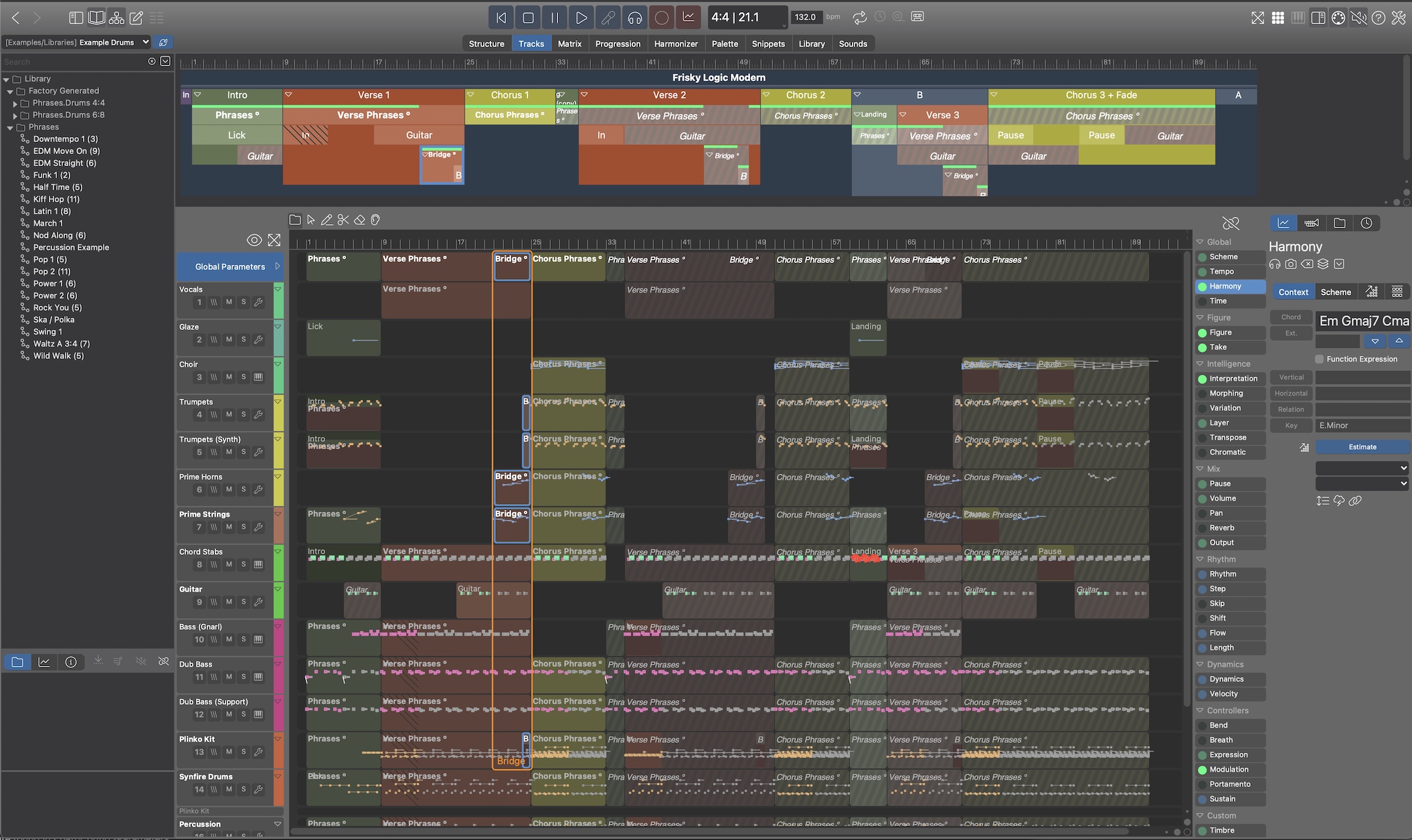
This is a simple pop song and how it translates from structure (above) to tracks view (below, open the image in new tab for more resolution). The selected container "Bridge" shows as an orange frame indicating the regions that belong to it as blue frames.
The display is intuitive. But if you start moving the orange frame around in the 'Tracks' view it gets confusing because "Bridge" is a child container. Moving it is fine until it moves close to or beyond its parent's bounds. What then? Where should it go? Moving it to somewhere outside the parent can radically change the output. My conclusion is that this kind of editing can only be done in 'Structure'.
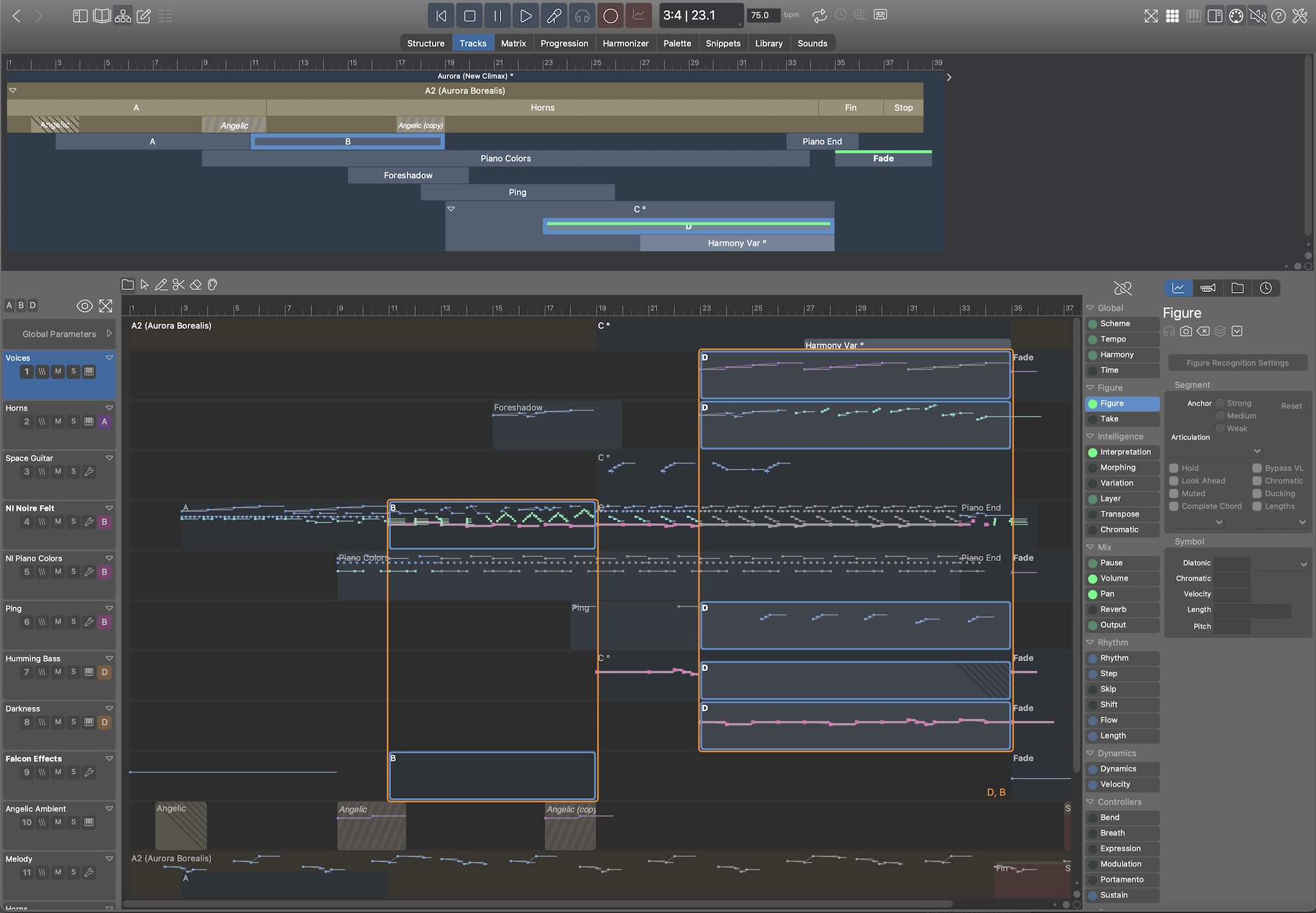
Here's another, less populated example:
I am inclined to block all structural editing in 'Tracks'. It requires too much mental gymnastics to even begin to understand what you are doing. I mean it looks beautiful but musicians are not scientists. Making things more complex is the last thing we want to do.
As I see it now, the only path forward is to strictly limit what can be done in 'Tracks'. If an arrangement is built in this view (which most beginners will probably do), the structure must be kept flat such that there are only surface-level groups without nesting. Any structure deeper than that is locked and can only be edited in the 'Structure' view.
Feedback and input is welcome.
Thu, 2025-08-21 - 17:04 Permalink
The orange and blue boxes are very helpful.
I agree that you should only be able to edit containers in the top region or on the structure tab.
You have probably already thought this through but:
To me the "obvious" way of working in tracks view would be to select a container and then do some editing in the lower region. Having to select a container in the upper region before editing feels DAW-like (as a Cubase user, anyway). Whilst this is a little restrictive, I think it would help to see exactly which container you are working on when they are nested. You would need a tool-tip to explain to users who clicked elsewhere.
Alternatively, you could have the orange and blue boxes spring into new positions if the user clicks outside the orange box in the lower region (so the first click outside an orange box changes the selected container, subsequent clicks perform edits).
Either way, perhaps you could restrict editing in the tracks view to orange bounded regions (selected containers), and only be able to make the same types of edit as in the phrase editor (or a sub-set). You would have to make sure the container view could not be hidden.
Thu, 2025-08-21 - 23:54 Permalink
Suppose one wanted to copy the 4 bar bridge and have it appear again after Chorus 1 (at m33).
The hope I'm expressing is to be able to copy (all of the) data that appears in the 4 bar bridge and paste it all at m33, moving everything currently at m33 4 bars to the right. This would be one simple operation, as it is in a DAW. (Ideally the new bridge could be a new animal, or a ghost copy at the user's discretion.)
If I'm thinking about it clearly, you'd have to construct a new "fully inclusive" bridge container that has incorporated all of it's inherited information into itself, and then place that in the new location, moving whatever needs to be moved to accomplish this "insert" operation.
This would be complex as a matter of development, but very simple for the user user, as it would be working just like a DAW in this respect.
In this hopeful world, editing done in container view would behave in the container-like fashion, with the track view results being "calculated" by the software. Likewise in reverse, editing done in track view would behave in a track-like (DAW-like) fashion, with the container view results being "calculated" by the software.
Possibly requiring a pre-existing blank area of time in the destination of a paste operation in the track view could bound the development problem enough to make it tractable.
With all the capabilities Synfire has as a prototyping engine, users have to "come to the software" (learn to understand, use, and thrive with the container paradigm) to some extent or another. Perhaps in the final analysis it is a reasonable ask, all things considered. OTOH, if the goal is for non-object-oriented typical DAW users to be able to quickly and easily transition to using Synfire, then the software is probably (IMO) going to have to "come to the user" (as per above) to a greater extent than currently.
But to be clear, even if building and editing in container view is the one and only way to do that, simultaneous visualization of the linear results in track view will go a long way towards assisting the learning, understanding and workflow process. It is going to be glorious!

Fri, 2025-08-22 - 01:03 Permalink
I don't get the pictures, looking at the first, reading the text, I think I'm getting it, then I look at the second and nope, I don't understand how selecting one container generates two non-overlapping orange boxes.
Sj1, if I've understood what you are suggesting correctly, it would ruin my workflow 100%, I'd copy something, paste it later in the track and it would completely change things like the progression in the root container and have other unintended consequences. What I'd do at the moment, is make a copy of the container, place it where I want, then add in anything that wasnt in the container but I'd like in the new one, for instance the progression at the original position. If I really intend to insert it, shifting everything over to the right so nothing remains from the place where I place it, yes I'd have to split containers, resize them to make room, or drag them over, etc, but I'm in control, it's my decision.
Whatever the outcome of this development work, I hope it adds to the current workflow and not replace it just to get features I have in my daw already. The daw I currently use to add audio tracks, add the final touches, tweek automation, mix, balance, mess with effects, etc before mastering it.
Fri, 2025-08-22 - 12:41 Permalink
Having to select a container in the upper region before editing feels DAW-like (as a Cubase user, anyway).
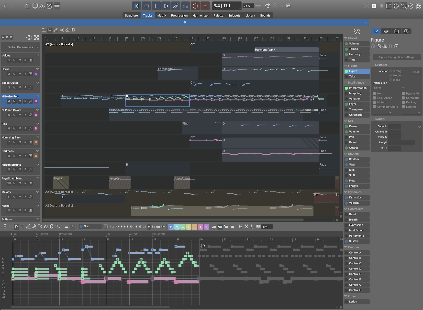
What is perhaps not clear from the screenshots: the upper container structure view is optional for additional navigation. On the 'Tracks' page it's hidden by default. The actual editing happens in the phrase editor at the bottom. Like here:
The hope I'm expressing is to be able to copy (all of the) data that appears in the 4 bar bridge and paste it all at m33, moving everything currently at m33 4 bars to the right.
This is possible only in a flat structure, i.e. there's no nesting deeper than top-level "group" containers. Such groups are essentially just permanent multiple-selections.
The downside of this kind of copy/paste operation is you end up with physical copies everywhere. So if you want to change e.g. the bass line you have to replace it manually everywhere it is used. Another question is whether it is really useful to copy/paste ALL regions within a time span. In a flat view it might be.
What makes Synfire powerful and inspiring is how looped phrases evolve over the course of time depending on harmony and parameters. This advantage is mostly eliminated when everything becomes physical copies (because parameters will be split/snapshot/copied in pieces also).
The 'Tracks' view will inevitably be seen as a "DAW with Figures", only a small step away from the old static workflow. Whether that is good or bad, I don't know. Often small steps make a bigger difference than great leaps.
the software is probably (IMO) going to have to "come to the user"
Absolutely. That's our motivation for the 'Tracks' view, although it is tremendously useful for power users as well. I don't know about you, but I don't want to miss it anymore even though I primarily use it as an 'Overview' and for editing details in already existing phrases.
editing done in track view would behave in a track-like (DAW-like) fashion, with the container view results being "calculated" by the software.
That's what it already does. Although it works better in the containers-to-tracks direction than the other way. A flat structure created on the 'Tracks' page looks very verbose on the 'Structure' page (lots of small containers that cannot always be automatically consolidated into something more concise).
I don't understand how selecting one container generates two non-overlapping orange boxes.
That's a multiple-selection of two containers for demonstration.
Whatever the outcome of this development work, I hope it adds to the current workflow and not replace it just to get features I have in my daw already.
Absolutely. The goal is to make it easier to get something done already before a new user is required to understand all the new concepts of Synfire. Building a bridge.
It's probably best to lower expectations (mine too). The familiar look of "tracks" might already go 50% towards the goal. Being able to record phrases, stitch them together and export that to a DAW is also very useful and rewarding for beginners (another 25%). If composing more elaborate music in a non-destructive algorithmic way requires the 'Structure' view, that's where the journey will eventually take them anyway. It is just no longer a requirement.
It always reminds me of text editing programs. The vast majority of users just types ahead and doesn't bother with paragraph styles and layout features. Only with larger documents these features become inevitable.
Sat, 2025-08-23 - 16:01 Permalink
Simple once one is educated to a certain point, I'm sure. Thanks.
I still think seeing is believing though. Could the process described be done "live" in realtime? Could it be done on the Snippets side as well?
Starting from zero, or near zero, following those instruction might take hours of research and experimentation that a video could show off directly in minutes.
Maybe make it one of a growing number in the "Synfire Workflow Series".