Posted
nobody has some information about the new version?release period?
cant wait :)
Pagination
Wed, 2013-06-12 - 03:07 Permalink
Very excited for the update. It would be really nice if drop and drag of midi from files was possible directly.
I have Drum Core 3 and it hasll of these great midi snippets of drum patterns that are designed to just be dropped and dragged to a track in a DAW . Would love to be able to use that in Synfire . I believe that Stylus RMx also works this way but I am less familiar with it.
I am a big YES fan and my drum core has great midi snippets from YES drummer Alan White that I would love to use in Synfire!
Anyone know of a drum program where the drum kits correspond with GM midi drums? I'm not a drummer so I import in midi drum examples into synfire.A lot of the drum software i have doesnt seem to match up with midi standard? Any suggestions?
Yes I know, i got a little off topic!
Sorry!
Fri, 2013-06-28 - 08:54 Permalink
What's needed there is what's called drum maps.
You have an "in note" number and an "out note" number. So say a snare drum on your Drum Core 3 kit is on note #40 and you want it on note #45 to match the midi file mapping you'd just enter 40=45 and so on for the rest of the kit until the drum map matches your midi file mapping.
But drum maps are more of a daw feature so I'm not sure we're going to see that in Synfire. If you use a daw to host your plugins via virtual midi from Synfire all you need is your daw to support drum maps (Reaper or ableton live for example)
Fri, 2013-06-28 - 18:10 Permalink
Then maybe it's the opposite: please do take a Holiday!
I'd rather wait longer and be able to count on development for the long haul than have a 'stressed out' or 'burnt out' developer.
Andre, taking good care of yourself is taking good care of Cognitone.
Mon, 2013-07-15 - 21:54 Permalink
Ok, the video is still not done, but here are a couple screenshots for a brief preview.
Audio & MIDI Setup
Input Ports
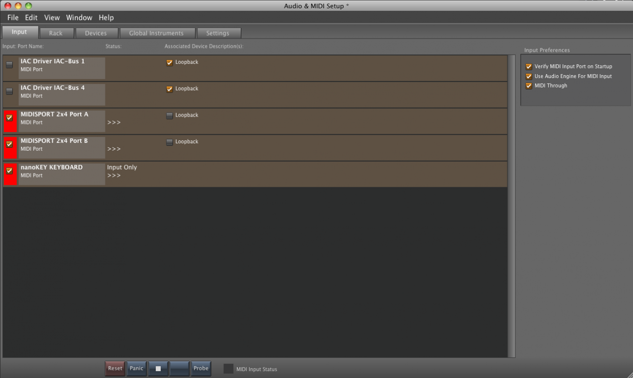
This view has been largely cleaned up. Only ports capable of providing MIDI input are listed here. Whether a port is active for input or not is now more obviously checked at the port display directly. There is a new feature to flag a port as "Loopback", which will be used to avoid infinite feedbacks that can potentially crash Synfire.
Those working with DAW Drones will see them appear here too, because the can provide input to Synfire.
Shared Rack
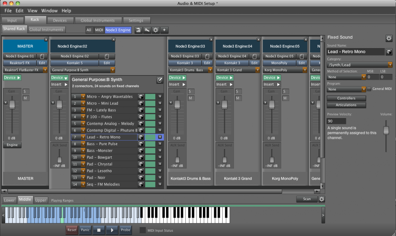
The shared rack, like all other racks, are now presented according to DAW idioms, which everyone is aleady familiar with. Rack modules (depicted as channel strips) can be added and configured through popup menus, very similar to Logic and other DAWs. Most of the previously confusing functionality is now put into these popup menus, making rack setup a snap.
Devices can be expanded or collapsed per each rack module, showing full details for each available channel. And yes, channels are fully editable here. That is, you can tell Synfire what sound is on a channel without switching to another view. Even the ranges can be set here. I'll show in the video how this works, and am sure you will love it.
Of course, rack modules can copy & paste, making it easy to duplicate or transfer presets. As I am at it, presets can be saved and restored for rack modules you frequently use. These include plugin, preset data and devices.
Devices

The device editor is divided into tabs "Properties", "Connectors, Channels" and "Programs".
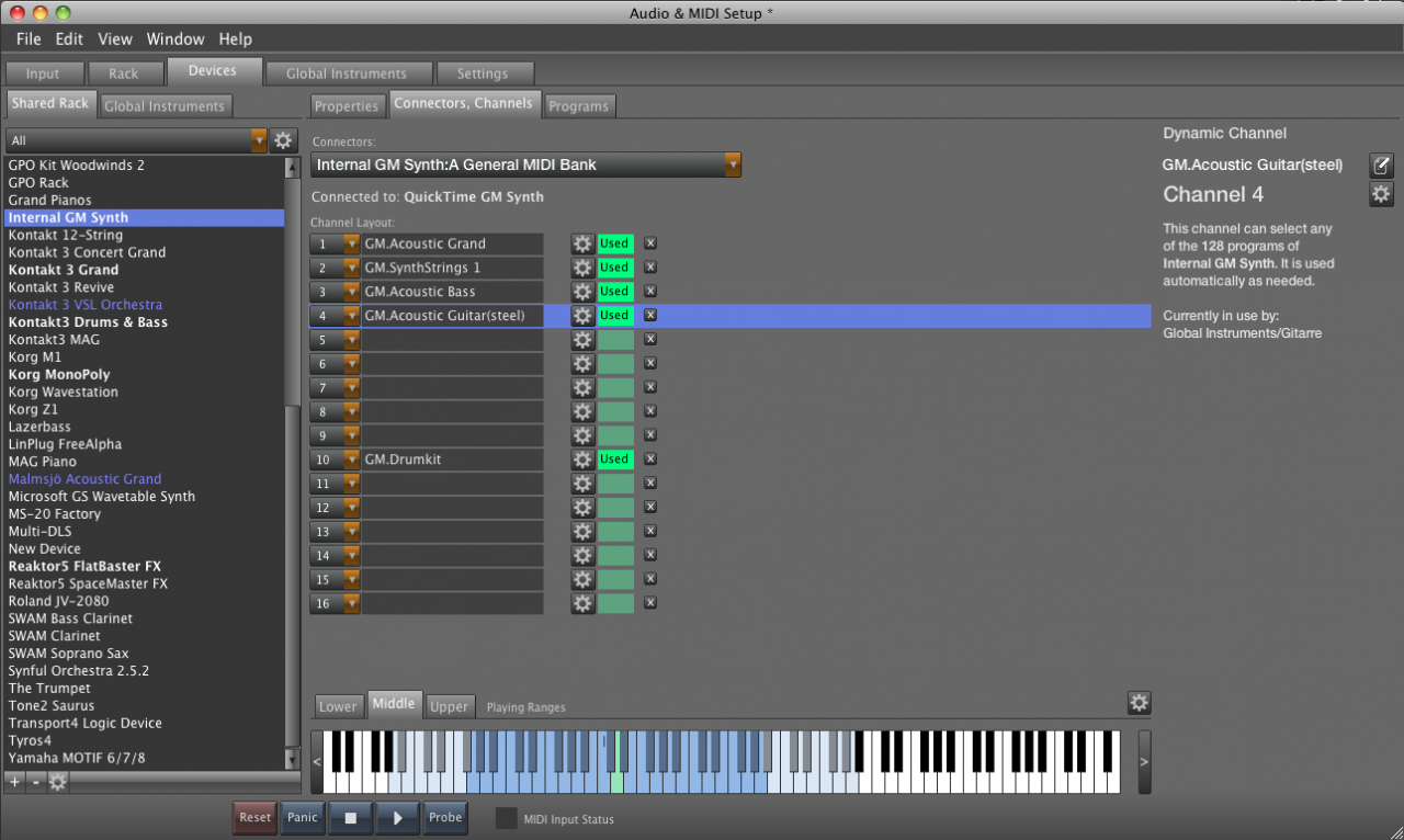
On the connectors tab, one can define A B C and D connectors and setup each 16 channels per connector individually. This tells Synfire if a channel is dynamic, fixed or a reserved channel (e.g. for GM drum kits). It is also indicated whether a channel is currently in use and by what object in the system.
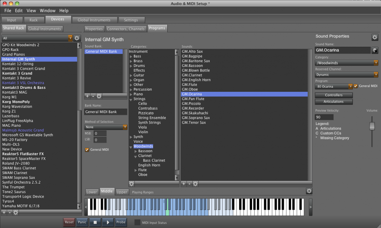
The "Programs" tab looks almost like the old editor, but has been redesigned to work more intutively.
Global Instruments

This has also been cleaned up and redesigned. Instrument setup now looks and works exactly the same at all places in the system. The video will tell how it works in detail.
Arrangements
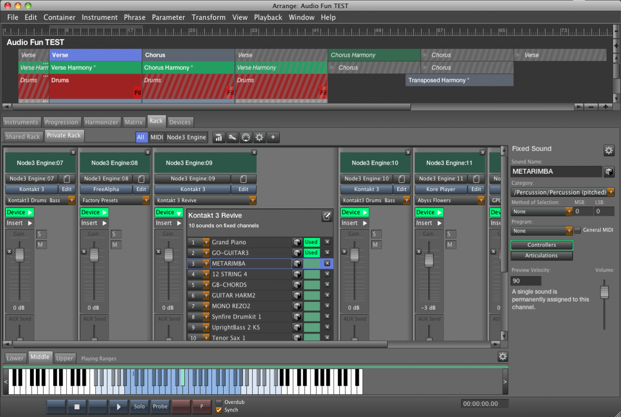
Now for the real big deal: Inside each arrangement, one can now edit the private rack AND the shared rack AND the private devices AND the shared devices -- all in the same window. Look at the tabs "Rack" and "Devices" for details.
This means there is no more confusing hidden magic. You can now see it all, edit it all and more easily understand how it works together. Don't get distracted by the rich elements you see. The mechanics are 100% identical to Audio & MIDI Setup window.
Ah, I forgot: There's an Insert FX now per rack module. Will show it in the video.
Channels

The channels can be set up per private device the same way as with global Audio & MIDI Setup. Although you can already do that from within the instrument inspector (see below).
Instrument Inspector

This inspector selects one of the sounds you have set up. Basically this requires 2 steps only: (1) Select the rack module, (2) Select the channel on that module. For program-based synths, you can browse all sounds using the "Search" icon. It got really simple. The new browser, by the way, is also way more concise and easy to use.
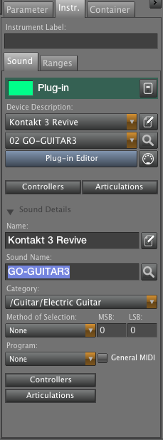
If you need to modify individual channels and sounds, you can expand the inspector view and do that right here without visiting the rack tab or global setup. All in one place. This is great if you don't want to create a device in advance but rather setup channel by channel as you move forward with your project.
If you need more control, the icon buttons at the right will jump you to the respective rack or device editors, again all inside the single arrange window.
Enter The Matrix
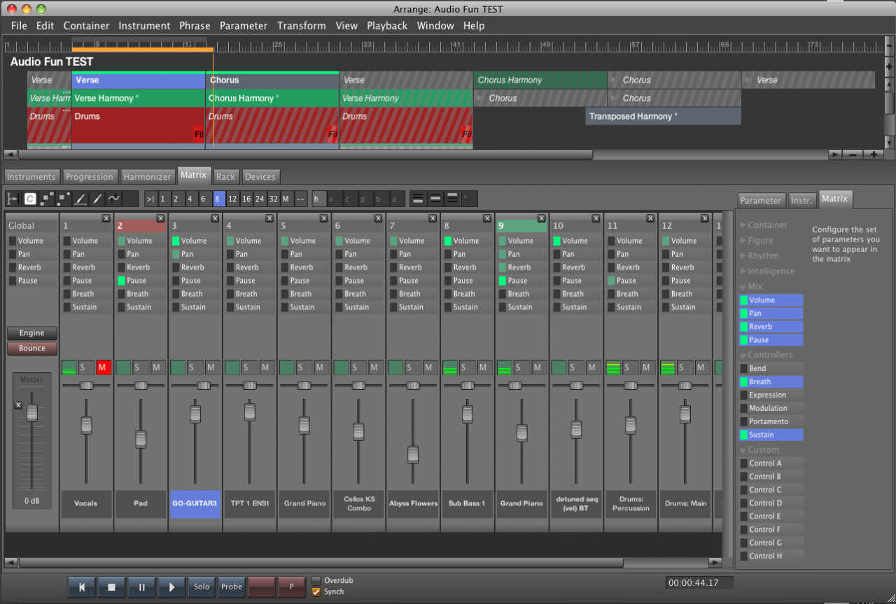
Since all audio setup is now done on the rack tab, the old mixer tab turned into a "Matrix": Slim channel strips per instrument, which you can set up to show any combination of LEDs you choose. This is a great way to explore and edit an arrangement from a birds perspective. The picture does not show the vector graphics, which is opened at the bottom of the window when you double-click a parameter. And yes, you can of course also edit Figure and everything here.
Ok, that's it for today.
Did I mention this update will be for free?
Tue, 2013-07-16 - 03:44 Permalink
Reading here, it's too big a mouthful to swallow all at once ... but it looks like you have addressed all the major issues. I'm eager for the video and the update!
One thing I didn't see (and perhaps I missed it?) is whether on the arranger page the instrument controls for mute/ solo/ etc. remain in view on the left of the window as the arrangement scrolls left to right across the timeline.
There appear to be fantastic improvements to 'setup,' but I hope the 'operations' side of things also gets your masterful attention.
Prado
Tue, 2013-07-16 - 09:47 Permalink
ok andre'..it looks great!
although I havent really understood the setup thing(but probably because I always use synfire with loopback and Studio one so I never used shared rack and stuff) it seems nicer, compact, and more intuitive..lets see
thanks!
Tue, 2013-07-16 - 18:55 Permalink
Yes, indeed it looks great. And I really didn't expect this to be a free update :admire:
I most like the new matrix view. This will really help to get a better overview of the parameter settings.
Audio&Midi setup also is significantly better structured. But of course I have not yet understod everything. The old "Ports" tab is replaced mainly by the new "Rack" tab, correct?. I can't see in the picture, if I can get a simple overview of all connected MIDI output ports there. But these questions certainly will clarify quickly when the update is available.
Tue, 2013-07-16 - 22:00 Permalink
Well done, even I don't understand all points as I gave up synfire during my studio move which took longer than expected , I think I will start from a fresh new version my apprentice , I guess in September it would be ready for beta testing ?
Cheers and looking forward !
Isham
Mon, 2013-07-29 - 17:31 Permalink
For me i was aspecting that this should be a free update, because it was userunfriendly and difficult to start as a beginning composer in music with Synfire
It is strategic move from Cognitone..business wise..good (neccessary)move. :thumbsup: ( that's my idea )
And ofcourse easy handling of all VSti sounds .. a milestone
Yes, indeed it looks great. And I really didn't expect this to be a free update
Wed, 2013-08-07 - 10:18 Permalink
Synfire 1.7 is nearing its completion. Here are a few more details on what I am working on at the moment, besides testing the all new audio setup interface.
While the update focusses on the sound setup system, a few user interface enhancements and simplifications will also make their way into the next version of Synfire:

For maximum comfort, a palette will be integrated with the arrange view on a tab. The notepad progression view on top is linked to the real progression of the currently selected container. No need to copy/paste notepad content anymore, or juggle with palette windows on your screen. Of course, you still have the option to open as many extra palette windows you want.
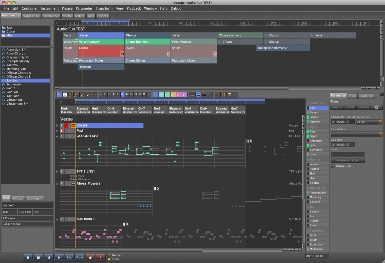
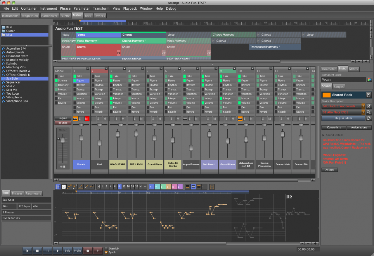
Synfire Pro: Arrangements will include an embedded library that can serve as a clipboard for trying out ideas and putting stuff aside without losing track of it. Drag and drop is a snap. Very handy for keeping multiple versions of phrases. The library can be hidden or shown, on the Instruments and Matrix tabs, as needed. Due to its impact on the way how arrange documents work under the hood, this feature may or may not be done when the update is due, but is definitely being implemented.
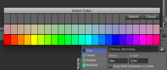
Colors can be assigned to containers, rack modules and channel strips in the Matrix. You can choose between full and dimmed "muddy" colors. The dozens of shades of colors required to make the structure view work are computed automatically based on your choice.
This update took longer than expected, because major portions of the code had to be rewritten, reorganized and tested anew. The nice side effect of this cleanup is things are working much better and are more robust and intuitive now.
Wed, 2013-08-07 - 12:33 Permalink
Looks good. The new Palette tab is really a good idea.
Just a few thoughts:
I can imagine, that the name of the "Instruments" tab is misleading to new users. The purpose of this tab is not only to make instruments settings there, is it? It's what we knew before under the term Arrangement view, so why not call this tab "Arrangement". Well, i see that in the new Matrix view the container structure is also visible, so maybe that's the reason, why you don't want to call the "Instruments" tab "Arrangement". Alternatives would be perhaps: "Track view", "Staves" or "Staff view" (The term "Staff" appears also in the manual).
The tabs "Instruments" (Arrangement) and "Matrix" should be placed next to each other. They are different views to the composition (similar to the session view and arrangement view in Ableton). So, these two tabs belong together, I think. My suggestion for the order of the tabs would be: Arrangement - Matrix - Palette - Progression - Harmonizer - (then a small gap) - Rack - Devices.
Wed, 2013-08-07 - 17:12 Permalink
It's like in Excel working with tabs: you can rearrange any order of the tabs you want there
Synfire can overtake this from Excel..or HALion5 has this feature too and more
It is possible to undock a tab a screen in HALion5
The tabs "Instruments" (Arrangement) and "Matrix" should be placed next to each other. They are different views to the composition (similar to the session view and arrangement view in Ableton). So, these two tabs belong together, I think. My suggestion for the order of the tabs would be: Arrangement - Matrix - Palette - Progression - Harmonizer - (then a small gap) - Rack - Devices.
The "tabs"in HALion5 are advanced --> i can undock a tab ( than i becomes a whole new screen for a second monitor ?)
Wed, 2013-08-07 - 20:07 Permalink
Looks great Andre.... You are truly a hard working person, always open to people's ideas.. I can see you have poured your heart and soul into Synfire and Cognitone.. You deserve, and will get the appreciation of many new users.
This really is 'cutting edge'.. Back in the early 70's - 90's, I worked for ARP and MOOG synths, and also a few Music software programs.. Dr. T's sequencer, Roger Powell's Texture program, and Voyetra (heavy duty hybrid synth, and then sequencing software..
The excitement here around SFP and your dedication to it, reminds me of those 'good old days'; when I was a young man and the impossible seemed possible..
Hats off to you....
Wed, 2013-08-14 - 21:55 Permalink
Again more details on the coming update:
The library part has been rewritten to a large extent. The tall library windows do now expand on double-click on a phrase pool to open the pool editor. Both units are in the same window now, which resizes as needed:
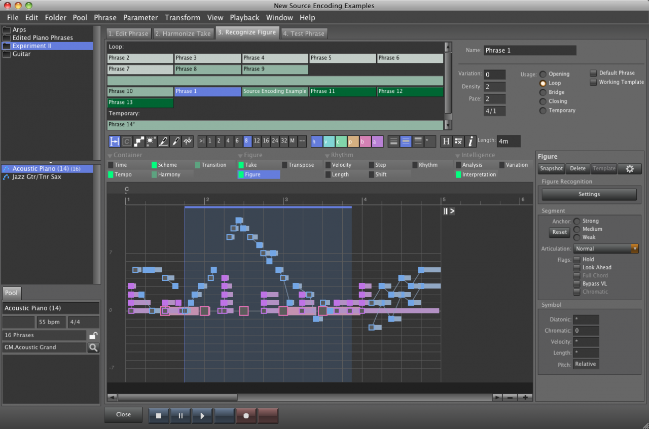
Much of the quirky user interface was streamlined to be simpler and more intuitive to use. The harmonizer will look like everywhere else:
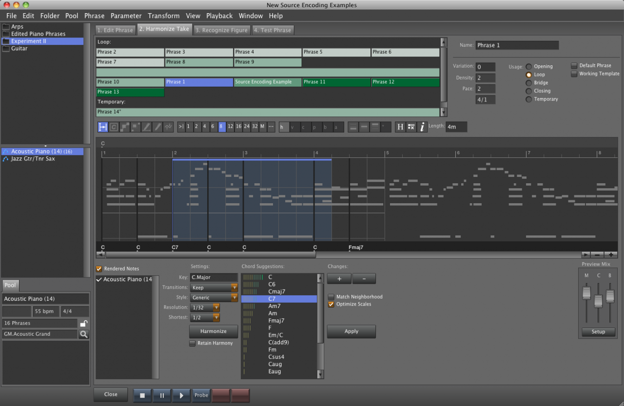
There will be a huge improvement as to how the dragging of phrases works within the arrangement. I'll show that in a video later. In short, it will be possible to drop a phrase at any position, in between or after existing phrases, or create a new instrument "track" by dropping a phrase onto the slack area of the sheet :-D
The Phrase Pool Editor is intended to become a workbench for creative manufacturing of personal "construction kits" for quick prototyping.
Pagination
